Fire sprinklers are visible in ceiling at Art Institute of Chicago.
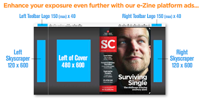
Left of Cover
I like this ad
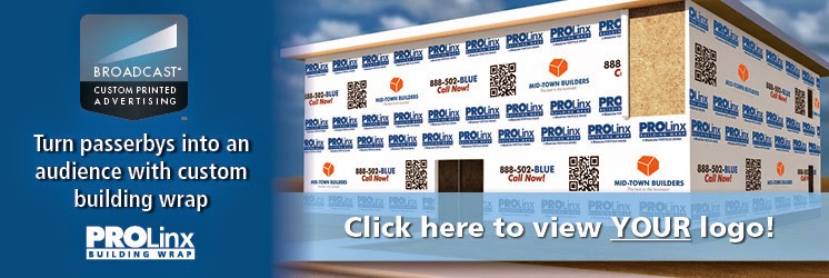
Turn your product into jobsite advertising
"BROADCASTSM custom printing, another SystemComponents®
advantage. Not only are SystemComponents products exceptional roof
underlayments, they’re also available with industry-leading BROADCAST
custom printing, with the following features:
FULL COLOR: A full range of vivid colors.
MAXIMUM-SIZE: The largest print area available.
ALTERNATING MESSAGES & IMAGES: Select multiple messages.
FLEXIBLE ORDER SIZE: Industry’s smallest custom print minimums.
"Hundreds of drivers, passengers, and pedestrians pass a building site each day. BROADCAST custom printing turns them into your audience, and a building into a billboard — a vivid, multi-colored, multi-messaging platform with numerous messaging possibilities. Advertisers can now connect with residential and hard-to-reach on-site venues. BROADCAST custom printing might be used to advertise a contractor’s company, services, or building benefits. It could even be sold to a local business, such as a landscaping or painting company. Or it could be offered to the client to advertise a coming business or community

What a great idea.
"Hundreds of drivers, passengers, and pedestrians pass a building site each day. BROADCAST custom printing turns them into your audience, and a building into a billboard — a vivid, multi-colored, multi-messaging platform with numerous messaging possibilities. Advertisers can now connect with residential and hard-to-reach on-site venues. BROADCAST custom printing might be used to advertise a contractor’s company, services, or building benefits. It could even be sold to a local business, such as a landscaping or painting company. Or it could be offered to the client to advertise a coming business or community


What a great idea.
Bad Ad: You're looking at wasted ad buy
What is VRF? The ad sure doesn't say. The first five responses to a Google search on VRF says it is "virtual routing and filing, whatever that means. It also returns "violation risk factor", "visual resources facility", "vertical reporting framework", "very rapid fire", "vertical removal fixture", and many other terms that seem plausible as construction terms. I conclude that the glazed look on the model's face means another case of VRF -- Verified Readership Failure.
Except for one line mentioning "heating and cooling", the ad could be for almost anything. But the ad doesn't draw the reader to read it so carefully that they see the words "heating and cooling".
VRF turns out to be "variable refrigerant flow", a heating, ventilating, and air conditioning (HVAC) technology. Perhaps I was not the target of the ad, that the ad was directed to engineers that know the abbreviation. Then why did they place the ad in Building Design and Construction, a magazine also read by architects, building owners, and general contractors -- readers that can influence the selection of heating and cooling equipment.
My guess is that the ad agency did not know what VRF was either, and that the folks who signed off on the ad think everybody knows the product. In that case, all they had to do was link the brand, LG, with the technology, VRF; the ad could have been as simple as:
LG 4 VRF
Such a simplified ad has a clearer message, could be more visually arresting, and would probably outperform what they used.
Marketing Value of MasterSpec
A building product rep addressed a question to specifiers on the LinkedIn CSI group:
MasterSpec. Buiding System Design, and other subscription specification services affect building product marketing strategy in two ways:
1. Visibility at the "Point of Specification"
For many types of products, product selection is not considered until someone starts writing a spec. If your product is listed in the master specification, it may stimulate someone to include your product in the specification. It can also be considered a type of very targeted advertisement and part of your media buy. The companies you represent should contact the subscription services and "sell" them on including your product in their documents.
1. Can the Subscription Specification Service Present your Product Property?
Subscription specifications have to treat all manufacturers fairly. This makes it difficult for them to include language necessary to specify the unique requirements about your product. More, the subscription specification will also name your competitors and could, in fact, lead your customer to go astray. For these reasons, manufacturers of proprietary products should also consider offering their own guide specification. It will be a valuable part of your product literature and good content for your website.
You can read my posts about guide specifications at http://tinyurl.com/nqyzerf. Feel free to contact me directly if you want to discuss your unique situtaion.
I am interested to hear how much MasterSpec is relied upon in creating your specifications. Some of the products I represent are listed in MasterSpec. I am trying to gage the importance of having the products that are not in MasterSpec added to the service.My reply:
MasterSpec. Buiding System Design, and other subscription specification services affect building product marketing strategy in two ways:
1. Visibility at the "Point of Specification"
For many types of products, product selection is not considered until someone starts writing a spec. If your product is listed in the master specification, it may stimulate someone to include your product in the specification. It can also be considered a type of very targeted advertisement and part of your media buy. The companies you represent should contact the subscription services and "sell" them on including your product in their documents.
1. Can the Subscription Specification Service Present your Product Property?
Subscription specifications have to treat all manufacturers fairly. This makes it difficult for them to include language necessary to specify the unique requirements about your product. More, the subscription specification will also name your competitors and could, in fact, lead your customer to go astray. For these reasons, manufacturers of proprietary products should also consider offering their own guide specification. It will be a valuable part of your product literature and good content for your website.
You can read my posts about guide specifications at http://tinyurl.com/nqyzerf. Feel free to contact me directly if you want to discuss your unique situtaion.
Humor Educates... and Sells
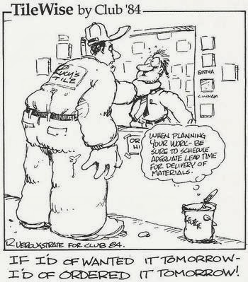
A ceramic tile promotional group has, for years, been using a cartoon series to educate contractors and specifiers. It is model other building product manufacturers and promotional groups can emulate. The group's website explains:
"TileWise cartoons were developed under Donato Pompo's leadership for Club '84 (Ceramic Tile Action Group). Club '84 was a non-profit organization of accomplished individuals from all segments of the ceramic tile industry. The group's mission was to develop and distribute educational aids to educate, train and bring quality awareness to the distributors, specifiers, installers, and consumers of Ceramic Tile.
"The TileWise cartoons were created to communicate issuses and concerns in the business of using ceramic tile for all segments of the industry. The objective was to educate to promote the quality use of ceramic tile. In each cartoon the screen exagerates what you shouldn't do or emphasizes an issue or concern, then George the Bucket (named after CTI founder George Lavenberg) says what is correct. The cartoons ran for twelve years in each issue of the Tile Industry News, a major industry publication, published by the Ceramic Tile Institute until 1999 when it ceased
"Use these cartoons to educate your customers and employees to help avoid potential problems, and to promote a positive image of your company through newsletters, posters or mailings.
"We hope you can put these cartoons to good use to help your industry and your business, and we know you will certainly benefit from them if you do. Good Luck!"
Your factory can earn during off hours
 |
| Michael Jackson's Thriller was shot on the street behind Davis Colors, Los Angeles, using the factory's distinctive masonry wall as a background. (photo credit) |
 |
| Industrial Acoustics Company, Bronx, NY is listed in a location database. |
 |
| Your plant, like IAC's, may be useful for a variety of locations. |
On most shoots, both you and the producer will want to sanitize the site so the location is not recognizable. In other cases, when the film project is compatible with your branding, you may want to have your brand recognized and can stipulate that your logo, product, or company name is visible on screen. In advertising, its called, "product placement".
Logo Sponsorship
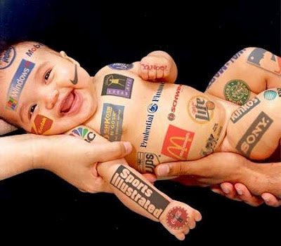
Construction tool manufacturers already know the benefit of paying for their logos on race cars. It seems to me, however, that there are many opportunities for sponsoring buildings by offering logo display opportunities.
What I envision goes beyond small logos on jobsite construction signs. These signs typically list the designers, prime contractors, and owner, but not suppliers.
Using buildings as billboards is also well established.
Instead, what I imagine is making extensive use of buildings for corporate logos.
How much would it be worth to a contractor to sell advertising rights to the building exterior or site fence while it is under construction? Would a material supplier discount its wares in exchange for exposure.
Then again, some building product manufacturers have already figured out how to get their brand displayed for free:

|
 |
| See site for interesting comment about this urinal drain cover. |
Promote The Right Thing
Promotions – which usually means giving something away free – can be a great way to raise awareness, build a relationship with a potential customer, and give them a chance to experience your product first hand...
...If you do it right!
Case in point: I downloaded a free iPhone app that helps you learn German. Like many free apps, it's a "lite" version designed to expose potential customers to the product and entice them to buy the full or 'pro' version.
It's a nice little app. Every night at midnight, a new German word arrives on my phone. The app will pronounce it properly for me. It will show me examples of the word in use in German, and (usually) supply the English translation for the phrase or sentence. There's often a picture of it, too. (Which can present an interesting challenge at times. Today's word is actually a phrase, "ich verstehe das nicht" – "I don't understand" - and the picture of it is a woman facing a geometry figure on a blackboard and scratching her head.)
All good. After using it for about three weeks, I got several cool words, a number of useful words, and a couple of close English cognates that made me feel more confortable with German. I began to think about buying the full app. But it was $14.99, a little expensive for something I wasn't yet particularly committed to, so I decided to use it some more.
That's when the app designer lost the sale.
The longer I used the app, the more close cognates I got. For example, in the past week, I've gotten Komodie ("comedy"), Japanische Yen ("Japanese Yen"), oft ("often"), and Los Angeles ("Los Angeles"). More than half were close cognates, some laughably close.
Now, I no longer feel like the cognates make me comfortable with German. I feel like either the app developer is deliberately giving me educational junk-food to force me to pay up to get more substantial education (bad impression of the brand), or else German is so close to English that it's hardly worth $14.99 (doubting value of the product). Neither of these feelings makes me want to buy.
What do we learn from this?
1) If you're going to give something away, think through the way it will be received and used, and what that experience will say about your company. The best promotional item I've ever seen is a simple plastic stick-pen, bent into a dog-leg and imprinted with the name of a chiropractor. Every time you use the pen, you think about your back. If the shape of the pen makes it hard for you to use, it will also make you think about your body being nonfunctional when it's bent up.
2) If you're giving away a product sample that's intended to be utilized (as distinct from just sitting on a shelf looking pretty), give away the quality and quantity of product adequate to producing a great result. It could be a small great result, but it better be great. One of our clients gave away samples of a new concrete coloring treatment. The sample was just right: the perfect size for coloring one 2-car garage floor. Our client knew perfectly well that no intelligent decorative concrete contractor would use an untried product on a client's job, but they all test products out in their garages. This way, they could get an entire nice garage out of it (not just a 4'x4' patch in the corner), and end up feeling good about the product and the company they got it from.
If you're giving away freebies, there's a temptation to try to limit the expense. Understandable, but don't limit the $$$ in a way that undercuts the object of the promotion. Whatever you give away, make it represent the quality and intelligence you want associated with your brand.
Respect Your Target Audience
I was researching a media-buy for a client, and while perusing a trade magazine's media kit, I came across an impressive statistic: 90% of the people they surveyed read their magazine. Only about 50% of those same folks read the next most popular magazine in that field. Sounded great.
Except that I like context. So I wondered, who exactly were the folks they surveyed?
It turns out it was a survey of their 14,000+ readers. It turns out only 90% of their readers actually read their magazine, and 94% of their readers receive their magazine. This leaves me wondering how they define their readers, since (if you consider their own statistics and use the kind of meatball logic they used) there seem to be some "readers" (6%) who neither read nor receive their magazine.
It did not leave me wondering about the quality of their statistics: I now believe very little of what they say, not without close scrutiny. Clearly, they did not intend me to take away the message that their magazine is so boring that 10% of their own readers don't even read it. Clearly, what they intended was for me not to read the fine print.
Did you really think I wouldn't read the fine print, guys? Did you really think I'd just look at a big number and take out my checkbook?
Personally, I think it would have been wiser to craft a different headline out of their survey data. They could have ignored the percentage of their readers read their magazine (that still twists my brain) and focused on the 50% of them who read only that magazine, out of all the publications in their field. If you're talking to me as a potential advertiser, the idea that the only way to reach those 7000+ people is through your magazine is pretty compelling sales-stuff. Much more compelling than the admission that your "readership" figure is inflated by 10%.
More to the point, their assumption that I wouldn't question their headline, that I wouldn't read the fine print, insults me. It insults my intelligence and my competence at buying media. Insulting your potential customers is hardly ever a good place to start, even if you're a stand-up comedian.
This is a lesson for anyone who designs or approves advertising and sales literature. If you assume the audience is stupid or lazy, you will pay for it. It will reflect badly on you, and invite speculation on what other kinds of deception you practice.
The Moral:
Promote if you can,
Hype if you must,
But trying to hustle me
Busts my trust.
Awareness is Where You Find It
This recent post on Advertising Age has nothing to do with building products specifically, but everything to do with creative ways to raise awareness. Many of the "10 Most Unusual Advertising Placements" are examples of brand awareness advertising (as distinct from promoting a specific product). A couple are really advertising venues in search of an advertiser. What they all share is a clever rethinking of where to contact the potential customer.
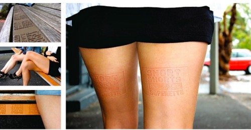 The best of these ideas not only find a clever way to get noticed, but feature a fundamental appropriateness of the location they operate in, and a real connection between the way they communicate and the brand/product being advertised. Anyone could imprint their logo on the thighs of someone wearing shorts who sits on the bus-bench in #5. The brilliance of it is using it to advertise a sale on shorts. The same technique might also work for a gym, or a campaign for women's rights. It wouldn't make much sense for a car company, though, and it might be downright negative for a brand of canned ham.
The Power of Graphics
Human communication is increasingly visually driven. Digital cameras, shooting still and video, are everywhere, and everyone knows how to use them, so visual instructions and explanations are becoming ubiquitous.
Shooting a video to explain an idea or process is tempting, because everyone seems to want visual communication. However, a video of someone reading an explanation isn't really "visual." It's just Text in Video clothing. Truly visual communication is a a very different animal.
Sometimes, a good old-fashioned graphic, or a clever, new-fangled interactive graphic, can do the job very nicely, where a video might be quite a challenge to execute effectively. Here are two examples that each tackle the concept of giving scale to large numbers and sizes.
This page uses static graphics to great advantage, depicting the 9 big banks' derivative exposure in $1 Trillion towers of palletized $100 bills. (You might want to read the entire page, too, for some interesting info on world economics.)
http://demonocracy.info/infographics/usa/derivatives/bank_exposure.html
This page uses flash to let you "scroll dimensionally" in and out of size, from the size of quantum strings up to the estimated diameter of the universe (as distinct from the smaller diameter of the "known universe").
http://htwins.net/scale2/scale2.swf?bordercolor=white
Both illustrate the concept of scale very effectively. They also offer the viewer the ability to dwell over them as needed to comprehend what they are saying, a measure of control that videos distinctly lack (as in, "Yeah, I already know that, move on to the next thing.").
They also illustrate the value that a good graphics designer can have to enhance your marketing efforts.
Shooting a video to explain an idea or process is tempting, because everyone seems to want visual communication. However, a video of someone reading an explanation isn't really "visual." It's just Text in Video clothing. Truly visual communication is a a very different animal.
Sometimes, a good old-fashioned graphic, or a clever, new-fangled interactive graphic, can do the job very nicely, where a video might be quite a challenge to execute effectively. Here are two examples that each tackle the concept of giving scale to large numbers and sizes.
 |
| Goldman Sachs' office building, next to towers of palletized $100 bills representing Goldman's derivative exposure. Each tower is $1 Trillion ($1,000,000,000,000). |
http://demonocracy.info/infographics/usa/derivatives/bank_exposure.html
This page uses flash to let you "scroll dimensionally" in and out of size, from the size of quantum strings up to the estimated diameter of the universe (as distinct from the smaller diameter of the "known universe").
http://htwins.net/scale2/scale2.swf?bordercolor=white
Both illustrate the concept of scale very effectively. They also offer the viewer the ability to dwell over them as needed to comprehend what they are saying, a measure of control that videos distinctly lack (as in, "Yeah, I already know that, move on to the next thing.").
They also illustrate the value that a good graphics designer can have to enhance your marketing efforts.
Advertising Excellence Award Finalist Created by Chusid Associates
Ceiling's Plus' "You Wood If You Could" advertisement is a finalist in Architectural Record's 2012 Advertising Excellence Awards. Architectural Record tends to attract the best, most thoughtfully designed and altogether tasty advertising in the construction world, providing what the magazine publisher calls "stiff competition." According to Laura Viscusi, VP of McGraw-Hill Construction Media (which publishes Architectural Record and SNAP - the ad appeared in the latter publication), the finalists were picked from 170 ads. "This is no small feat, the ads get better and better every year."
Winners of the 2012 competition will be awarded at the Excellence in Advertising Awards Breakfast will be held on Friday, May 18th at the Grand Hyatt Washington, in Washington, DC, during the 2012 AIA convention.
The ad was also the top response-generator in SNAP, a measure of effectiveness which we find perhaps even more gratifying than an award nomination. It was designed by Chusid Associates; Steve Klippenstein, Art Director; Steven H. Miller, Copywriter; Michael Chusid, Account Executive, for client Nancy Mercolino, President of Ceilings Plus.
Brand Names and the QWERTY Effect
 Type the name of your company or brand.
How many of the characters are typed with the right hand? With the left hand?
According to recent research related to QWERTY keyboards, words typed primarily on with the right hand are associated with greater positivity than are words typed primarily with the left hand.
Published in Psychonomic Bulletin and Review [Kyle Jasmin and Daniel Casasanto, The QWERTY Effect: How typing shapes the meanings of words], the research abstract says:
The QWERTY keyboard mediates communication for millions of language users. Here, we investigated whether differences in the way words are typed correspond to differences in their meanings. Some words are spelled with more letters on the right side of the keyboard and others with more letters on the left. In three experiments, we tested whether asymmetries in the way people interact with keys on the right and left of the keyboard influence their evaluations of the emotional valence of the words. We found the predicted relationship between emotional valence and QWERTY key position across three languages (English, Spanish, and Dutch). Words with more right-side letters were rated as more positive in valence, on average, than words with more left-side letters: the QWERTY effect. This effect was strongest in new words coined after QWERTY was invented and was also found in pseudowords. Although these data are correlational, the discovery of a similar pattern across languages, which was strongest in neologisms, suggests that the QWERTY keyboard is shaping the meanings of words as people filter language through their fingers. Widespread typing introduces a new mechanism by which semantic changes in language can arise.How does the word "feel"
The research raises many questions that should be explored before we understand the implications of handedness on marketing.
It clearly does not determine the fate of a brand:
- BASF, a firm with many building product brands, has prospered despite being typed entirely with the left hand.
- Pulp, a specialty glass manufacturer, cannot attribute its growth exclusively to being typed entirely with the right hand.
Still, the research offers an important reminder:
When selecting a new corporate or brand name,
consider how it feels to type.
Your customers may be typing the name more frequently than they speak it. So the feel of typing the word must be considered along with the sound, look, and meanings associated with it.
Photo by MichaelMaggs, http://en.wikipedia.org/wiki/File:QWERTY_keyboard.jpg, accessed 2012-03-10, and used under a Creative Commons Attribution-Share Alike 3.0 Unported license.
Friends with Posts
Truth in (my own) Advertising
I recently received the following email:
Can you produce evidence that you are "North America’s leading product marketing and architectural consultant"? This is such a broad and outrageous statement that it gives me suspicion that any consultation advice or information coming from Chusid Associates is likewise suspicious. But if it is true, I am quite impressed.I started describing Chusid Associates as "North America’s leading building product marketing and architectural technology consultant" about twenty years ago. The slogan was suggested by my father, a man with substantial marketing insight. "But," I protested, how can I say that? I have just a small business and there are lots of consultants with much bigger practices."
Dad replied, "There are lots of way to be a leader. You can lead by providing valuable insight and outstanding service to your clients, by being at the leading edge of innovations in your industry, and by being the most creative."
I learned a valuable lesson from my father, that day. And ever since, I have proudly described Chusid Associates as a leading consultant. It reminds me of the high aspirations I have for the work I do. To justify the claim of being "leading," my associates and I have to lead. It is a goal that inspires us to do our best.
Here is my email reply to my correspondent:
"Leading" has a range of meanings. Chusid Associates is leading in the sense of providing leadership or guidance, and advancing ideas that are often in the forefront of the industry. Each person can decide for themselves whether the description fits.Thanks, Dad, for providing such leading advice.
There is also the sense of leading that means being first; when I began practice about 30 years ago, I did not know anyone else providing the type of focus on building product marketing and technical consulting.
If you want evidence to prove the claim, speak to my clients. Most of them will tell you that Chusid Associates helps them create better business outcomes. Chusid Associates' work has also been recognized with awards of excellence from Construction Specifications Institute, Construction Writers Association, and other industry associations.
Perhaps it is hyperbole is to call Chusid Associates "the" leading, rather than "a" leading consultant. This type of puffery* is acceptable in general marketing claims. For example, Coke does not claim to be "a real thing;" it is "the real thing," and most consumers understand it in context. When, however, I provide the specifications about Chusid Associates' credentials and capabilities I try to be objective and avoid exaggerated promotional claims.
The claim that the company is a leader inspires me, every day, to do the best I can for my clients and to improve best industry practices in construction.
----------
* The United States Federal Trade Commission (FTC) defined puffery as a "term frequently used to denote the exaggerations reasonably to be expected of a seller as to the degree of quality of his product, the truth or falsity of which cannot be precisely determined."
The Optics of Advertising
I recently had a little lesson in the power of visuals in advertising.
I had knee surgery, and was surprised to learn - afterwards - that I would not be allowed to walk at all on that leg for 4-6 weeks. This required some fast re-arranging of my life. Hobbling on the other leg with crutches or a walker quickly produced more collateral damage than I found acceptable. I realized I needed some kind of mobilized transport.
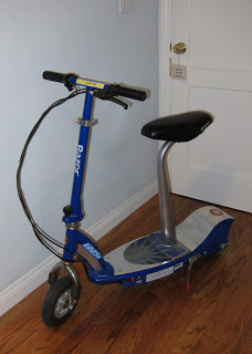
I picked up a used 2-wheeled electric Razor scooter, a model with a seat. It's about a yard long, and can maneuver around in the house reasonably well, but it looks like a toy. Standing on one leg, I can just manage to lift it into the back seat of my car. However, I was concerned about going abroad with it, specifically, about being thrown out of stores if I tried to ride it inside. Would I look like a person with a disability and a legitimate reason to ride into Home Depot? Or would I look like an arrested-adolescent joyrider, worthy of the disapproving sniff, or perhaps even the bum's rush?
I decided it was an advertising problem. It needed the quality that all good advertising needs in the information-overload age: The Fast Read. I needed to convey to store personnel and other shoppers - at first sight - that I wasn't stepping over the line, because I couldn't walk.
I took off one shoe.
(I was wearing white socks that first day, which made it even better.)
When I rolled into OSH, two employees parted before me like they were auditioning for the roll of The Red Sea in the remake of The Ten Commandments. One of them blurted, "Nice!"
(I might add that when I go places with a walker but wearing both shoes, I get some doubtful looks. Which is to say, ineffective advertising can hurt your credibility.)
Effective advertising talks about the one thing that's most worth saying, and finds a way to say it with maximum efficiency. Often, that is visually. Sometimes, it's just a few words. A single ad can't carry the whole sales pitch; it's the all-important foot in the door, where the sales pitch can begin. Pick the right thing to say, and the best way to say it.
Have I seen your email?
A while back, Aaron posted this article about the wrong way to do graphics via email. I was reminded of it on a recent morning, when a retailer sent me a graphics-heavy email.
Now, just as Aaron does, I also have my Outlook set to only download pictures from certain senders. So the email was pretty much blank when I first saw it. But "underneath" the biggest graphic, as alternate text, was a polite little letter, thanking me for joining the retailer's club and welcoming me. It was complete with a "Warm Regards" and the name and title of the president of the company. As it happens, that was the text on the image, too.
Clearly, this company was aware that my first impression of their email might not, in fact, be the smiling model in the picture. They found a low-bandwidth way to greet me and get my attention. And yes, I let Outlook load their graphics. I think the nice note had something to do with that.
Update: I was curious how the alternate text was handled, since I have not seen other vendors break the text into multiple lines. Unfortunately, I wasn't able to get my hands on that nice introductory email. However, the same vendor sent a nice example this morning, so I was able to view the source code and see how it's done.
Here's what I saw before I downloaded the pictures:
And here's the dead-simple source code for the alt text:
Yes, it's that simple: They made their text stand out on the empty page by adding returns to the alternate text. It's surprising how little effort is involved, and even more surprising how seldom it's done. Building product manufacturers really need to steal this easy trick!
And here's what I see when I let the pictures download: Virtually the same text, but with all the images, each backed up with web links, just waiting to take me shopping.
Now, just as Aaron does, I also have my Outlook set to only download pictures from certain senders. So the email was pretty much blank when I first saw it. But "underneath" the biggest graphic, as alternate text, was a polite little letter, thanking me for joining the retailer's club and welcoming me. It was complete with a "Warm Regards" and the name and title of the president of the company. As it happens, that was the text on the image, too.
Clearly, this company was aware that my first impression of their email might not, in fact, be the smiling model in the picture. They found a low-bandwidth way to greet me and get my attention. And yes, I let Outlook load their graphics. I think the nice note had something to do with that.
Update: I was curious how the alternate text was handled, since I have not seen other vendors break the text into multiple lines. Unfortunately, I wasn't able to get my hands on that nice introductory email. However, the same vendor sent a nice example this morning, so I was able to view the source code and see how it's done.
Here's what I saw before I downloaded the pictures:
alt=
"Colorful CARGO Combos
Our best-selling Cool Cotton Utility Pant
meets its match with lightweight new tops.
SHOP THE COLLECTION"
Yes, it's that simple: They made their text stand out on the empty page by adding returns to the alternate text. It's surprising how little effort is involved, and even more surprising how seldom it's done. Building product manufacturers really need to steal this easy trick!
And here's what I see when I let the pictures download: Virtually the same text, but with all the images, each backed up with web links, just waiting to take me shopping.
Drive Your Brand
Applying your brand identification on company vehicles can have high impact. You probably have signage on delivery and service vehicles already, so why not extend it to cars driven by sales reps and other field personnel?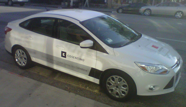 This vehicle provides a case in point. A sales rep had parked it in front of a distributor's office while on a routine call to deliver new samples. Meanwhile, customers passing the car on their way into the office received a brand impression even before they got to the distributor's door.
Throughout the day, the car is probably parked at many locations where it is visible by potential customers: at a designer's office, construction job sites, a CSI or trade association meeting. Since Cosentino promotes several of their brands to consumers, the vehicle even creates brand impressions while stopped at a traffic signal.
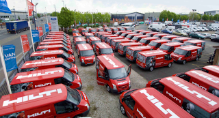
Hilti has been doing this for years. Their distinctively marked fleet of vans are a veritable tool box on wheels at many construction sites. They recently took this a step further, outfitting 55 vans in the UK as field demonstration and training.
Here are some considerations:
1. The visual design has to be consistent with your overall branding.
2. The type of car must support your branding. If you have a green message, for example, consider a hybrid vehicle.
3. Keep the vehicle clean and in good condition.
4. Train your drivers in safety and driving courtesy.
 This vehicle provides a case in point. A sales rep had parked it in front of a distributor's office while on a routine call to deliver new samples. Meanwhile, customers passing the car on their way into the office received a brand impression even before they got to the distributor's door.
Throughout the day, the car is probably parked at many locations where it is visible by potential customers: at a designer's office, construction job sites, a CSI or trade association meeting. Since Cosentino promotes several of their brands to consumers, the vehicle even creates brand impressions while stopped at a traffic signal.
Hilti has been doing this for years. Their distinctively marked fleet of vans are a veritable tool box on wheels at many construction sites. They recently took this a step further, outfitting 55 vans in the UK as field demonstration and training.
Here are some considerations:
1. The visual design has to be consistent with your overall branding.
2. The type of car must support your branding. If you have a green message, for example, consider a hybrid vehicle.
3. Keep the vehicle clean and in good condition.
4. Train your drivers in safety and driving courtesy.


