copywriting

Respect Your Target Audience

I was researching a media-buy for a client, and while perusing a trade magazine's media kit, I came across an impressive statistic: 90% of the people they surveyed read their magazine.  Only about 50% of those same folks read the next most popular magazine in that field.  Sounded great.

Except that I like context.  So I wondered, who exactly were the folks they surveyed?

It turns out it was a survey of their 14,000+ readers.  It turns out only 90% of their readers actually read their magazine, and 94% of their readers receive their magazine.  This leaves me wondering how they define their readers, since (if you consider their own statistics and use the kind of meatball logic they used) there seem to be some "readers" (6%) who neither read nor receive their  magazine.

It did not leave me wondering about the quality of their statistics:  I now believe very little of what they say, not without close scrutiny.  Clearly, they did not intend me to take away the message that their magazine is so boring that 10% of their own readers don't even read it.  Clearly, what they intended was for me not to read the fine print.

Did you really think I wouldn't read the fine print, guys?  Did you really think I'd just look at a big number and take out my checkbook?

Personally, I think it would have been wiser to craft a different headline out of their survey data.  They could have ignored the percentage of their readers read their magazine (that still twists my brain) and focused on the 50% of them who read only that magazine, out of all the publications in their field.  If you're talking to me as a potential advertiser, the idea that the only way to reach those 7000+ people is through your magazine is pretty compelling sales-stuff.  Much more compelling than the admission that your "readership" figure is inflated by 10%.

More to the point, their assumption that I wouldn't question their headline, that I wouldn't read the fine print, insults me.  It insults my intelligence and my competence at buying media.  Insulting your potential customers is hardly ever a good place to start, even if you're a stand-up comedian.

This is a lesson for anyone who designs or approves advertising and sales literature.  If you assume the audience is stupid or lazy, you will pay for it.  It will reflect badly on you, and invite speculation on what other kinds of deception you practice.

The Moral:

Promote if you can,
Hype if you must,

But trying to hustle me
Busts my trust.

Mining Data from Illustrations

Forgive the pun title for this post -- but it this illustrations brings two topics to mind.

1. Mining is a huge market for construction materials! It is frequently overlooked by building product manufacturers more tuned into above ground construction. Mining -- particularly underground mining -- requires concrete and other structural materials, lighting and communications, plumbing and ventilation, tools and equipment, and more.

Most products used underground have to meet severe service conditions including dust, moisture, physical abuse, and fire/explosion resistance. Yet many of our clients have found that, with appropriate product modifications and a disciplined sales and marketing effort, new opportunities can open beneath their feet.

2. A good illustration is an invaluable sales tool. When I had had to learn about the mining business in a hurry, I realized I was in over my head. It began opening to me when I found this illustration, in Shotcrete magazine. Within minutes, I was able to grasp important mine construction concepts and familiarize myself with terminology.
zazzle.com

Of course words are also important in marketing. Sometimes a single phrase can change a person's entire attitude. It happened to me when I saw this phrase:

 I can dig it!


Brand Names and the QWERTY Effect

Type the name of your company or brand.

How many of the characters are typed with the right hand? With the left hand?

According to recent research related to QWERTY keyboards, words typed primarily on with the right hand are associated with greater positivity than are words typed primarily with the left hand.

Published in Psychonomic Bulletin and Review [Kyle Jasmin and Daniel Casasanto, The QWERTY Effect: How typing shapes the meanings of words], the research abstract says:
The QWERTY keyboard mediates communication for millions of language users. Here, we investigated whether differences in the way words are typed correspond to differences in their meanings. Some words are spelled with more letters on the right side of the keyboard and others with more letters on the left. In three experiments, we tested whether asymmetries in the way people interact with keys on the right and left of the keyboard influence their evaluations of the emotional valence of the words. We found the predicted relationship between emotional valence and QWERTY key position across three languages (English, Spanish, and Dutch). Words with more right-side letters were rated as more positive in valence, on average, than words with more left-side letters: the QWERTY effect. This effect was strongest in new words coined after QWERTY was invented and was also found in pseudowords. Although these data are correlational, the discovery of a similar pattern across languages, which was strongest in neologisms, suggests that the QWERTY keyboard is shaping the meanings of words as people filter language through their fingers. Widespread typing introduces a new mechanism by which semantic changes in language can arise.
How does the word "feel"
The research raises many questions that should be explored before we understand the implications of handedness on marketing.

It clearly does not determine the fate of a brand:
  • BASF, a firm with many building product brands, has prospered despite being typed entirely with the left hand.
  • Pulp, a specialty glass manufacturer, cannot attribute its growth exclusively to being typed entirely with the right hand.
It is only in the past few decades, since the widespread acceptance of personal computers, that QWERTY has become such an important form of mediating communication; it is already on the decline among young folks who text with their thumbs, and future technologies may render it obsolete.

Still, the research offers an important reminder:  

When selecting a new corporate or brand name, 
consider how it feels to type. 

Your customers may be typing the name more frequently than they speak it. So the feel of typing the word must be considered along with the sound, look, and meanings associated with it.


Photo by MichaelMaggs, http://en.wikipedia.org/wiki/File:QWERTY_keyboard.jpg, accessed 2012-03-10,  and used under a  Creative Commons Attribution-Share Alike 3.0 Unported license. 


Writing Captions


The Frank Gehry-designed bandshell in Chicago's Millennium Park provides an exciting visual anchor to the end of East Washington Street. Without this caption, however, you might not have recognized the view nor known what I felt about it. (©Michael Chusid 2011)
Writing captions for a magazine article or internet posting is an art. Here are some guidelines: 

Captions Sell the Article: The typical magazine reader flip through an issue to see what captures the eye. If a photo or illustration captures attention, the viewer is then likely to read the caption. If the caption conveys useful or intriguing information, the reader may decide to read the rest of article. 

Captions Summarize Article: Use illustrations and captions to summarize the article. That way, the reader gets useful information -- and you get your point across -- even if the reader does not read the body of the article.

Tell a Story with Captions: A caption should do more than just identify the content of an image. It has the opportunity to tell a story. Even a short caption can explain who, what, when, where, how, and why.

Caption Stands Alone: To the extent practical, a caption should be able to stand alone so the meaning of the photo is understood even before someone reads the article. This means, for example, that abbreviations and jargon should avoided in the caption, or at least succinctly explained.

Search Engines Like Captions: When writing for the internet, captions help search engines find your illustrations.

Editors like Captions: Editors hold the key to getting your message out. So anything you can do to make the editor's job easier will help you get exposure. I found this to be the case when Carolyn Schierhorn, the former editor of Masonry Construction, expressed her appreciation for an article I contributed: “It was a pleasure to receive an article so well-organized and mechanically flawless that almost no editing was required. That you included detailed, beautifully written captions as well is nothing short of miraculous.”

Finally, remember to include copyright notices and other identifying information required for use of the photo or artwork.

Proofread or Perish

Your 2nd grade teacher was right: proofreading your stuff is an absolute must.  Othawise, your risk having you’re busness appear solppy an unresponsible, or worse, even ignorent.

Which stuff am I talking about?  Every single thing you publish.  Your product literature, your ads, your catalogs, your website, even your material safety data sheet (MSDS).

I was recently reading a web page about a coloring product.  The manufacturer was boasting that the product “is available in a full pallet of pigments.”  Which is good, I suppose, if you’re a volume user who buys pigments by the pallet.

But if you’re an artist who likes many color choices, you might prefer a full palette of pigments.

I thought to myself, "the code monkey who put together this website isn’t very literate."  Then I pulled up the technical data sheet for the product, and found the same language there.  It wasn’t that feckless web designer after all, it was the manufacturer!

Another technical data sheet I recently downloaded was simply incomplete.  Two sections were blank except for notes in red, notes asking if this info should be a copied from the sheet for a related product.  Nobody had checked the file that went online.

To be fair, the file was dated several years ago and nobody had ever said a word about it, so we might conclude it wasn’t getting read very much anyway.  Maybe this slip-up hadn’t impacted their reputation heavily.  But it easily could have.

I see typos and grammatical mistakes every day on manufacturer’s websites and in their product literature.  It makes a bad impression on me, but it could have a more serious impact on architectural outreach.  Specifiers depend on the accuracy of product information when they select products for a project.   Do you really want to shake their confidence in your information?

Now that you’ve seen the light and are determined to proofread everything, a hint: it is very difficult for the writer of a piece to proofread it well.  She knows what it should say, which makes it easy for her to miss what is actually printed.  Somebody else should proof it.  Ideally, the writer should read it aloud to somebody else who follows on a printed copy and proofs it.


Proofreading Perils

The ad was already on the presses when I realized it contained several copy errors:

1. "The system is panelized for rapid installation and access above-ceiling access."

2. "Using high speed, equipment, each part is made with precision..."

Can you spot the errors?

Fortunately, with the aid of the ad sales rep and the cooperation of the publisher, the correction was made before the ink was laid down.

But the near miss motivates me to share these proof reading techniques.
  • Use a professional copy editor.
  • Dial phone numbers in the proof to make sure they go where you intended.
  • Don't wait until the last minute. It is amazing how many mistakes are caught after a night's sleep.
So what are the errors in these examples?
1. The word "access" is repeated.
2. There is a carelessly placed comma after "high speed".

The Fifth "C" of Technical Literature

Marketing copy writers love literary flourishes -- a catchy headline, prose that elicits an emotional response, and even poetry. Yet building product literature is also a bastion for straight-forward technical elucidation.

Construction specification writers use a standard they call the "Four Cs" - a document should be:
  • Clear,
  • Concise,
  • Complete,
  • and Correct.
This is a good guideline to use when writing technical literature for building products. I would add, however, that sales collateral also needs a Fifth C:
  • Convincing.
I learned this from Bryan J. Varner, CSI, CCCA, LEED AP, an attorney in Santa Rosa, CA. Bryan says that his arguments in court, even on technical points of law or interpretation of documents, have to be convincing to win over a judge or jury. Similarly, the technical arguments in product literature have to be convincing if they are to win over a skeptical designer, builder, or building owner.

One does not need to resort to hyperbole or slogans to be convincing. Knowing what a designer or builder (or, a worst case scenario, a judge) needs to know, organizing your information thoughtfully, and using easy-to-understand prose can make a very convincing case. Good graphics - photos or technical illustrations that explain a technical point, can also help convince the skeptic.

If your literature does not satisfy these Five Cs - it makes your customer's job more difficult. This then, will require another C:
  • Caffine.
This point is made convincingly by a promotional mug used by Conspectus, an East-Coast construction consultant. I have another C to describe their mug:
  • Cute.
---------------
UPDATE 2012-JUNE-28

To go viral, online marketing also has to be
  • Contagious
if it is to achieve "word of mouse".

T.L.A. can be B.A.D. for B.P.M.

I received an e-mail blast today from a leading building-industry organization and inviting me to an upcoming event:
NFMT’s the Place to be for BIM, FM, WBDG, FMOC, COBie and SPie
A string of initials like this is hardly inviting, and only barely intelligible. As the headline to this post suggests:
Three Letter Acronyms (TLA) can be bad (BAD) for Building Product Manufacturers (BPM).


Tips for more effective email blasts

QUESTION:
One of our clients received a prestigious award recently. As his publicist, we prepared a press release, sent it to the appropriate editors, and posted it on the client's website.

We also wanted to share the good news with his customers, vendors, and other industry contacts. Our plan was to send an email blast to his list of contacts, using Constant Contact as our e-mail marketing service. The email was brief; a photo of our client, two short paragraphs, his logo, and some boilerplate about his firm. For those wanting more information, we included a link to the press release on his website.

Our client asked, "Shouldn't we include the text of the press release in the email?"

REPLY:
We included the full text of the press release in the emails we sent to editors. The typical editor needs to scan the entire press release, and decide on the spot whether or not to use the information. Asking an editor to open a link would slow down the process and decrease the likelihood of the copy being read.

But in this case, our email blast was for relationship-building. There is an inverse relationship between the quantity of copy in an email and the likelihood that someone will read it. The email had to be friendly in tone and to the point. We crafted the email to get the most important branding messages into a single email screen.

More, the invitation to click-through to the press release creates an opportunity for engagement that brings the reader to a greater level of commitment than would simply reading the email. In Constant Contact, we are able to track who clicks through, a feature that gives us clues as to which prospects have the most interest.

Send your marketing questions to michaelchusid@chusid.com

Utilitas, firmatas, et venustas: A Latin lesson for product literature designers

Written about 20 years ago, this essay has stood the test of time and continues to provide insight into building product sales and marketing.
 
I work for an ad agency that has just been hired to design product literature for a building product manufacturer. I have experience creating sales collateral pieces in other industries, but this is the first time I have done work for an architectural product maker. What do I need to know to meet the needs of my client's target audience: designers? - A.C., account executive

Like all sales collateral, building product literature must stimulate awareness of and interest to your firm's products. But unlike product literature used in other fields, building product literature must also provide designers with the information they need to engineer, detail, and specify products. While these objectives appear simple, designing an effective piece of product literature can be as challenging as designing a building.

Vitruvius, a classical Roman architecture critic, wrote that good architecture is characterized by "utilitas, firmatas, et venustas," which means, "utility, firmness, and delight." Like architecture, sales literature has to be useful; it must help someone evaluate and select appropriate materials for a project. It must have firmness; the information provided must be accurate, reliable, complete, and clear. Finally, the literature must also delight the senses by being visually attractive.Aesthetics are especially important if the piece is geared toward architects and designers. As visual thinkers, they are strongly motivated by pictures and the graphic appeal of catalogs. Whenever possible, the most important features and benefits. of a product should be expressed through illustrations or photos. Effective literature uses an architect's visual language for communicating information, such as isometric drawings that show several surfaces at once, poche patterns to differentiate materials, and other drawing techniques.

Text is important, especially in technical data sheets and engineering manuals, but not as effective as visual information. If architects wanted to spend their time reading, they would have gone to law school.

Media jockeys vs. technocrats
Although aesthetics are important, they can receive too much emphasis. "Media jockeys" - graphic designers and other ad agency staff - know how to get readers emotionally attracted to a product, but too often they don't understand the technical data. They may create a beautiful page full of exciting images but product selection data can get lost in advertising hyperbole.

On the other hand, many manufacturers are staffed with technocrats who are so intent on talking about roofing or windows that they forget that the product will be part of an entire building. Other technocrats have great product knowledge but can't write catalog copy that communicates information to someone considering their product for the first time. The best sales literature balances aesthetics and technology.

Literature sells
Most architectural and engineering firms have large libraries of product literature. There are so many products available that no individual can have a comprehensive knowledge of them all If building products are the palette with which designers create, then the more catalogs available, the larger the palette of design options. [Update: Today, every designer has an internet full of product literature, creating a different set of challenges.]

The brochure or catalog is often the manufacturer's only contact with a specifier. If an architect can't find information quickly and easily, the literature has failed to serve its purpose.

Different pieces serve different goals. The type of information that is helpful to a specifier early in the design process is different from the information needed during preparation of construction documents. In the preliminary design phase, general information is needed so product selection decisions can be made quickly. Later, designers need complete technical information and supporting documentation to detail and specify a product. Although general and specific information can be included in the same brochure, it is usually better to create separate pieces of literature for each.

Depending on the type of product, sales literature can contain details, engineering criteria, installation and operation instructions, warranty information, code approvals, and much more. An architect writing specifications for product material usually works from master specifications. But many products are not written up in commercially available master specifications, so manufacturers must provide guide specifications to help the architect.

The word "specifications" has two meanings when marketing building products. Design professionals use it to mean project requirements, and manufacturers use it to refer to product capabilities. Product literature must be written and organized so that specifiers can readily determine where the projects requirements and the product's capabilities overlap.

All the architectural product literature for a product line should be assembled into a three-ring binder. It's easier for architects to find a conspicuous notebook in their crowded offices; individual brochures are easily misplaced in project files. The binder on the architect's shelf also serves as an advertisement for the building product manufacturer.

Keeping up with concerns
The construction industry never stands still. New technologies are developed, building codes change, and manufacturers merge and downsize. Construction marketers should avoid using product literature that is more than five years old.

With changing social concerns, product literature now gives more emphasis to building materials' environmental features. Metric units are becoming more common, to accommodate federal construction policies and international construction. And for many manufacturers, it is also important to translate product literature, especially installation instructions, into Spanish and other languages to accommodate international markets and a changing labor pool.

Electronic media have already made a huge difference in how architects select products. A large number of building product manufacturers are currently evaluating the development of CD-ROM's or Web sites. [Update: Obviously out of date. If I wrote this today, it would talk about BIM and mobile apps.]

During the next decades, the nature of construction information will change even more dramatically. Architects and engineers will shift from creating paper drawings of their buildings to creating computerized building models. Manufacturers will provide computer models of their products to be incorporated into the virtual models. The challenge, however, will not be to put existing product information onto computers, but to use computers to create new relationships between suppliers and specifiers, and to add value by offering better access to information. [Update: This is still the challenge.]

Send us your questions about building product marketing and we will answer them. Send to: michaelchusid@chusid.com.

Previously published in Construction Marketing Today

Taglines

A tagline can be an invaluable part of your brand. A good tagline has to be short, memorable, properly positioned, and on-target to communicate to your prospects and customers.

Here are examples of taglines developed by Chusid Associates:

A Step Up 
Zephyr Metalcraft
The tagline references their primary product, yet also captures the premium quality of their custom made monumental stairways.

The Renaissance of Fine Plasters
TexSton Industries
The use of the term, "renaissance" speaks to the Italian heritage of the firm's venetian plasters, and also to its role in reviving and updating an ancient craft.

Anchors that Hold Fast. Delivered Fast.
Heckmann Building Products
At a glance, a customer knows what the company makes and is reassured of the performance of both the products and the service.

Setting the Standard for Concrete Colors
Davis Colors
Their color cards used to say: Color Standards for Concrete. A minor change casts the firm as the industry leader.

Make Space for Grove Shims
Grove Products, Inc.
Little things on construction job sites are often overlooked, as are the companies that make them. Of course, making space is what shims are all about.

The Difference in Densifiers 
Lythic Solutions
For a brand new company with a new type of densifiers, we needed to emphasize that their products were different than all the established brands.

The Harder, Faster, Better Plaster
CTS Cement Manufacturing - Eisenwall Brand
The rhyme and meter of these product attributes flows like poetry.

Note that some of these taglines have been retired.  Each worked well in its day and helped the client advance to the next level.

Hyperbole vs. Credibility

I received a bit of spam from an individual named Stephen Sands, who made me an offer I could so easily refuse.  His spam began:

“With stronger web placement on the major search engines, your online results could be infinite.” That was all I needed to read to know that I never want to do business with this guy, even if he’s right.   I have a kneejerk reaction to people who toss around promises with the concept “infinite” in them: I figure they’re probably just blowing smoke in the first place.  They’ve got nothing and they’re trying to hype into something, so it’s no worse a lie to hype it into ‘everything.’

Perhaps Stephen Sands actually has a lot to offer, I don’t know; but his opening line made me certain that I’ll never find out.

In an atmosphere of so much competition for communications channels, the temptation to speak ‘louder’ is more intense than ever.  But we also live in an atmosphere of consumerist defensiveness and distrust, where hyperbole often has a negative impact.  That means we need to be both careful and thoughtful about what we claim in ads, sales literature, and other statements about products. 

Careful, because some statements may have legal implications such as an implied warranty. 

Thoughtful, because inflated claims create a credibility problem.

The first job of advertising and sales literature is, certainly, to get attention.  But we all know from grade school that there are both productive and unproductive ways to get attention.  Don’t choose a way that torpedoes the second job, which is to create the foundation for trust.  If the nature of your claims is too good to be true, people won’t believe them.  If the tone you set is over the top, people will  be suspicious.  If the crafting of the message impairs your credibility, it doesn’t matter how good your product is.

If, on the other hand, you can state some significant truths in an interesting manner, readers may trust you long enough to find out more.

Resist the temptation to hype, for truly, it is a fate worse than death.  (Oops!  I mean, resist the temptation to hype because you’ll probably do yourself more harm than good.)

The simplest test is to step back, look at your literature, and ask yourself, “If my competitor were saying this, would I believe it?”

Language Matters

Bad writing is a turn-off to potential customers. An example of very bad writing is in the following message that came in an e-mail from a building product promotion company:
Understanding Quartz Surfacing Material
"Provides 1 AIA/CES HSW LU

This course will better inform the designer on quartz, the history and its relationship with quartz surfacing materials. Quartz has played a unique role in the history of quartz surfacing materials. Its unique properties have made it into an exceptional material in the building industry. This course will help you gain a general understanding of quartz the unique manufacturing process of Quartz surfacing materials. You will also gain insight on the differences between solid surfaces, stone surfaces and quartz surfaces. 
This text cries out for a copy editor.  For example:

The first sentence mentions the relationship of quartz to the history of quartz surfacing. So does the second sentence.  The statement that "Quartz has played a unique role in the history of quartz surfacing materials." is outrageously obvious.

The word "unique" is abused by being used three times in this short paragraph, diminishing the word's impact.

The fourth sentence would benefit from a conjunction so that it would read: "This course will help you gain a general understanding of quartz AND the unique manufacturing process of Quartz surfacing materials."

There are other errors, too. See if you can identify them.

If you are not a skilled writer, find an editor to check your work before sending it out.

Good Grammer "are" Important

Sales literature for the XYZ Skylight Company boosts that the firm offers "consistent quality" and their structural drawings are "professionally reviewed."  Unfortunately, their sales corresponsdence and literature demonstrates neither of these attributes.

A recent cover letter introducing the company contains numerous grammar and spelling errors. For example, the letter's first paragraph states:
"XYZ is a manufacturer of commercial heavy-duty skylights; who delivers and installs."
Maybe they mean that they, "also deliver and install their product," but who knows?
"Our skylight systems is designed based on the principals of pressure equalization, more commonly known as the rain screen principal."
As my junior high school English teacher drilled into me, the, "The principle is that the principal is your pal."

There are similar errors in the company's brochure, too.

Recommendation: Don't rely on your computer's spell checker alone. Have your sales correspondence and literature copy edited by someone with the talent for catching errors. If you don't, your customers will. (Specifiers are especially keen on spotting mistakes of this kind.)

Construction Writers give Award to Chusid Associates

Chusid Associates has received Honorable Mention (second place) in the competition for the Construction Writers Association's Godfrey Award for journalistic excellence in coverage of the construction industry.


The Kneeland “Ned” Godfrey Award is presented for a body of work published in construction industry magazines and journals. It recognizes superior journalistic and writing skills over the course of a year.

Kneeland “Ned” Godfrey, a former editor of Civil Engineering magazine, was an active member of CWA. The association established the Godfrey Award in 1999 to honor his work with CWA and his skills as a journalist.


The winning articles from Chusid Associates include:
The jury, composed of professional journalists, praised Chusid Associates' work, saying it:
  • "Conveys technical material with a clear and approachable style."
  • "Dispels construction myths. These three articles are all excellent educational tools."
  • "Presents new and vital tools of the trade."
  • "Makes ideal use of sidebars and illustrations to highlight significant details."
  • "Provides great case studies; provides but doesn't overly depend on statistics."
  • "Tailors details and style for three different publications. That's impressive! Such an approach respects the intelligence and professionalism of each audience."
Chusid Associates won the Godfrey Award in 2008. The firm has also won the Construction Writers Association's awards for outstanding construction photography and corporate communications.

This year's award will be presented this fall at CWA's annual convention in Chicago.

Greenwash of Week

The following claim is from a building product manufacturer's sales literature:
"The copper used by [Company] is recycled, is recyclable and has a zero life cycle cost, since it is warranted for the life of the wall."
Copper products can contain high percentages of recycled content, provide a long service life, and can be recycled without loss of metallurgical value. However, it is greenwash to claim that this amounts to a zero life cycle cost.

The cost of fabricating, transporting, and installing the product virtually guarantees that the product will have a positive life cycle cost. The only exception I can imagine would be if the raw value of copper escalates so much that the product's scrap value in the future offsets the present value of construction. But I doubt the manufacturer intends to warrant this economic claim.

The sales sheet would have been just as effective if the manufacturer had claimed:

"The copper used by [Company] is recycled, is recyclable and is warranted for the life of the wall."

Communications

The core of marketing is communication. The following quotes inspire me to be a better communicator, and offer fresh ways to think about the dynamic of marketing:


Be sincere; be brief; be seated.
- Franklin D. Roosevelt

I quote others only in order the better to express myself.
- Michel deMontaigne

If I am to speak ten minutes, I need a week for preparation; if fifteen minutes, three days; if half an hour, two days; if an hour, I am ready now.
- Woodrow Wilson

Words are, of course, the most powerful drug used by mankind.
- Rudyard Kipling

The right to be heard does not automatically include the right to be taken seriously.
- Hubert H. Humphrey

Argument is the worst sort of conversation.
- Jonathan Swift

Try the experiment of communicating, with fullness and accuracy, some experience to another, especially if it be somewhat complicated, and you will find your own attitude toward your experience changing.
- John Dewey

In describing today's accelerating changes, the media fire blips of unrelated information at us. Experts bury us under mountains of narrowly specialized monographs. Popular forecasters present lists of unrelated trends, without any model to show us their interconnections or the forces likely to reverse them. As a result, change itself comes to be seen as anarchic, even lunatic.
- Alvin Toffler

Verbosity leads to unclear, inarticulate things.
- Dan Quayle

To effectively communicate, we must realize that we are all different in the way we perceive the world and use this understanding as a guide to our communication with others.
- Tony Robbins

I know that you believe you understand what you think I said, but I'm not sure you realize that what you heard is not what I meant.
- Robert McCloskey

To listen well is as powerful a means of communication and influence as to talk well.
- John Marshall

People change and forget to tell each other.
- Lillian Hellman

Wise men talk because they have something to say; fools, because they have to say something.
- Plato

The problem with communication ... is the illusion that it has been accomplished.
- George Bernard Shaw

Seek first to understand, then to be understood.
- Stephen Covey

Many attempts to communicate are nullified by saying too much.
- Robert Greenleaf

The colossal misunderstanding of our time is the assumption that insight will work with people who are unmotivated to change. Communication does not depend on syntax, or eloquence, or rhetoric, or articulation but on the emotional context in which the message is being heard. People can only hear you when they are moving toward you, and they are not likely to when your words are pursuing them. Even the choices words lose their power when they are used to overpower. Attitudes are the real figures of speech.
- Edwin H. Friedman

When people talk, listen completely. Most people never listen.
- Ernest Hemingway

The newest computer can merely compound, at speed, the oldest problem in the relations between human beings, and in the end the communicator will be confronted with the old problem, of what to say and how to say it.
- Edward R. Murrow

One of the basic causes for all the trouble in the world today is that people talk too much and think too little. They act impulsively without thinking. I always try to think before I talk.
- Margaret Chase Smith

Whenever two good people argue over principles, they are both right.
- Marie von Ebner-Eschenbach

The more elaborate our means of communication, the less we communicate.
- Joseph Priestley

Lying is done with words and also with silence.
- Adrienne Rich

Even if you do learn to speak correct English, whom are you going to speak it to?
- Clarence Darrow


Getting information off the Internet is like taking a drink from a fire hydrant.
- Mitchell Kapor

Communication is the real work of leadership.
- Nitin Nohria 

Truth in Merchandising

The point of purchase display at Home Depot read:

"Adding mouldings is a simple, affordable way to
increase your investment in your kitchen."

That is true. Installing gold-plated faucets would increase the investment even more.
Perhaps they meant to suggest the the home improvement project would increase the "value" of a home, or that mouldings offer a good "return on investment."

The Big Secret: Long Copy Works

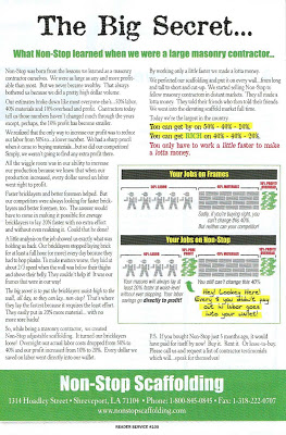
The trend is to use minimal copy in advertising. Rely on a catchy image, a clever headline, and minimal text. But that does not always work for technical products. In fact, the more time you can keep a prospect reading your ad, the more likely he or she will take a positive action.

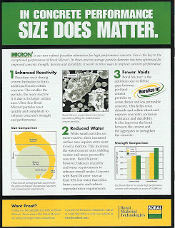
The big secret is that you have to grab the attention of qualified readers, and then never let them go until they understand the benefits of your product. Here is a recent example I admire:
And here is an example I wrote:
Both examples use strong headlines, break the message up into negotiable chunks, and provide graphics to support the pitch. If the reader is interested in productivity (in the first case) or performance (in the second case), he or she will feel compelled to read to the end. They will understand the benefits, and will take action.

To those who still doubt that long copy works in the age of 140 character Twits, I point out that trade magazines still publish features that run from 1200 to 5000 words -- and their subscribers actually read the articles. Length is not a deterrent if the content provides value to the reader.

Ads with Long Copy


There is a common perception that customers won't read advertising with long copy. In my experience, that is not always the case. If you can get prospect interested, they will read extended copy, and the more they read, the more likely they are to buy.

Here is a great case in point. Lots of words, but lots of punch. (click on image to enlarge).