Mobile

QR Codes Go Mainstream

As we have been predicting, QR codes are arriving at some sort of critical mass in the US, and suddenly, you see them everywhere.  Home depot has them on store displays.  They’re on the news.  A headstone maker is putting them on gravestones.

They may look like a maze puzzle to you, but to a smart phone with a (free) QR-reader app, they are a link to information, like a bar code on steroids.

Most current applications simply use the code to link to a website.  At Home Depot, a QR code attached to a display model links you to the Home Depot web page about the product. The gravestone-maker similarly uses the QR code to link to a web page about the deceased.  (The code, etched in stone, will probably outlast the web page.)


It is possible to pack plain text directly into a QR code, too. For example, the really dense QR code depicted here contains the first two paragraphs of this post.

What is it worth to building products manufacturers?  For starters, you could link all your product data and online instruction videos to a QR code right on your product packaging.  A contractor shopping at the distributor’s warehouse could find out everything he needs from the most accurate source: you.  On the jobsite, he could access instant video instruction for workers. You could link him to customer service and technical support just as easily.

You can put a QR on your business card, too, for direct link to your website.

For the time being, while QR codes are still a novelty, they offer tempting guerrilla marketing opportunities.  People will be curious and scan them just to find out what they link to.  Print them on cards and leave a few at big job sites, on Home Depot shelves, at union halls.  You can print them on stickers and find interesting places to attach them: a hard hat, a tool box, a product package.

They won’t be novel for long, though.  Acceptance is moving rapidly.

iPad Apps

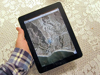
A year since its release, the iPad platform continues to gain broad appeal in the design and building product community.  That big, bright, highly portable screen is replacing both the clipboard and the laptop in many meetings and site visits. Businesses in all corners of industry and commerce have found it advantageous to create apps for the iPhone.

As an electronic catalogue, or purchasing device, its big screen can display architectural materials at a pleasant scale, and explain design problems and concepts with readily accessible illustrations.  The iPad-based catalog not only weighs nothing, so it can be carried anywhere, but it can go conceptually where a hardcopy catalog cannot: interactivity, video displays, and far more.

A thoughtfully designed app can be an effective means of interacting with your customers. We believe that developing such apps, is a great opportunity for building products marketers, and we are working with our clients to take advantage of it.

Signs of Change: Apps 6 times more popular than web on phones

A recent report found that for smartphone users apps are 6 times more popular than web browsers; for tablet (such as the iPad) the difference is less extreme - only a 60/40 split - but still prevalent:
The study, conducted in April 2011, found that on smartphones, apps were used 85% of the time, but the Web browser was used just 15% of the time. On tablets, apps were still popular, but were used just 61% of the time as compared with Web browsing, which was used 39% of the time.
There are two key takeaways on this:

  1. There is a difference in the way smartphones and tablets are used. Not a surprising conclusion, but an important one to bear in mind when developing your mobile strategy.
  2. People prefer dedicated apps for specific, common tasks. Many of the apps that are "more popular" than web surfing and email are, essentially, just narrowly-focused versions of web surfing and email. For example, people prefer using the LinkedIn app to accessing LinkedIn via the web browser, even though both offer ostensibly the same capabilities. 
I can verify the second point through my own experiences. There are several online resources I use very frequently, that currently do not have an app. Accessing them via browser is becoming problematic because it interferes with other, non-reoccurring web use; it is hard to save my in-progress work, for example, because every time I open a new link I loose my place.

This is important to bear in mind when deciding whether to create an app or a mobile website. If you expect customers to use your tools on a regular basis it may be worth creating a dedicated app, even if it is just a specialized web browser. 

Signs of Change: Our changing cameras

Two articles came out this week that underscore how much camera use is changing in the smartphone era.

First, Cisco announced they were discontinuing their Flip line of camcorders. Flip had emerged as the dominant brand name for ultra-portable consumer grade camcorders; the video equivalent of point-and-shoot digital cameras. For about a hundred bucks you could get a camcorder that fit in your pocket and took YouTube-ready video. Most models even have USB adapters for easy charging and one-button uploads to your website of choice.

I got one last summer, and my experience foreshadows Cisco's decision to end the line. It was a great piece of technology - worked well, easy to use, and took high enough quality video for what I needed - but I could not get in the habit of carrying another dedicated piece of technology at all times. If I need a quick spur-of-the-moment video, I use my iPhone. If I need something more sophisticated, I usually have enough advance notice to bring a full camcorder along. Apparently this was the general consensus, and the Flip is joining the list of useful-but-obsolete gadgets.

The second article shows how design firm Artefact is moving in the opposite direction; their goal is to create the first "smart camera".


Working on the "If you can't beat 'em, join 'em" philosophy, Artefact's plan is to make digital cameras more like smartphones. This would introduce such features as wireless handheld viewfinders (that look suspiciously like a smartphone), touchscreen controls, accelerometers, and dedicated apps.

The idea of integrating apps is potentially the most revolutionary. The primary reason most people use their phone instead of a stand-alone camera is the phone makes it easier to edit, organize, and share photos without having to transfer files to a computer first. If my camera had a direct connection to Facebook (or Picasa, or Flicker, or my company's website) and native photo editing software, the smartphone loses that advantage. Now the decision comes down to the photo quality I need; for most consumers the smartphone will be enough, but for professionals and hobbyists the full camera - complete with interchangeable lenses! - wins hands down.

What is notable about both these articles is that the changes they describe were motivated or inspired by smartphone adoption. We are evolving towards increasingly multi-functional, omnipresent, always connected devices. As marketers this should influence whether you create your sales tools as stand alone resources or dedicated smartphone apps.

The Computerized Jobsite

Contractors use metal containers to store their tools on a construction jobsite. This practice has been updated for use with the newest tools on the jobsite, computer and other digital communication tools.

For example, the BIM Kiosk from Modulus Consulting takes the computer out of the job trailer and puts it into the middle of the action. Instead of using large tables stacked high with a printed set of water stained and wind blown plans, the crew can refer directly to digitized versions of all the project documents and access all the resources on the web.

For the building product manufacturer, this is yet more evidence that your product literature, shop drawings, technical data submittals, Material Safety Data Sheets, and other information has to be ready for digital use in the field. For example, it becomes more practical then ever to use video instead of print for installation instructions, and for your customer service and technical advisers to use Skype instead of relying on phone calls.

Another Magazine goes Online Only

Masonry Construction is the latest trade publication to drop its print edition and become online only. This trend has important implications for advertising and PR.

An announcement from its editor explains:
Being nimble and quick on your feet are necessary when business prospects become challenging. As unpleasant as they may be, sometimes changes are necessary. Masonry contractors know this as well as anyone. The publishing environment has been very similar the past couple of years. So we are moving in a different direction and have ceased publishing the print edition of Masonry Construction magazine. But along with this, there is also good news: Masonry Construction will still appear in various electronic formats to keep you up to date about the masonry industry.
No doubt the Great Recession was a factor, but it also reflects changes in how the industry gets its information. Watch for Masonry Construction and others to start publishing for mobile devices that contractors can read in the field.

Mobile Phones - Another View

"I have always wished that my computer would be as easy to use as my telephone. My wish has come true. I no longer know how to use my telephone."

-- Bjarne Stroustrup,
computer scientist

Signs of Change: Android is #1

CNN Money reports that Android is now the most commonly used smartphone operating system in the United States. As the article puts it, "a stunning race to the top from a platform that didn't exist just 27 months ago."

Interestingly, most of this growth seems to have come at the expense of Blackberry, and to a lesser extent Microsoft. Apple's market share has decreased slightly, but remained mostly stable. Smartphone adoption also increased more than 10% last year, so I suspect much of Android's success is coming from new smartphone owners that are buying the newest, shiniest model available, rather than abandoning their old phones.

What does this mean for marketers?
The field is now more tightly packed. Early in 2010, Blackberry had nearly 50% of the smartphone market, with Apple in second place at less than 30%. Now, Apple, Blackberry, and Android are within about 5% of each other. This means it is no longer as viable a strategy to design a system-specific app unless you plan to make versions for each operating system. Even as the new front-runner, an Android-only app will ignore almost 70% of the market. The only exception to this is if you have done enough market research to know that your clients have a strong preference; this is, however, not likely to be the case.

Instead, look at creating web-based apps. Make these more than dedicated mobile sites by including functionality that clients will need while out of their office, and make it easier to treat it as a "dedicated app" by including instructions to install a shortcut on your smartphone's home screen.

Part of Android's success, in my opinion, comes from the same strategy that helped Microsoft beat Apple in the world of PCs: their operating system is not tied to a specific hardware. This means people can shop around more easily for lower price, and  feature sets that better meet their needs. But it also means there is less predictability about what features any given smartphone will offer. Design your web apps and mobile web pages around the most common features (touch screen, some form of keyboard, cameras, etc.), and do not be overly reliant on advanced features that may not be standard (gyroscopes, GPS, video).

It will be interesting to see how the continued emergence of tablets into mobile computing will effect these rankings. Will iPad's popularity and early technological  leadership help Apple retake the lead, or will Android-based tablets win out for the same reasons their phones did?

When tablets meet your website

Many companies are still working on designing a mobile version of their website, but the internet, being a creature that can never sleep or stand still, is already moving on. This time to tablets like Apple's iPad.

With the new technology comes a host of new formatting issues. In many cases your standard website (the "desktop version" as it is now being called), while slightly too big, will work just fine on a tablet; for other websites, or tablets with smaller screens, the mobile version is better, if slightly too small.

As Goldilocks discovered, though, "too big" and "too little" are different from "just right".

Putting a mobile-scale layout onto a tablet's larger screen tends to look ridiculous, as many app designers learned when they tried to export existing iPhone apps directly to the iPad. And using your desktop website might not work if it is designed to take advantage of larger screens, Flash, complex forms, or other hardware or software resources common to a desktop computer that may be lacking on a tablet.

ReadWriteWeb has a good checklist to help you test your existing website on a tablet from John Paul Titlow. First step, get a tablet to work with (in case you're still looking for an excuse). Then, go through these steps (and read the full article for further details):

  1. Test your site on a tablet
  2. Simplify the layout
  3. Ditch the Flash
  4. Check your form fields
  5. Make the user interface app-like
Tellingly, this list is very similar to the checklist for testing a mobile website. Or a desktop website, for that matter, substituting the various browsers for tablets and smartphones. In fact, a couple of these points are becoming standard best practices for all web design: Flash is no longer a good option for site navigation (use it for flavor only), and simpler layouts tend, in almost every case, to work better and make navigation easier. Or, as Titlow puts it: 
If simplicity is important in standard Web design, it's even more critical in designing for the iPad and similar devices. As a rule of thumb, strip out any elements of a page's layout that are not absolutely essential. Consider dropping that three-column layout for two columns. In many cases, cleaning up your site's design for the benefit of tablet browsers will have the added advantage of making the desktop browsing experience better.
Titlow recommends, resources permitting, creating a dedicated tablet-specific website. That's probably somewhat overkill, especially since tablet standards are still developing, and now describe devices ranging in size from "slightly bigger than an iPhone" to "slightly smaller than a laptop", with a wide variety of aspect ratios, browser combinations, and technical capabilities.

More likely your company will be fine making a few modifications to the existing website, and providing tablet-optimized versions of the resources your clients are most likely to need while away from their desks.

App usage overtakes web & voice on smartphones

According to a report released last week by Zokem and GSMA, app usage is the second most common smartphone activity, trailing only messaging.


I have a few issues with these findings, but it still contains a useful message.

I take issue with two points of this report. First, they report usage in terms of "minutes", not "data transfered", "number of uses", or any measure of the utility of the medium. Considering how slowly most people type on smartphones, saying that I spend 30% more time on email than voice calls is not very meaningful.

Also, the dividing lines between these categories are very fuzzy. Many of the apps I use are essentially single-purpose web browsers, and many apps replace functionality I would normally get from a browser as well. So if I can check email using the iPhone's native capabilities (categorized as "Messaging"), from a dedicated app, or via my web browser, how does my time get labeled? What if I make a phone call using an app, such as Skype?

Despite these concerns, there is still an important message. When there are multiple tools available to accomplish a given task, people prefer to use a dedicated app -- especially for tasks they perform on a regular basis.

In other words, if I am looking for information on a company's product, and it is a one time only purchase, I will use my web browser. If I use that company's products regularly, I will use their app.

For marketers, this means there are two situations where you should look at developing an app:

1. There is a specific task related to your product for which you can create a tool (ie, a brick cost estimator app), or

2. You anticipate customers frequently accessing your catalog, guide specs, etc.

If either of those fit your needs, consider creating an app. If not, your app will probably be perceived more as a vanity/marketing project and is less likely to be downloaded or used.

New phones for contractors will increase mobile product research

Construtech reported on a new breed of cell phones that use native work tracking programs as a means to reduce jobsite paperwork and improve archivability.
According to Sonim [Sonim Technologies], its XP family of phones meets extreme-condition metrics called RPS (Rugged Performance Standards). The phone is completely waterproof at depths up to 6.5 feet and can withstand a 6.5-foot drop onto concrete. The device is also scratchproof with a Corning Gorilla Glass lens.
Beyond the impact on jobsite progress tracking, this type of "all-terrain phone" has implications for marketers.

One of the major limits on smartphone use is environmental. These phones are expensive pieces of equipment and many people are reluctant to endanger their smartphone needlessly by exposing it to excessive water, impact, chemicals, or other harsh conditions. (This, by the way, is why I love the OtterBox Defender cases; it saved my phone within the first week I owned it.)  A construction site is full of these hazards, which has greatly limited mobile data use on-site.

If contractors have access to tougher phones, it gives them more opportunity to access online resources from in the field. This could include everything from product research to installation videos to troubleshooting. It also reduces the communication gap with you, for good or ill.

This is not a new story, but it is an important expansion of mobile adoption's rate and scope. Focusing just on the architects that specify your products, and not the contractors that install them, is a major mistake. There is a strong likelihood, in fact, that good contractor-focused mobile tools will be more important in the long run, as the contractor is more likely to be literally in the middle of a situation when information is needed.

It also presents an amazing customer service opportunity. If you develop the right relationship with the contractors using your product, or have the right communication system set up, it becomes easier to troubleshoot on-the-job problems, literally walking them through it step-by-step, while they send video or pictures of each stage and you send the information resources they need to be successful. That type of support will make a lasting positive impression.

Gigabyte-Sized Photos add interest to website

A new digital photographic technique has exciting potential for building product presentations, websites, and social media.

Back in the days of film photography, I would take a dozen or more overlapping photos of a scenic panorama, then cut and paste individual snapshots together to show the entire vista. Software like Photoshop made the job easier as one could "stitch" images together digitally, even automatically. Recent advances take this a step further, making it simple to stitch together dozens of images. The composite files, which can contain gigabytes of information, capture an awesome amount of detail.

For example, this image of the most recent presidential inauguration is made up of 220 separate exposures. The composite image size is 59,783 X 24,658 pixels or 1,474 megapixels.

While an ordinary camera with a wide angle lens could capture the same view, it would not allow the viewer to zoom in to see details like the following:
When viewed online, one can see an amazing amount of visual information. In addition to the president, one can pan and zoom in to see thousands of individuals and details of Washington. For example, these architectural details are just below the dome of the Capitol:
If you have ever used Google Earth or the satellite or street views on Google Maps, you already know how powerful composite images can be. What is new is that an inexpensive device from Gigapan Systems now makes it possible for almost anybody with a digital camera to create gigabyte images that are easy to display and manipulate online. While the "pro" model costs $900, for only $300,
"the GigaPan Epic robotic camera mount makes it fun and easy to capture gigapixel panoramas with most compact digital cameras and works seamlessly with GigaPan Stitch software and GigaPan.com. Compact and lightweight, yet powerful and durable - the GigaPan EPIC is ideal for travel and adventure."
MARKETING USE

Scale: One of the challenges of architecture and engineering is to be able to move between scales. The architect needs to see an entire space or even an entire building within the context of its environment, but also has to understand how a doorknob or window detail fits into the the project. The structural engineer must understand how forces get distributed throughout an entire structure, but must also pay attention to individual joint and anchorage details.

GigaPan allows you to present your products in context. Beneath the overall composite, you can show thumbnails of interesting close-ups. When a thumbnail is clicked, the software zooms from the macro image to the indicated item.

Discovery:
A typical photograph will capture a viewer's attention for a fraction of a second. But a GigaPan invites a viewer to explore, increasing his or her time on your website page where other product-related messages can also be displayed.

Games and Contests:
This may be the ultimate "Where's Waldo" puzzle. A contest can encourage viewers to search an image to find your treasure or clues. Information about your product can be embedded throughout the image. Games like these can be especially attractive to a younger audience that grew up playing online games.

Technical and Quality Control Issues:
The stitching works not only with vast vistas, but also with micro photography. This opens many opportunities for use in technical presentations or for offering evidence of quality control.  Click here for micro images of insects.

Training and Presentations:
Complex products, machines, and systems can be made easier to understand when the viewer can move around and get in close to see parts of interest.

Social Media and Mobile Media:
These giga images can be inserted into websites or e-mail and used in other social media applications. They offer a way to display large images on a small mobile platform like an iPad or smart phone.

Search Engine Optimization:
Images can be posted at the GigaPan website and linked into Google Earth. Undoubtedly, other platforms will embrace the format and they will become integrated into video and photo sharing sites. These sites allow the use of tags and keywords that can help search engines and potential customers find you.

New Advertising and Publishing Format:
I can imagine giga photos as a type of online banner ad that allows one to zoom in or out to get more information. An entire catalog or magazine could be captured in a single giga image.


Final Thoughts:
I am sure I have just touched the surface what will emerge from this technology. Eventually you will be able to use systems like this to transmit real time images, and photos like this will be integrated into building information models (BIM) and virtual reality worlds.

I invite you to contact Chusid Associates to discuss how giga photos can be most useful in your marketing mix.
-----------------
Here are links to a few architectural or construction images from the GigaPan website:
Burj Khalifa Tower
Burning Man Waffle Structure
Frank Gehry's Fred and Ginger Building
Quarry
Leonardo Dialogo (nanotechnology art) - Interior
Union Station, Washington DC - Interior
Building after gutting by fire - forensic record

Another publisher of panoramic giga photos is at www.360cities.net.

Fax speed can propel you to competitive edge

This is an encore of an article Michael Chusid wrote more 20 years ago. We can look back at the introduction of fax technology for clues about how best to adopt newer communication technologies.

It seems as if I now send and receive more letters by facsimile than by U.S. mail. How can I make better use of the fax machine in my sales and marketing program? —T.M.J., vice president, sales and marketing

The phenomenally fast spread of fax machines throughout the industry leaves us wondering how we ever got along without them. Time is money; even overnight delivery of orders, sales directives, or product information can be too slow.

When writing a construction specification recently, I called two competing manufacturers for product information. One responded by overnight delivery. Not only did it cost the firm more than $10 for shipping plus the cost of the printed literature, it also cost the firm the chance to be specified. While I was still waiting for that manufacturer’s information, the second manufacturer responded by fax.

In fact, the fax arrived while I was still on the phone with the firm’s salesperson. We were able to clarify immediately which product met my requirements. By the time the competitor’s overnight package arrived, I had completed that section of the specification.
Increasingly inexpensive, fax machines are now ubiquitous in architectural and engineering offices and are becoming more common in jobsite trailers. For overseas work, fax may be the only way to quickly and reliably send written or graphic information. Many firms have more than one fax line to avoid busy signals.

A “shoe shine and a handshake” once epitomized face-to-face selling. Now we routinely buy over the telephone from faceless voices. But the need for graphic information in design and construction limited the use of telemarketing in building product sales. Salespeople and customers still had to meet to exchange drawings and sketches.

Fax machines have turned the telephone into a more useful tool for building product sales. Along with other new technologies, such as online computer communications, fax machines will enable manufacturers to reduce their field sales forces. A salesperson who could visit only five customers a day before can now contact dozens in the same time frame. Telemarketers should have fax machines on their desks so they can send and receive drawings while on the phone with customers.

Make fax a part of your field sales automation program, too. Salespeople should have access to fax machines wherever they work to avoid delays and to cut down on telephone tag. Salespeople who work out of their homes should have fax machines in their home offices. Those on the road can have a fax in their cars thanks to cellular telephones. Traveling salespeople can use a compact fax modem with a laptop computer to send and receive faxes without lugging around a separate fax machine. They may also want to consider an “electronic mailbox” at which to receive fax transmissions. Electronic mailboxes, offered by online information services such as CompuServe, store fax messages until the recipient can download them from a hotel room or even a pay phone along the highway.

Fax machines will change your marketing communications, as well. While “junk fax” should not be encouraged, you can use the fax judiciously to notify customers of special promotions or buying incentives.

An innovative maker of expansion joint covers recognized that most specifiers did not need complete information on each of the firm’s several hundred designs. The manufacturer also felt that as technology and testing status of its fire rated joint covers changed, printed data sheets would rapidly become obsolete. The solution was to distribute a summary catalog with an offer to fax full, updated information on products of interest. The firm offered a toll-free phone number for inquiries.

To make a program like this even more efficient, consider using the new computer-based fax servers. These systems store product data sheets, test reports, article reprints, and other sales collateral on a hard disk and are linked to your customer database. When your salespeople receive an inquiry, they can call up or enter a customer profile, record the nature of the inquiry, and select appropriate product literature from a menu. The materials can be faxed directly from the computer before the conversation is over. Similar fax fulfillment services can be obtained from outside vendors such as McGraw Hill Inc.’s Product Facs program.

Make sure your product literature is readable by fax machine. Background colors or patterns that look good in print can be illegible when faxed.

Direct mail bounce-back cards and magazine reader service cards should be large enough to feed through a fax machine. Include your fax number and those of your reps on your product literature, advertising, stationery, and any form asking customers to submit information.

When shopping for a fax machine, look at those that can store the phone numbers of your sales offices, distributors, and others you communicate with regularly. A machine that can transmit to pre-programmed routing lists is a valuable time-saver when you have to communicate price or policy changes to many salespeople or customers across the country.

Emerging technologies promise to make the fax an even more important sales and marketing tool. Large format machines can transmit drawings as wide as 24 inches. Machines with high-resolution color capabilities give good reproductions of color photographs or images. Pay-for-use 900 numbers enable trade associations and others to automate fax delivery of standards and other documents they normally charge fees for.


Have a question you'd like us to answer?
Send an email to michaelchusid@chusid.com 

By Michael Chusid
Originally published in Construction Marketing Today, Copyright © 1992

My Life in an iPhone: One Year Later

It seems hard to believe I've only had my iPhone for one year; it's had such an impact on my home and work life that it feels like it's been around for a lot longer. In that year there has also been a significant cultural shift in the way we use mobile, so much so that it's easy to forget only about a third of cell phone users have smartphones.

It is useful, given the predictions of explosive smartphone adoption in the coming year, to look at some of the ways smartphones have changed the game, and try to understand how they can assist a marketing campaign.

First, a word of clarification. From a functionality standpoint, most of the current generation of smartphones are essentially interchangeable. I talk about iPhones a lot because that's what I have - and they are, for now, the most iconic of the latest generation smartphones - but almost everything I say about them applies equally well to Blackberry, Android, Palm, and the rest.

My iPhone isn't actually the first smartphone I've owned. I was one of the first people in Southwestern Michigan to use a Palm Pilot, and as soon as I had the opportunity I upgraded to a Trio. That lasted until I had to change providers, and went to a Windows Mobile device. I stuck with that through a couple incarnations before coming to the iPhone. In some ways, my history as a smartphone user makes it even more remarkable that the iPhone made such an impact; it didn't add any capabilities I didn't already have, so what makes it so much better?

What differentiates the modern generation of smartphones from their predecessors, in my mind, is they were designed with internet connectivity at the core. By contrast, my earlier smartphones felt more like portable business machines with internet capabilities added on as an extra feature, much like early PCs. The difference is that surfing the net, checking email, and downloading new programs is simple and enjoyable, rather than simply possible. I spent more time online in the first month I had an iPhone than in the years I had my older devices.

Several of the smartphone's defining features stem from this internet centrality:

  • Extensibility: It is very easy for smartphones to pick up new abilities, or modify existing ones, on the fly. I experienced this at a conference this summer; I wanted to take a picture of the speaker, and needed a better zoom. After a few minutes in the App Store I had zoom, color correction, and photo cropping capability, plus one-button uploads to Facebook. What does this mean for manufacturers? If you make a useful tool, and make it easy for people to find when they need it, people will use it. 
  • Cross-Media Communication: All of my communication media streams funnel through my smartphone, which means I can easily move a message from voice mail to email to SMS to Twitter. Most people don't do voice communication through PCs, yet, so in this way the smartphone is more versatile than my desktop computer. 
  • Constant Communication: In the same vein, smartphones allow essentially around-the-clock (if you choose to let it) connection to all your key communication media. Everything else only allows communication when you're at your desk, or in the office, or have a table, power outlet, and WiFi for your laptop. Savvy marketers appreciate this because it means instantaneous responses to customer inquiries or complaints.
  • Not Just A Mini Computer: This recent evolution has truly separated the smartphone from the "Pocket PC" mentality; that is to say, the idea your smartphone is the same as your computer with smaller, less powerful bits. Instead of looking like a shrunken Windows desktop, the iPhone interface looks like, well, an iPhone. This paradigm change means the message of the smartphone is starting to emerge. Marketers that continue to design "mobile friendly" content as "like normal digital content, but smaller" are making the same mistake as those that think their website is a digital version of their catalog. 
  • Media Center: Again, this is, ostensibly, something my old smartphones could do, but the iPhone made it an easier, better experience. I can fit my company's complete A/V and photo library on my phone with room to spare - and that's not because we have a small library - and take it with me on sales calls. Professional photographers have told me the color is not right, printed photos are still better, but it's good enough for a sales call or an elevator pitch. 
  • Instant Information: I realized one day that teenagers will never again have to ask, "What are the lyrics to that song?" If the answer exists online, it is accessible on your phone. Which means your answers had better be online, in a mobile-friendly format, or prospects will use your competitor's answers instead.
The really cool advances are coming when people find ways to combine these features to create a unique capability or experience. When, for example, a customer can take a picture, use your app to analyze it and get answers, and get a follow-up phone call from a sales rep while they are still in the situation where they need the information. 

Bottom line, the opportunity smartphones provide marketers is to be closer to their customers. You can be a pocket-sized "virtual consultant" for your clients when they go into sales meetings or design sessions. That increases your value to them, which produces more sales.

Websites without Phone Numbers

If you want to do business, make it easy for your customers or prospects to find you.

That would seem to be obvious. Yet many building product websites do not list phone numbers or email contacts.

Case in point:  www.BoralBrick.com.  Boral is one of the largest brick manufacturers in North America. Yet their website does not list a phone number or email address on the front page or any of the customary, obvious locations. Even their Contact Us page omits contact info. It has just a form that I can use to send them an email -- if I am willing to give them all my contact info. Some calls are too urgent to wait until someone responds via email, and their form does not allow me to attach documents, copy others, or get a copy for my records.

While it is probably just a oversight, they even omit their phone number where they intended it to be. Their Privacy Policy page provides corporate boilerplate saying:
How To Contact Us
Should you have other questions or concerns about these privacy policies, please call us at [phone number] or send us an email at [email address].
After several minutes of searching, I did find their phone number -- at the bottom of a press release. But how many potential customers would have given up the search and moved on to another supplier's site?

For reference, Boral Brick can be reached at 800-5-BORAL-5.


------------
By the way, spelling out phone numbers is cute and can be memorable, but it does not work anymore. Few mobile phones have letters associated with numerals on the "dial" pad anymore.

Continuing Education on my iPod? Yes, please!

I love podcasts. Living in LA there's lots of time stuck in traffic, and podcasts become drivetime educational opportunities, which is why I am excited to see The Continuing Architect - an online continuing education course catalog from the publishers of Architectural Products - now offers streaming and downloads for iPad and other mobile devices.

There are a lot of online course catalogs for the A/E/C community; I haven't had enough experience with all of them to endorse the course quality, selection, or ease of use, but I predict The Continuing Architect's mobile-compatibility will be a winning edge. Or at least spur the others to introduce similar capabilities.

Tim Shea, publisher of Architectural Products, was telling me about The Continuing Architect's features when he came through town last month. Based on what he said, and my experience browsing around the site, this site is angling to be the most useful for marketers. Effort was made to make it as easy as possible to link to a course directly from your website (or a QR Code on your business card...) and the interface is clean and easy to navigate.

It's great to see this convergence of two trends - mobile computing and continuing education. It means architects get the content they need in the format they want. McGraw-Hill and AEC Daily currently have the biggest audience, but The Continuing Architect is an upstart worth watching!

Signs of Change: "Shocking" Text Message Habits

New research from Nielsen shows that while teens 13-17 are still the most frequent texters, college students (18-24) are averaging 3 texts per hour. The "shocking" part is that they do this during classes.

I know, right? College students not paying attention to a lecture; who could have known? 

What does this mean to you?

The simple message is that 78% of your next generation of customers use text messages, and a growing number of them consider texting easier and faster than voice calls.
The advantage of giving out your cell phone number is it offers flexibility for clients to call or text you, but have you ever invited a client or prospect to text you with their questions? Have you ever responded via text?

In the business environment it is tempting to split immediate customer communications into voice or email, but consider that something you could respond to with a one-line email could probably be handled as well via text message. Is there an advantage to doing so? Maybe; it's one step easier for me to read a text message than an email on my phone; however, if it's your client's preferred method of communication, that becomes a huge advantage. 

Not everyone has text messages in their cellular plans, or feels comfortable using them, so I would ask before assuming you can communicate with a client this way. Make a note of their preference in your contact database, and start experimenting with using this communication medium to develop your comfort using it in a business environment. 

And please, resist the urge to use Twitter-speak in any of your business communications. I know there's a limited character count, but it just looks silly.

[h/t ReadWriteWeb]

Privacy Issues with QR Codes

My basic philosophy of internet privacy is this: if you put it on the internet, it's not private. Period. Doesn't matter how many passwords, firewalls, or encryption keys you put in front of it, if someone somewhere can see it on their screen - including you - it can become front page news on Google tomorrow. As new internet technologies break out, it is important to remember this maxim applies to them as well. We may not understand what the privacy risks are with some new medium, but rest assured they exist; be careful about what you post, and as new privacy implications are discovered act accordingly.

Which is why this post on QR Code Magazine is a must-read; it highlights potential privacy risks in proprietary QR readers that most users may be unaware of:

When you download a scanning app that can resolve proprietary 2d codes...it will contain a unique identifier. Every time you scan a code the app will send that unique identifier to be logged and passed on to whoever was allocated the code.
As with much of this type of data collection there does not seem to be an overt connection with your personal identity (it won't be linked to your name or home address), but it will create a unique profile based on all QR codes scanned by your phone or other device. There is, of course, buried in the user agreement for these scanners, a line granting the company the right to sell and use your data as they see fit.

Roger points out that all QR codes send some form of identifying data - every visit to any webpage does - but for non-proprietary codes that data is non-unique and mainly used to help display the page correctly. My computer, for example, comes up as a laptop running WindowsXP browsing the web with Firefox 3.6 and displaying pages in English; not enough to build a strong profile around, in other words.

Implications for Marketers

The implications are two-fold: your prospects might block your message while protecting their own privacy, and there could be backlash if they later find out you helped "steal" their data.

First, many net citizens, and especially early adopters, are getting good at using privacy protection techniques, combining software and behavior. One way or another, this means they may be unwilling or unable to use your QR codes if they contain proprietary formats known to create and sell these unique user profiles.

Second, if it later comes to light that the QR codes they've been using for years - yours - have been building this profile all along there is potential for a major backlash. This is the type of thing that got Facebook into trouble this year; people started learning that their personal data was not as private as they expected, and they got pissed. It has not hurt Facebook's overall market position, but it generated tons of bad PR.

The indirect, proprietary codes are enticing to many companies because they come with strong campaign tracking and management tools. I understand that appeal; paying for a pre-made service can be much more attractive than trying to design your own system for free. Weigh in these hidden costs, though; what will the user experience be with the proprietary service? Are they getting a better experience in exchange for your money, or just the same service with more annoyances?

App to Find People at Trade Shows

Nowadays, there seems to be a mobile phone app for everything.  The latest app I've come across seems to have a great implication for trade shows -- Fast Society.

Fast Society allows people at large chaotic events, such as trade shows, to communicate their exact locations and schedules with their team.  Of course you'd have to build your team first.  I'd suggest messaging a few contacts/prospects before a trade show, sending them your team information, and then connecting with them while you're there.

TrendCentral.com describes Fast Society:
"Anyone who has attempted to organize a group outing knows how frustrating coordinating schedules can be, not to mention the difficulty of actually sticking together in a crowded public space once they’re hangin’. Enter Fast Society, a mobile chatroom-slash-friend locator that could change people’s (social) lives. The free app allows its users to group text, conference call, and share locations among groups of friends (known as “teams”) for specified time periods. (Mashable recommended it for concerts, but it can be used for any unruly excursion.) Although there are similar apps on the market, like GroupMe, Fast Society is emerging, um, fast as the category leader."

Your web site's first impression

Your web site's first impression just got more important than ever. Google's Instant Preview allows users to see a small screen preview of your web site before they click through. Take a look at copyblogger's post on the subject:
With Instant Preview, potential visitors are going to make a judgment about whether or not to visit your site without even reading the content. It’s too small to see in the pop up window. They’re going to decide based purely on — (drumroll, please) — design.

In building product marketing, the visual impact of your site was always important. But now that architects can leaf through a pile of online "brochures" and only open the most attractive ones, the pressure is on. In the preview, designers can see the shapes and colors of your site, the headlines, and the visual style of your text, but none of the small words. Even on my 24" monitor, the preview is smaller than the screen of my iPhone. And sure enough, the site I previewed had a Flash-based image, front and center, that shows up in the preview as a gray box. Give Google Instant Preview a try, and see for yourself how your site appears.


The good news? Changes you make to create a better Instant Preview are also smart changes that improve the full-size impact of your site and the mobile view of your site. And the other good news? Chusid Associates can help you choose which elements to emphasize, to give your site the visual impact to survive the preview.