Fun

Dihydrogen Monoxide: Hazard?

Dihydrogen monoxide (DHMO) is colorless, odorless, tasteless, and kills thousands of people every year. Most of these deaths are caused by accidental inhalation of DHMO. Prolonged exposure to its solid form causes severe tissue damage. Symptoms of DHMO ingestion can include excessive sweating and urination, and possibly a bloated feeling, nausea, vomiting and body electrolyte imbalance. For those who have become dependent, DHMO withdrawal means certain death.

Dihydrogen monoxide:
- is the major component of acid rain
- contributes to the "greenhouse effect"
- it can cause severe burns in its gaseous state
- contributes to erosion
- accelerates corrosion and rusting of many metals
- may cause electrical failures and decreased effectiveness of automobile brakes
- has been found in tumors of terminal cancer patients

Despite the dangers, dihydrogen monoxide is often used:
- as an industrial solvent and coolant.
- as an ingredient in concrete.
- in nuclear power plants.
- in the production of styrofoam.
- as a fire retardant.
- in many forms of cruel animal research.
- as an additive in certain "junk-foods" and other food products.

Companies dump waste DHMO into rivers and the ocean, and nothing can be done to stop them because this practice is still legal.

The American government has refused to ban the production, distribution, or use of this damaging chemical due to its "importance to the economic health of this nation." In fact, the navy and other military organizations are conducting experiments with DHMO, and designing multi-billion dollar devices to control and utilize it during warfare situations. Hundreds of military research facilities receive tons of it through a highly sophisticated underground distribution network. Many store large quantities for later use.

Chemical Formula: H2O.

Other Names: Product also known as water, ice, and steam.


Material Safety Data Sheets (MSDS) and other disclosures of potential product hazards are vital to protecting public and environmental health, safety, and welfare. Still, the testing, documentation, and record-keeping requirements can be an onerous burden. For anyone who has ever felt rankled in this regard, I hope the preceding warning brings a smile to your face.

Based on Petition to Ban Dihydrogen Monoxide at www.petitiononline.com/h2o/petition.html.

Flying Concrete

In the 90's there was an underground comic called Concrete. The character got his name because, like concrete, he was strong, tough, heavy, and unattractive.  This has traditionally been the common conception of concrete, which is why it's been so amazing to see concrete change over the past decade into a decorative, fluid, lightweight medium.

Flying Concrete demonstrates how far concrete has come. The site is run by Steve Kornher, a designer/builder currently working in Mexico, who loves pushing the boundaries of what he can do with concrete.
Concrete is a plastic medium and has incredible potential for creating fluid, sculptural forms. I will admit that some of the dullest structures around are made of concrete but dullness isn't a limitation inherent in the material. As the accompanying photographs demonstrate, the builder's imagination may be the greatest limitation of its use as a sculptural medium.
His site is worth checking out, especially the Projects section. Many of the slideshows contain a good deal of process shots in addition to completed projects; watching him develop the forms and structures is fascinating.

Steve points out on his site that he is not a registered architect, and needs to work with one on all his projects. I wonder how much of his creativity stems from that lack of certification. Is it his lack of formal training that allows him to visualize novel forms, or is he just getting clients more willing to take the risks?

As of this writing, the site seems to have gone dormant; the last update was in 2010, and no new workshops have been scheduled in over a year. Hopefully that just means he's been too busy working to post new material, and we will see more soon.

Impressive Animal Architecture

As a treat to start your weekend, check out Cracked's list of The 7 Most Impressive Examples of Animal Architecture.

These reminded me of Janine Benyus's book on Biomimicry: Innovation Inspired by Nature. It's amazing how many issues we as an industry still struggle with - such as energy efficient air conditioning - that these animals solved millenia ago, without even using BIM!

A handy visual guide to modern architecture

To help start your week off right, enjoy this nice infographic summarizing the styles of several well-known modern architects:

Modern Architecture 101

16 Fun Things To Do At Trade Shows

To get you in the mood for World of Concrete, here's a fun list from Skyline:

  1. Look up on the show city’s Visitors and Convention Bureau website all the fun activities you can do outside of show hours (try indoor skydiving in Las Vegas, it’s a blast).
  2. Go to dinner with the funniest sales person who is staffing the booth. Repeat nightly.
  3. Count how many trade show booths you can walk by before a booth staffer tries to engage you.
  4. Visit your competitors at the show and ask them what they don’t do well. Watch ’em squirm.
  5. When you meet attendees in your booth, stop treating them like numbers on the sales chart, and treat them instead as if they are going to be your new best friend.
  6. Drinking game: Walk down the trade show aisle carrying a bottle of water (unless you are at a European show). Whenever a booth staffer says, “Hi! How are you?” you reply, “Fine,” take a swig, and keep walking.
  7. Pick up giveaways from your fellow exhibitors, and then give them back … to different exhibitors.
  8. Go to lunch with the second-funniest sales person who is staffing the booth. Repeat daily.
  9. Look up old friends you haven’t seen in ages that live in the show city, via Facebook, LinkedIn or other social media, and relive the glory days.
  10. Create a fun activity in your booth that helps get your message across to visitors.
  11. Walk into an island trade show exhibit and play with their products. Count how many seconds (minutes?) it takes for a booth staffer to engage you.
  12. Smile at your booth visitors, even if they aren’t. Pretty soon you’ll both be smiling.
  13. Have a contest with fellow staffers to see who can work specific obscure words into conversation when talking with booth visitors, such as “corollary,” “obtuse,” and “Sandra Day O’Connor.”
  14. Walk the show with a colleague. Have a bet on who can count the most: booth staffers sitting down or booth staffers on the phone. A third friend can count booth staffers eating or drinking. (This is like counting states on license plates when on a long drive.) Loser buys lunch.
  15. Have another bet: Before you hit the show floor, bet which trendy new color will be on the trade show displays. Then count the exhibits with that color. Loser buys drinks … that are the color they picked.
  16. Thank everyone who has helped you with the show – your booth staffers, your exhibit house, your manager, the show owner, the show labor, and especially your booth visitors. You’d be surprised how much fun that can be.

Use social media to avoid disrupting your prospect's day

Jason Fried is the founder of 37signals, the company behind Basecamp and other popular online collaboration tools. He recently gave a great talk at TED about why work doesn't actually happen at work, citing the tendency of M&M - Meetings & Managers - to disrupt productivity. It's full of quotable lines ("It's only a one-hour meeting if only one person's there. If ten people are there it's a ten-hour meeting."), really wild ideas (Casual Friday? Meet No-Talking Thursday), and great insights into why these interruptions make it so hard to get stuff done.

As I watched, it occurred to me that Manufacturer's Reps and Marketers are in danger of becoming the next M; when you visit a busy architect at a major firm, are they glad for the chance to take a break or slightly frustrated by the interruption to their day? Ideally they are happy to see you, because they have a good relationship with you and know you bring valuable information, but even a pleasant phone call can disrupt workflow. If prospects start to see you as a disruption, are you going to get that sale?

Of course not. So how do you avoid that?

One of Jason's recommendations is to use "passive" tools like email and IM (instant messaging) instead of meetings; the technology is still disruptive, but while face-to-face collaboration is an immediate distraction, email can be slotted into a slow part of your day. This is why social media, including email, is an important tool for manufacturers: it lets you continue building the relationship while fitting into their schedule.

Jason calls social media the modern version of a cigarette break; a couple decades ago no one had a problem with people stepping out for a smoke a few times a day, but now checking Facebook for 15 minutes is a productivity problem? Of course it's not. In fact, studies are finding that letting employees check social networking sites improves overall productivity.

This gives us an opportunity. A well-designed social media campaign can become part of your prospects' "brain candy" instead of - in addition to - building the relationship by providing education and top-quality technical information.

Here's a strong but simple example. SkimStone is a cementitious microtoping with strong decorative applicaitons. Their Facebook page hosts an active community where people post pictures of recent (amazing!) projects, comment on those pictures, ask technical questions, and discuss future projects they have in mind. In other words, it's exactly the kind of place a designer looking for a 15 minute "mental health break" would come to virtually hang out for a few minutes.

Then they share the page with their friends and coworkers, who also come check it out. Or find a great picture and send it around the office.

Without leaving your office, without disrupting your prospect's day, you just put your product in front of an entire office of designers with a personal recommendation from their friend saying, "This product is amazing!"

You can't buy publicity like that.

Metric vs Imperial

Something fun to help you through your Wednesday:


On a serious note, this is a reminder that it's becoming increasingly important to provide all measurements in Imperial and Metric, especially if you do business internationally (Canada counts!) or plan to in the future.

Signs of Change: Sony Retires the Walkman

Please remove your headphones and join me in a moment of Volume Down to mark the passing of the cassette tape-playing Walkman. While the Walkman was officially ejected from Sony's line on October 25th, the stop button was pressed on production back in April of this year.

What was most striking to me about this announcement was that I didn't even realize the cassette-based Walkman was even still in production! Once I got my first CD player, the cassette collection I had spent so much time building quickly started gathering dust, and I can probably count the number of music CDs I have purchased in the past decade on both hands. The only cassette player I still own is in my car; I only ever use it to plug in my iPod adapter. 

Walkman once defined the category now ruled by iPod. Digital music aficionados highlight the benefit of "infinite adaptability" of digital music, meaning that if (when) MP3 is dethroned as the file of choice, converting your entire music library will be a relatively  simple software solution, as opposed to the cost and effort of replacing cassettes with CDs. There is a certain truth to that, but also a certain naivete; CDs were also heralded as the ultimate eternal medium, but now laptops are being sold without any optical drives at all!

What lesson does this teach building product marketers? 

Do not confuse the medium of your sales literature with its content or its structure. We are seeing the death throes of the architectural binder, and the packed-with-literature CD and even flash drive will eventually follow. The best philosophy now is flexibility. Everything in your binder or on your CD should also be available on your webpage, ideally as text and graphics as well as PDF, and as new formats become widely used consider the best way to convert your documents to reach these new users while not abandoning the existing ones.

This is not a perfect solution, nor is it intended to be. It is more of a mindset; change will occur, and to maximize return on the investment you should be making in your sales literature, your media choices need to change too. 

Classical Branding

I have a theory that every important concept can be explained through sword fighting. When I started working in this industry I was able to understand how new building products worked by comparing them to what I know about sword construction, and most swordplay technique can be understood from a marketing perspective as "advanced compliance gaining strategies". So I was very happy when I realized this weekend that fencing could help explain another aspect of marketing: logo design.

Corporate branding has been in the news recently as a couple well-known national brands changed their logos. Meanwhile, a recent episode of Duct Tape Marketing's Small Business Marketing Podcast focused on "Color As Branding Element". The origin of modern corporate branding through logos and colors has its origins in the classical tradition of heraldic coats of arms, which brings us back to fencing.

The group I currently fence with, the Society for Creative Anachronisms, delves into all parts of medieval culture, including, notably, heraldry. Most anyone who is in the SCA long enough will eventually have to design their own device, and must struggle with creating something that reflects their personality interests while being aesthetically pleasing - or at least interesting - enough that they are willing to be seen wearing it in public. There are Heralds available to help people develop their devices, and it is interesting how often their advice lines up with modern theories on corporate branding:

  • "The heraldic device originated in war...you had to decide within seconds whether someone approaching was friend or enemy...Ideally, the result is simple, memorable, and easily identified."
    The primary use of modern logos is this type of identification. Hopefully people have more than a split-second to make decisions about your product on a job site, but this is still a useful guideline for evaluating a logo: will people be able to quickly and easily identify your product in the chaos of the job site?
  • "Since a device identified the man who displayed it, it was very important that no two men have the same device." This is the reason so many generic colas try so hard to look like Coke, and why Coke works so hard to dissuade them. Your logo loses much of its value if it is easily confused with another company's, especially if you both focus on similar products or industry sectors. A major part of logo design consists of studying the existing logo landscape, and making sure that new design you're so excited about will truly stand out as original.
  • "Good devices have as few charges [shapes or objects] and colors as possible. The best devices fill the...shield with one or three identical charges, and use only two colors." This gets back to the issue of simplicity. Imagine yourself at a trade show, trying to give a prospect directions to your booth. "Look for the big, red square" is a much easier direction than something involving several shapes and many colors. The major exception to this involves companies that want to incorporate full color spectrums into their design, but at that point "rainbow" or "multicolor" becomes the color descriptor.
  • "Good devices make it easy to identify each charge...And all charges are drawn as large as possible while still fitting in the space available." If people cannot easily understand what the shape is on your logo, they will create their own interpretation. And theirs may not be one you like. It is very important at this stage, and throughout the process really, to show your design to someone else. Don't tell them what it is; let them try to figure it out. If they get it wrong, redesign the logo.
  • "Good devices have high contrast between their parts. As much as possible, light charges (white, silver, yellow, or gold) are put on dark fields (red, green, blue, purple, or black), and vice versa. (Traffic and street signs all do this, to be as easy as possible to read.)" Again, this also makes it easier to describe the logo, and for others to recognize it. Our logo has charges and text against a white background for contrast, but violates this guideline slightly by incorporating two shades of blue. But for us that's ok; we are fine with people identifying our colors as "blue and red"; the extra color does not hinder recognition.
One of my Herald friends also recommends the "Other Side of the Room Test": can someone recognize an 8.5x11" print-out of your logo from across the room? Similarly, how does it look online? On a mobile phone? Printed in black and white? We rely so much on color as an identifier, but the logo still needs to hold up without it.

Simple. Identifiable. Unique. The characteristics of a good heraldic device and a good corporate logo. Once again, a difficult business concept is explained through swordplay.

Open During Construction; Please Pardon Our Dust

Readership has grown enough that we've had to remodel our blog for clarity and to handle the traffic. As long as we're at it, we plan to finish the basement, install a solar-powered water heater, and make some exterior improvements. We hope you enjoy the new look and functionality; if you do find any bugs, please bring them to my attention.

Thanks for reading!

An Important Reminder

Here is a reminder that it is important to address a prospect in a language the prospect understands:


Building product sales is especially challenging because your prospects may have such varied interests: performance, sustainability, aesthetics, availability, constructability, cost, and more.

Visualizing Carbon Impact

Many of us struggle to find ways to communicate the relative importance of our environmental message. This brick produces 85% less carbon dioxide during manufacture; great! Is that a lot? How big an impact does that make?

Information is Beautiful
has a great example today of one way to do this. We've heard a lot the past few days about Iceland's volcanic activity and the impact of more than 7,000 tons of ash on air travel, health, and marathon runners. Sounds like a massive environmental disaster! Then McCandless and Bartels showed us this:


Suddenly I have perspective, and a good argument to reduce air travel.

How do you tell your story visually? Give us links to your infographics in the comments.


iPad Apps: Channel to Reach Designers


The arrival of the Apple iPad on April 3 was followed, just 5 days later, by the arrival of the first BIM app for the iPad. Structural Engineering & Design reports that goBIM is the first iPad-compatible app to enable users to navigate models and review data tagged to model elements (such as materials, manufacturer information and volumetric information). www.gostructural.com/news-ipad_to_unlock_power_of_new_app_for_building_designers-435.html.


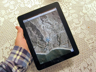
Apple's iPad has a large, bright, colorful screen that is likely to be very useful to design professionals.

This early entry of A/E tools to the iPad platform is, perhaps, an indication that the device will have broad appeal in the design community.  That big, bright, highly portable screen could be replacing both the clipboard and the laptop in many meetings and site visits.

Businesses in all corners of industry and commerce have found it advantageous to create apps for the iPhone.  Some of these apps are simply brand promoters, such as the brilliant sponsoring by Charmin toilet paper of a free app that locates public restrooms in the user’s immediate vicinity.  Some serve a function directly related to doing business, such as a dedicated insurance quote app for a particular insurance carrier’s agents.  Some serve as an electronic catalogue, or a purchasing device.  This last idea lends itself far better to the big-screen iPad, where it can display architectural materials at a pleasant scale, and explain design problems and concepts with readily accessible illustrations.  The iPad-based catalogue not only weighs nothing, so it can be carried anywhere, but it can go conceptually where a hardcopy catalogue cannot: interactivity, video displays, and far more.

Apps have powered the mushroom-like growth of the iPhone, and can be expected to have a big effect on the popularity of its larger sibling, the iPad.  The device will in all likelihood attract design professionals, which will attract developers to make apps for those designers to buy.  This means the device will probably be in their hands in large numbers by this time next year. Put the pieces together, and it suggests that iPad apps could be a golden road to the hearts and minds of architects and engineers.  

A thoughtfully designed app that is both useful and free will always be popular. We believe that developing such apps, to give away from promotional purposes, is a great opportunity for building products marketers, and we are working with our clients to take advantage of it.


SixthSense and the Future of Construction

Whatever you are doing, STOP.

Take three minutes to see the future of computing. What will this mean to the way architects, engineers, builders, and the public select, purchase, and use your building products?

What will it mean to the future of your company and how you do business.

This is not something over the horizon; this moves the horizon.

Pranav Mistry: The thrilling potential of SixthSense technology | Video on TED.com


"Farchitecture" and Promotion

Here's a great promotional idea you can use to attract the attention of architects:

As we are in the business of architectural consulting and marketing innovative building products, I could not help but mention the company CoolHaus and their coined term: "farchitecture".

CoolHaus is a Los Angeles-based company that has combined food + architecture to create a concept they call "farchitecture."
They have used their architectural design skills to turn an old postal van into a food truck where they sell their building-shaped ice cream sandwiches that are named after famous architects. They are representing their green efforts through the use of edible wrappers (anyone who's ever eaten an ice cream sandwich will appreciate this idea) and are looking into creating other edible utensils to reduce waste. To find out more about "farchitecture" click here.

Sponsor them in your booth at the next architectural tradeshow, and see all the attention you get.