Human communication is increasingly visually driven. Digital cameras, shooting still and video, are everywhere, and everyone knows how to use them, so visual instructions and explanations are becoming ubiquitous.
Shooting a video to explain an idea or process is tempting, because everyone seems to want visual communication. However, a video of someone reading an explanation isn't really "visual." It's just Text in Video clothing. Truly visual communication is a a very different animal.
Sometimes, a good old-fashioned graphic, or a clever, new-fangled interactive graphic, can do the job very nicely, where a video might be quite a challenge to execute effectively. Here are two examples that each tackle the concept of giving scale to large numbers and sizes.
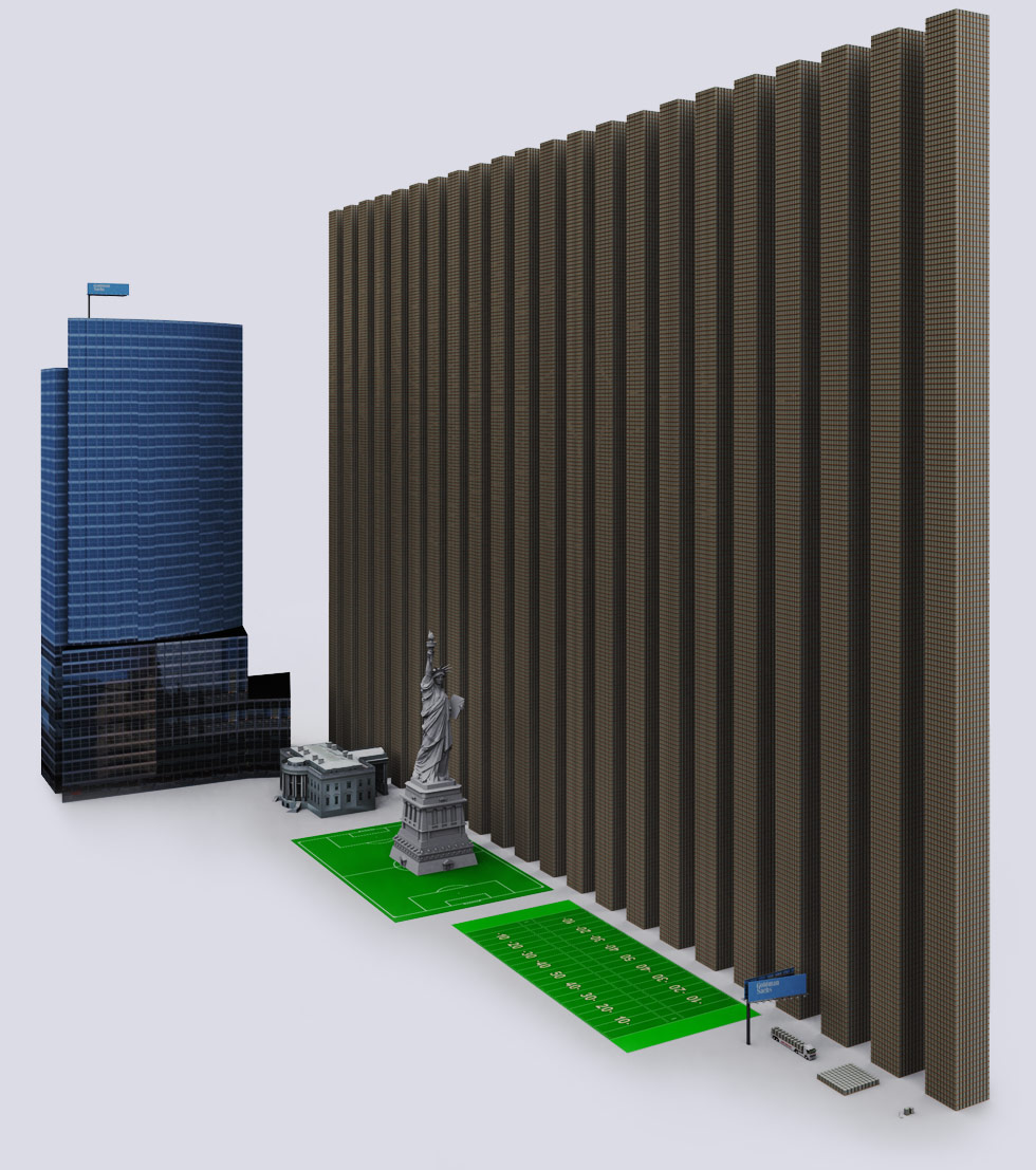
This page uses static graphics to great advantage, depicting the 9 big banks' derivative exposure in $1 Trillion towers of palletized $100 bills. (You might want to read the entire page, too, for some interesting info on world economics.)
http://demonocracy.info/infographics/usa/derivatives/bank_exposure.html
This page uses flash to let you "scroll dimensionally" in and out of size, from the size of quantum strings up to the estimated diameter of the universe (as distinct from the smaller diameter of the "known universe").
http://htwins.net/scale2/scale2.swf?bordercolor=white
Both illustrate the concept of scale very effectively. They also offer the viewer the ability to dwell over them as needed to comprehend what they are saying, a measure of control that videos distinctly lack (as in, "Yeah, I already know that, move on to the next thing.").
They also illustrate the value that a good graphics designer can have to enhance your marketing efforts.
Shooting a video to explain an idea or process is tempting, because everyone seems to want visual communication. However, a video of someone reading an explanation isn't really "visual." It's just Text in Video clothing. Truly visual communication is a a very different animal.
Sometimes, a good old-fashioned graphic, or a clever, new-fangled interactive graphic, can do the job very nicely, where a video might be quite a challenge to execute effectively. Here are two examples that each tackle the concept of giving scale to large numbers and sizes.
 |
| Goldman Sachs' office building, next to towers of palletized $100 bills representing Goldman's derivative exposure. Each tower is $1 Trillion ($1,000,000,000,000). |
http://demonocracy.info/infographics/usa/derivatives/bank_exposure.html
This page uses flash to let you "scroll dimensionally" in and out of size, from the size of quantum strings up to the estimated diameter of the universe (as distinct from the smaller diameter of the "known universe").
http://htwins.net/scale2/scale2.swf?bordercolor=white
Both illustrate the concept of scale very effectively. They also offer the viewer the ability to dwell over them as needed to comprehend what they are saying, a measure of control that videos distinctly lack (as in, "Yeah, I already know that, move on to the next thing.").
They also illustrate the value that a good graphics designer can have to enhance your marketing efforts.
