Infographics

Mining Data from Illustrations

Forgive the pun title for this post -- but it this illustrations brings two topics to mind.

1. Mining is a huge market for construction materials! It is frequently overlooked by building product manufacturers more tuned into above ground construction. Mining -- particularly underground mining -- requires concrete and other structural materials, lighting and communications, plumbing and ventilation, tools and equipment, and more.

Most products used underground have to meet severe service conditions including dust, moisture, physical abuse, and fire/explosion resistance. Yet many of our clients have found that, with appropriate product modifications and a disciplined sales and marketing effort, new opportunities can open beneath their feet.

2. A good illustration is an invaluable sales tool. When I had had to learn about the mining business in a hurry, I realized I was in over my head. It began opening to me when I found this illustration, in Shotcrete magazine. Within minutes, I was able to grasp important mine construction concepts and familiarize myself with terminology.
zazzle.com

Of course words are also important in marketing. Sometimes a single phrase can change a person's entire attitude. It happened to me when I saw this phrase:

 I can dig it!


Digital Asset Management


Chusid Associates has recently entered the field of Digital Assets Management (DAM). We have invested in a new piece of DAM software to help us do our DAM job. This is a DAM-useful piece of software that simplifies many DAM projects. Its Graphics On Demand (GOD) capabilities allow us to quickly and easily produce a ### DAM slideshow, webpage, or presentation. If you would like us to help organize your DAM assets, let me know. Chusid Associates – We give a DAM!

Info-opera: Presenting charts as...songs?

A recent episode of NPR's Planet Money started in a very interesting way. They were discussing home prices over the past decade, a common enough topic, but this week they chose to present the rise and fall of the market as music. So this:


became this:


As a life-long singer, this struck me as a great way to present the information. It was novel, first of all, and I was able to quickly pick up on information that would have taken much longer to read on a printed chart. Part of that is because of my training, granted, but it still reveals an important issue: many of your prospects are probably auditory learners

Recent studies suggest 20-30% of adults learn better by listening to information than by reading it. I suspect this is one of the reasons podcasts and audiobooks have become so popular; advances in technology have made it easier for auditory learners to get large quantities of spoken-word education. In the pre-iPod era, many people had limited access to that level of resource after graduation. 

Now obviously most of your technical information will not convert easily to song. Or at least not one anyone would want to listen to. But you can tell a lot of your product's story using video, which will usually include an audio track. 

You may already be doing this, after a fashion. Consider, for example, a video demonstrating maintenance for concrete saws; one of the key diagnostic tools is the sound the blade makes on the concrete. Rather than try to explain the difference in sounds, this video can play the actual sound, explaining what each one means and how to address it. 

As another example, imagine a video about staining concrete. Color layering could be explained by having a single tone or instrument represent each color, with the combined chord representing the final result. Variations in volume could represent color intensity, demonstrating how changing relative levels of individual components impacts the final product,  or different rhythms representing various brush techniques. 

You can see - hear? - how excited I am about this idea.

See what you're Tweeting

Tweet Topic Explorer is a new web app that creates infographics based on frequency of word use in a given Twitter stream. From their homepage:
This tool retrieves recent tweets from the given ID and displays the most common words used in those tweets.
The area of the circles is proportional to word frequency. Words that are most often used together are grouped and given the same color.
Like Wordle before it, this is an interesting way to visualize your online communications to see if the message you are actually sending matches the one you intended to send. I am particularly intrigued by its ability to group words that are used in conjunction. I can see that being useful for message development, and potentially even for SEO. For example, on our graphic the largest words are "Building" and "Product"; I was pleased to see, though, that they were closely linked to "Green", "Concrete", and "CSI".

For now these apps are primarily toys for most people, but they are informative toys and I expect they will eventually develop into useful tools.

Good advice, in any language

Watch this:


This short video from Vodafone is remarkable for two reasons.

First, it's an excellent reminder to us all to be more aware of our computing environment. (As I type this I realize I've let myself slouch in my chair again. One moment please...that's better!) We as a species are still adapting to our sedentary lifestyle, and the stresses of sitting and computing all day can be very damaging to your body. Please take care of yourself: give your workstation an ergonomic upgrade, take regular breaks from your computer, stretch and move around, and stay well-hydrated.

In addition to the importance of the message is the way in which it is delivered. The video's title, descriptive text, and most of the comments are in Spanish, but the content is delivered so it transcends any language barrier. Using simple, clear animation they make a frequently confusing topic simple and universally accessible.

Present infographics using real objects

Infographics (short for Information Graphics) have gained popularity online as simple, clear (when done well), and often amusing ways of communicating what could otherwise be very bland or difficult-to-grasp information. Peter Ørntoft has a new set of infographics up using physical objects in the place of the usual bar charts, pie graphs, and other common means of comparing sets of data.

Headscarf used as an infographic
His work is inspirational and exciting, and worth checking out if you are looking for new ways to communicate your story. Plus, it works very well for manufacturers of such concrete materials as, well, concrete.
You may already be doing this type of infographic without realizing it. Showing a picture of your product side-by-side with the competitors to highlight size or weight differences, for example. But consider what other parts of your message could be conveyed this way. One of our clients, for example, has a product aimed at DIY homeowners; they explain the time savings they offer as "enough time to redo your basement and still watch a football game". Imagine illustrating that this way:


Better yet, consider what you could do using your actual products. Show off what they can do while giving the data. Tell the story at the same time you demonstrate the story.

[h/t PSFK]

Who's posting pictures on Facebook?

According to data released by Pixable, age is no longer a strong indicator of who posts pictures to Facebook. The difference between 26-year-olds (most photos) and 46-year-olds was only 30%. Still a significant gap, but that's still over 400 photos per user in the over-40 demographic.

As notable, it is estimated there will be over 100 billion photos on Facebook by Summer 2011.

Most building product manufacturers will likely never have or need substantial galleries on Facebook or similar social networks, but this new data points to two important conclusions:

1. The people making purchasing decisions about your product are on Facebook, and are accustomed to viewing and commenting on photos there.

2. Facebook photos have become part of the new default landscape, and should be considered part of your baseline marketing mix.

What does this mean for you? If you do not already have a Facebook page for your company and/or products, consider this further evidence that you need one (even if it's minimalist and rarely updated). If you do have a Facebook page, be sure you have at least a small collection of good photos. I recommend a mix of product and project shots, with a couple installation pics if available.

There continues to be some debate about who owns photos posted to Facebook. Err on the side of caution; post good pictures, but not your best, indispensable ones. Assume that you will loose control of, and possibly ownership to, whatever pictures you post, and select accordingly.

(Pixable is a new online company with services that give Facebook users more options for accessing and cataloging their friends' pictures, and the study sample size was only 100,000, so take these findings with an appropriate grain of salt. You can see the full infographic here.)

A handy visual guide to modern architecture

To help start your week off right, enjoy this nice infographic summarizing the styles of several well-known modern architects:

Modern Architecture 101

Infographics of New Zealand Earthquakes

One of the challenges in technical marketing is to communicate complex information effectively, efficiently, and engagingly. This website has a map of recent New Zealand seismic activity that meets all these criteria.
The quake is yet another reminder of the importance of adhering to best industry practices. If New Zealand had not had rigorous building code enforcement, the death and destruction there would have been even greater.

B2B Social Media Infographic

Check out this great infographic about the rise of social media use by B2B companies. A mix of exciting and disturbing information. (Only 50% of B2B marketers analyze metrics? Really? That's like saying only 50% of pilots check the fuel gauge!) Overall, shows evidence of an increasing trend throughout the B2B (business-to-business) world, which makes this useful information if you are trying to justify increased social media spending at your company.

[h/t Socialnomics]

Infographic: Social Media ROI

Click for full size
Calculating social media ROI is very important, and very difficult. The value is that you know whether you are getting benefit from your investment, or just wasting time and money. The difficulty is that it is not clear how to determine the "Return" on a social media investment. Social media frequently pays off long after the original investment is made, but like face-to-face networking can be slow to produce visible results.

Addressing this confusion, the Socialcast Blog has a great infographic explaining how to calculate ROI for enterprise social media. Because it focuses on enterprise social media (the systems used to communicate within your company) these ideas do not translate directly to engaging and selling to your prospects, but there are still some valuable lessons:


1. Low initial investment: "With industry costs averaging $3-5 per user per month...even small increases in key performance...produce significant ROI."

For marketing purposes, social media set-up and ongoing maintenance costs can be kept fairly low. There is no (or minimal) cost to use the various tools, and very little specialized training needed. So even a small increase in sales, spec rate, or customer loyalty quickly justifies the investment.

2. Increased engagement is valuable: "...companies like Starbucks, Limited Brands, and Best Buy not only greatly value employee engagement as a concept, but also can also accurately quantify an increase in employee engagement in actual dollars.  For example, at Best Buy, a 0.1% increase in employee engagement at the store level is worth a $100,000 increase in annual operating income per store."

The behavior of highly engaged employees is a good model for the behavior of engaged customers. You could do a similar engagement study on users of your webpage, readers of your newsletter, etc. This would let you determine how valuable engaged customers are, and how engaged valuable customers are.

3. Turnover costs you money: "It is estimated that the cost of employee turnover is 100% to 150% of the employee’s base salary."

Similarly, the cost of new sales is higher than the cost of repeat sales. You are more likely to keep highly engaged customers. Furthermore, keeping them in your network and on your subscription list improves the likelihood that an inactive account will return down the road.

4. Improved sales information: "Enterprise social software platforms provide employees with real time business insights, allowing them to react faster to product availability, customer issues, news about the competition, and other insights that help them go first to market with new products."

This is a direct correlation. Your sales team will also benefit from real-time information about customers and competitors, and can respond immediately to customer questions or complaints. This responsiveness is the strongest argument for using social media in sales.

The theory and practice of social media ROI calculation is still evolving. It is likely that, at this early stage, calculations will be imprecise, and miss important factors. Still, it is important to gather the data and develop the habit of analyzing it. As better analysis tools come along, use them to improve your process.

Good Looks Don't Always Sell

A recent issue of Architect Magazine had an interesting report on architectural compensation and other practice-related issues. Instead of using conventional bar, line, and pie graphs, the article explored new ways of constructing charts. One of the resulting graphics was even featured on the cover:


While visually interesting, the graphic is almost impossible to understand. A simple bar graph would have been much easier to read and understand, allowing trends to be identified at a glance. This chart contains data, but it obscures information.

Perhaps one can forgive an art director that wanted to create a cover that would catch the eye. But the charts in the body of the article were equally confusing. This reflects a tension in architectural practice: the drive to create new forms versus the need to create structures that perform well.

Building product manufacturers and their ad agencies can also experience the same tension. Sometimes, in the drive to create visual excitement, they end up with an ad, website, or brochures that no longer communicates usable information.

For useful guidance on how to create useful charts, I recommend How to Lie with Charts by Gerald Jones, an interesting read and a handy reference in our office.


State of Online Video

Exciting data on online video use, in an easy-to-understand format. Key facts:
  • Age 18-29 is still the top demographic, but 30-49 has caught up:19% to 17%!
  • 14% of net users have posted a video.
  • Social media sites narrowly edge out YouTube/Google in uploads.
  • Most common viewer has a college degree and earns over $75,000.
Check out the full image below:


Marker Board Mania

Marker boards, also known as white boards, were ubiquitous at Neocon this year, the annual contract furniture expo at the Chicago Merchandise Mart. The shift is not only quantitative but qualitative – “markerability” has been incorporated into a surprising variety of architectural surfaces and building furnishings. This suggests the trend may offer opportunities for other building product manufacturers.

I started noticing dry erase marker-compatible boards in the 1980s. At the time, I was skeptical about the value of the products as the markers were more expensive than chalk and had an objectionable odor. The odor problem was solved, and marker boards gained market share, however, due to:
• Brighter, more vivid colors compared to chalk.
• Elimination of erasure dust and simplification of washing a board.
• Elimination of the clicking that occurs when writing with chalk.
• Preference of white surfaces over dark chalk board surfaces.

Where chalkboards were primarily confined to educational settings, white boards have been accepted into the workplace.

While marker boards are still available as framed panels, a legacy of the heavy weight of slate chalk boards, the marker-compatible products I saw at Neocon include:
Tabrasa, (shown above) a field-applied paint that can transform almost any wall into a marker surface.
• Office Furniture: Haworth, for example, was offering conference tables with markable table tops to promote brainstorming and collaboration.
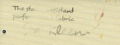
Sta-Kleen by The Mitchell Group faux leather bonded with a urethane that resists markings of all sorts, including "permanent" markers such as a Sharpie marking pen. They are promoting it for stain-resistant upholstery, but there is no reason it couldn't be used as a markable wall finish. (I suspect their urethane will find its way onto other materials, too.)
Evonik was promoting its acrylic sheets for use with markers.
• While markers can be used on most glass surfaces, several firms were showing glass products that could serve as floor-to-ceiling marker surfaces. For example, one company had a glass with a white backing plus a subtle dot pattern that could be used as a guide for drawing grids and graphs or to encourage more uniform writing. The wall also had a steel backing, so magnets could also be used.
Skyline Design (below) had a set of glass panels specifically for children. Variations included teaching aids like lines for teaching letter heights, but others were designed to stimulate creative play – something that might be used on a wall in a pediatricians waiting room, for example. Some of the products had a white backing like traditional marker boards, but others were clear glass to encourage two-sided play.
• Hospital furnishings companies had marker surfaces incorporated into all sorts of nursing station and patient room furnishings.
• Several companies have marker boards that capture whatever is drawn or written so it can be integrated with a computer. Others have linked white boards to cameras that capture the motion of infrared-transmitting pens and then transmit a projected image onto the board.

Where else can this trend go?
     Marker board doors could be a big hit for college dorms.

     Toilet partitions that encourage graffiti?

     Mechanical equipment could have markable surfaces for notes about maintenance concerns like when a filter should be replaced.

     Flooring products so one could mark on the floor to help envision room layout, turn the floor into a game land where children (and adults who remember what it's like to be children) can layout imaginary cities or puzzles, to attract attention to promotions at retail establishments, or a myriad of other creative activities.

     More, it raises questions about the marker compatibility of a variety of existing surfacing materials. For example, how well does Corian work as a marker surface? (Remember to test cleanability with both dry-erase and wet-erase markers).

I would love to hear your ideas about how a marker board option might complement your product line.

Visualizing Carbon Impact

Many of us struggle to find ways to communicate the relative importance of our environmental message. This brick produces 85% less carbon dioxide during manufacture; great! Is that a lot? How big an impact does that make?

Information is Beautiful
has a great example today of one way to do this. We've heard a lot the past few days about Iceland's volcanic activity and the impact of more than 7,000 tons of ash on air travel, health, and marathon runners. Sounds like a massive environmental disaster! Then McCandless and Bartels showed us this:


Suddenly I have perspective, and a good argument to reduce air travel.

How do you tell your story visually? Give us links to your infographics in the comments.