Trade Shows

Tradeshow Booth Sidewalls Restrictions

Most trade shows that offer "inline" 10 x 10 ft booth spaces prohibit exhibitors from using tall display materials that encroach into the front five feet of the booth. The logic has been that this restriction assures that attendees can see into booths down an aisle without blocked views.

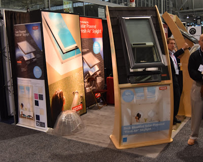
Recently, I have seen many instances of shows relaxing their policy, giving waivers, or not enforcing the sidewall limits. Is this a trend?  These examples were at the recent ABX tradeshow in Boston:
Comes to within 2 ft of aisle.
The post and rack cut into the view of the neighbor's booth.
The front half of the booth's glass side walls are transparent for minimal interference with views.
Freestanding, yes; but as tall and opaque as a wall.
RECOMMENDATIONS
1. Limiting the encroachment of side walls make good neighbors.
2. Ask show management for waivers before shipping your booth.

Trade Show Follow-Up: Use booth photo

Inline image 1
After a trade show, I usually get a flurry of emails from exhibitors. In many cases, I don't remember the name of the company or what triggered my interest.

David Condello, Commercial Accounts Representative, Ceilume Ceiling Tiles has a technique to trigger the memory of visitors to his booth; he puts a photo of the booth at the top of his email. For visual thinkers, like many designers and builders, this communicates more than the proverbial thousand words.

He also writes a great letter and sprinkles it with other photos. And most amazingly, he sends the emails just two days after the show.

Hanley Wood Exhibits now Informa Exhibits

Hanley Wood Exhibitions will be rebranded as Informa Exhibitions US, Construction and Real Estate.


HW had owned World of Concrete, AIA Expo, Construct, and other US construction industry events.

Registering dissent about registering on websites

Members of Specification Consultants in Independent Practice (SCIP) are in charge of the specifications of billions of dollars in construction annually. Their ranks also include thought leaders with enormous influence in our industry. When they speak, building product manufacturers would be wise to listen. And this is the message they announced at the recent Construct 2014/CSI Conference last week in Baltimore:
 Don't ask us to register before getting access to your website.

Their objection is that the registration process takes valuable time, asks for information that is not germane to the issues at hand, is an intrusion into their privacy, can lead to unwanted sales calls, and may harm a building owner's need for confidentiality in a real estate or construction transaction.

Ready access to information is the life blood of design and construction, and the registration process hinders that.  Specs are often prepared under the pressure of deadlines and many architects will simply go to another site if it is difficult to find the info they need with just a few keystrokes.

Some manufacturers claim that registration prevents competitors from accessing trade secrets. Yet every building product manufacturer I have ever served had figured out how to get into your website. True trade secrets, of course, require security, and names and addresses have to be collected when requesting samples. What SCIP members are objecting being asked to register to see essential product selection information. 
Typical of SCIP members, Mitch Lawrence (left) works for a Altoon Partners, an architectural firm active on three continents. Stephan Nash (right) is a consultant writing specs for many of the major Hawaii-based architects and projects. If you want their business, make it easy for them to get onto your website.
There is a better way to collect data: make a compelling offer.  This could be an entry into a competition, coupons for discounts, vouchers for special events, registration for a webinar, or other promotional items. When I worked at Ceilings Plus, for example, we offered to send an "Idea Book" with a portfolio of design ideas, finish samples, and design tools in a neat, compact package. The trick is to offer something that will be of interest to bona fide prospects but of no interest to pursuing swag.

Please share this page with your web designer.
-------------------------------------------------------
A friend in the industry adds:

"What is even more infuriating is to try to go back to a manufacturer's website that you may have registered at years before... and discover that you need to try and remember the password you used... and the site won't allow you to access unless you remember that password!! This usually happens at 10PM when you're trying to finish up a project specification and there's no way to call the manufacturer!!"

A comment about this post, from a registered architect, says:

"I absolutely agree with the hassle of registering on a manufacturer's web site to get information. Proprietary information - I can't imagine a manufacturer is so stupid to allow me to access their proprietary information off of a web site so the excuse that it protects them from competitors is, on the face of it, absurd. If possible I switch to a competitors web site rather than register. AND I remember when I write specifications for a project - if you are going to make it difficult for me (register OR charge for information such as referenced ASTM standards or minor verification/selection samples), I simply do not include that product/manufacturer in the list of approved equals."

A variation on the registration them:

"I was researching a fire curtain. When I clicked on a link labeld "Brochure", the link opened an email browser so I could send a request. That is just as much a nuisance as having to register.  Pooh on you!"

A Quick Response from an Exhibitor at Trade Show


Lynn Javoroski FCSI CCS posted this on the CSI LinkedIn Group:  "Did y'all know that "No registration" pins were handed out at CONSTRUCT2104? And that the exhibitors were asking about it? Some of us received thanks from ClarkDietrich with a picture of the button and 'ENJOY THE ACCESS WITHOUT THE OBLIGATION. With no registration required, ClarkDietrich offers you access to a wealth of product information and tools' written next to the picture. At least someone listened."  

I APPLAUD CLARKDIETRICH FOR ITS QUICK THINKING ON THE TRADE SHOW FLOOR.

Lynn wrote me about how the No Registration button came about:

"What started this whole thing off at Construct was this: I went to a manufacturer's website needing to know in what color(s) their laboratory countertops were available. When I clicked on the "color" button, a pop-up appeared and stated 'You are not authorized to view this information without registering'. Needless to say, they were removed from my spec. Sometime afterwards, I was corresponding with Colin [Colin Gilman publishes 4spec.com] and mentioned it; somehow we got to the idea of buttons and he said "send me the graphic and I'll have them made up and shipped to you". So I did and he did. "
 
------------------------------------------------------
See more discussion about this topic at CSI Group on LinkedIn.

Speak at AIA Convention 2015

You’re invited to be an AIA Convention 2015 speaker!

We’re developing an incredible education program for AIA Convention 2015, the largest annual gathering of architects in the country, and we’d love your help.

If you’re an articulate subject matter expert looking for an opportunity to educate, engage, and connect with the architecture and design community, we invite you to submit an education proposal between July 1 and August 15, 2014.

What’s behind a winning education proposal?

Each year, attendees rate our speakers as a highlight of the packed, three-day convention experience. Your proposal should demonstrate how you will create an experience that inspires and empowers; features interactive, engaging learning; and showcases emerging trends and innovations.

All proposals are evaluated by the AIA Convention Education Peer Review Team.

In Phase 1, proposals will be rated on demonstration of the following characteristics: Emerging trends, new ideas, engaging learning, and knowledge level appropriate to our audience.

If your proposal moves to Phase 2, it will be evaluated for learner outcomes, speaker expertise, and value to attendees.

Even if your proposal is not accepted, you’ll still gain value from the experience: The AIA Education Team provides feedback on every proposal.

Need inspiration? Check out the lineup for AIA Convention 2014.

Why you should submit a proposal

AIA Convention offers speakers a unique opportunity to share their knowledge, expertise, and best practices with members of the design community. Some of the perks of being an AIA Convention speaker include complimentary registration, recognition on the national stage by your peers, and the opportunity to earn continuing education credits towards licensure, to name a few.

We know it’s hard work, but it’s definitely worth it!

How to submit your education proposal

Our process is designed to streamline the submission, to save you time, and to result in the best possible content at AIA Convention 2015.

Visit the Call for Proposals submission site, where you’ll find the full details, requirements, and deadlines. It’s also the place where you’ll submit and store your proposal information throughout the process. Log in and get started any time after July 1.

Save and change information anytime until the proposal deadline of 11:59 p.m. PDT, August 15.

Questions? Contact the team at ConventionEducation@aia.org. Need technical support for your submission? Call 410-638-9239 or 877-426-6323.

Dates to remember

Please note: Deadlines below are firm.

July 1: Call for Proposals opens August 15: Call for Proposals closes at 11:59 p.m. PDT September 7: Notification of acceptance into second round September 20: Second round detail submissions due October 10: Notification of final acceptance

For assistance preparing a winning proposal, contact Michael Chusid.

Networking for Fun and Profit

Two Men TalkingI got 20+ solid leads during a two-hour networking event this week.

Sponsored by a CSI Chapter, there were about 45 table top displays from building product companies, and over two hundred attendees. The leads were generated by brief contacts in the exhibit space, in the lobby outside the meeting space, and even in line for the parking lot attendant afterwards. The leads created opportunities for follow-up phone calls or emails or generated new leads and introductions. On top of that, I got to say hello to dozens of other industry contacts to keep our relationships fresh.

You can create similarly high results at similar events. Here are five tools to make the most of networking events:

1. Know your goal: I went to the CSI event with the intent to interact with a lot of people, and I succeeded. But I may have had other purposes in mind. For example, I went to a party at a trade show for the specific purpose of meeting a potential client that I anticipated would be there.  He was, and I was able to get him to join me for a full hour at a table on the periphery of the event.

2. Be prepared for surprises: Be ready to change your goals as opportunities or circumstances arise. I was at one conference, anticipating an afternoon of glad-handing, when the conference organizer approached me and asked me to be on a panel discussion in place of someone that cancelled at the last moment. Instead of 20 1-on-1 conversations, I addressed an audience of 200. At another event, I was drafted to serve at the registration desk, and got to introduce myself to everybody at the show.

3. Ask others questions about themselves: You are itching to talk about your product or service. But start by asking others about their businesses, their families (if you have a personal relationship), or any new products/projects they have. Networking has to be a win-win situation, and your interlocutor must feel a stake in the conversation. More, his or her comments may reveal needs or opportunities that are openings to sales opportunities.

4. Get to the point: Everyone at the event is there for networking. So forget the small talk during business hours; save it for receptions and the lounge.

5. Get contact info and set up a follow-up: Carry more of your own cards than you think you will need. But be sure you know how to contact the person with whom you are speaking. Get permission to recontact the person when possible. This could be as simple as saying, "I'll send you XYZ with more info." or, "Would it be better for me to call you tomorrow or later in the week?"

To learn more about networking, sign up for this webinar offered by Ceiling and Interior System Contractors Association (CISCA):
How to Construct a Strategy for Networking at Conferences
Wednesday, March 12, 2014. 2:00p.m. ET
Free for CISCA members, $49.95 for others

Networking creates an opportunity and strategy to build and maintain relationships with current and prospective customers. Networking involves more personal commitment than company money. No matter how busy we are, we all still need to make time out of our schedule to network. It requires dedication on an individual level. This webinar will examine specific ways you can expand your network for yourself and your company.

Learning objectives:
  • The Keys of Successful Networking
  • Networking Etiquette: What works…. and what does not
  • How social media can aid in your Networking goals
  • Building and Maintaining the New Relationship by adding value
Click here to register.

Etiquette

If you are not an exhibitor at or sponsor of the event, don't be a carpetbagger. It may be a fine line, but there is a difference between doing sales and networking.

If you are networking with an exhibitor for purposes other than learning about his or her product, do it only when there is not a real prospect in or approaching the booth.

Continuing Education Units at Trade Shows: Why Not?

The three days I spent visiting exhibits at World of Concrete trade show felt like a trip to a major museum or browsing the stacks in a university library; everywhere I turned there was something new and exciting to learn.
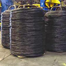
At the Loos & Co. booth I was introduced to the different types of wire rope and how they are made. My "teacher" went on to regale me about the history of the product from John Roebling's 19th Century Allegheny Portage Railroad to the latest aviation applications.
Yet I may not be able to count any of my 36+ hours at the show towards continuing education units (CEU) I need to maintain my architectural license or my certified construction specifier status.  The continuing education criteria, established by state licensing boards and administered by AIA and other groups, are complex and impose burdensome paperwork requirements to get courses approved. While CEU can be earned through self-study, the design professional has to substantiate the educational value and an individual's initiative can be denied by regulators.
Cemex and several other organizations conducted a demonstration of roller compacted concrete and discussed quality control measures. While I had read about the technique, seeing it being installed was highly educational.
The educational value went beyond ordinary commercial transactions and networking to become brief master classes taught by the recognized authorities in their particular fields. When traffic in the booth was light, they would gladly spend a few minutes holding forth. The examples on this page are but a few of the many lessons received. Note that many of them would have earned me the more stringent health, safety, and welfare (HSW) credits if they had been presented in an approved course.
A gentleman form Oklahoma Wire and Steel took time to explain that concrete reinforcing is produced in coils. Fabricators either straighten the material and cut it to length, or they fabricate it into stirrups, rings, or the other shapes required on a construction site. Huge machines have largely replaced manual methods of cutting and bending rebar.
Many trade shows have concurrent classes that offer CEU credits. My argument is that this should be expanded to give credits for time spent on the trade show floor. Exhibitors are the financial underpinning of trade shows and want to maximize attendance.So it is in the interest of the building products industry to establish procedure for attendees to earn CEUs while visiting the show floor. Alternatively, show producers or trade association sponsors could take the lead in negotiating this change in CEU criteria.
Even though they knew I was not a potential customer for their equipment, the pair working the Sensocrete booth explained, with great passion, how to improve quality control of concrete.

One can argue that some trade show visitors are more interested in swag or social interactions than in educational benefits. But these same individuals can sit through a lunch time course and get nothing out of it but calories and an unjustified CEU.
Continuing education requirements are based on hour-long classes. Trade show lessons are necessarily brief, but no less powerful It took the rep at BASF only a few minutes to explain how their new "crack-reducing admixture" challenges fundamental assumptions about concrete performance and give me a sizable nugget of knowledge to digest.
The CEU divines differentiate CEU programs that involve face-to-face exposure with a qualified instructor from "distance learning activities" like reading an article or watching an online video. Distance learning activities require students to pass a ten-question quiz to demonstrate that they understand the material presented. Perhaps this model can be used for awarding credit for trade show time; attendees would have to submit a declaration of what they learned at the show. Another approach would be to discount show attendance so that an hour on a trade show floor would be worth only a quarter of a CEU.
A one-on-one master class with an Ward Malisch from the American Society of Concrete Contractors provided an authoritative answer to my question about cement hydration.  Figure above, from NIST, shows "concrete at four different length scales: upper left is concrete, upper right is mortar, lower left is cement paste, lower right is C-S-H." (See earlier post)

Are you ready to mount a campaign to accomplish this? Give me a call so we can plot strategy.

Chusid is "Innovator of Century"

I am posting this from World of Concrete trade show in Las Vegas.

BASF has a gimmick in their booth that actually makes sense from a promotional standpoint.  I stood in-front of a greenscreen while my portrait was photographed. Then I was offered my choice of Las Vegas-themed backgrounds, each of which had a BASF branding message. By the time I got back to my hotel, I was able to download the image.

By putting the prospect into the frame, BASF created a piece of promotional literature the prospect will keep forever. I bet I am not the only booth visitor that posted the photo to Facebook or sent it home to the family, helping to spread the BASF brand. 

To see site in action, go to www.basfmosaic.com/. Photographic mosaics may have other applications in your business. To learn more, visit the developer, www.PictureMosaics.com.
The promotion was so much fun, I visited booth a second time.

What Would You Like to Say to Homebuilders?

The National Association of Home Builders' annual International Builders' Show (IBS), has put out a call for speakers at its 2013 edition in Las Vegas.  It is the largest residential construction industry show in the world.  


There are a range of different educational tracks for presentations, focusing on issues of the craft and business of residential construction.  It is a great opportunity to share your expertise and establish your presence with builders and designers in residential construction.  Deadline for submissions is Feb 24.  www.nahb.org

How NOT to use Flash Drives in Press Kits

It has become popular to use "thumb-size" flash drives in press kits. Having the copy and photos on a thumb drive makes it easy for an editor to transfer the data directly into a story, without having to go onto your website or open a CD.

Thumb drives are also a type of "swag" that will attract the attention of an editor. In the press room at the recent World of Concrete (WOC) trade show, I watched editors browse through press kit to see what was worth the effort of hauling home; press kits with flash drives went right into their goodie bag.

But here are a few pointers about how to do it wrong:

- Not using printed media, too. If you just put a bunch of flash drives on the press room table, your message will not be available to the editor during the trade show. Use your paper literature to motivate the editor to visit your booth and to stimulate buzz at the show.

- Not putting editable text on the drive. If you want the editor to run your story, include the press release in a format that the editor can cut and paste. Some of the press kits I saw had pdf files that were locked to prevent text from being copied. What editor will take the time to re-key your article into their word processor?

- Not including an overview sheet on the thumb drive. When I opened one of the flash drives from the trip, all it showed me were file names like:  2450GR, RT24, and 830RT. These may very well be model numbers for new products, but it is off-putting to a busy editor that doesn't know your company well. File names like, "Pervious_Concrete_Admixture" or "New_Sales_Manager" will be more easily understood.

- Not using the color of your brand. Flash drives come in all colors, and can be imprinted in any color. Use colors that support your branding.

- Not printing the name of the company on the data stick. The editor will probably erase your content and reuse the data stick for his or her own purposes. If the name of your company is printed on the face of the drive, at least the drive will continue to provide brand awareness.

- Not including links to your website on the thumb drive. The press release is supposed to be a tease that encourages an editor to go deeper into your story. Put live links into the digital press releases to invite editors to learn the rest of your story.

- Not indicating the name of the trade show. A well formatted press release should have a release date and, if the announcement is being made at a trade show, the show name should be indicated. Yet this information was missing on many of the flash drives I collected.  Compare that to naming the drive "WOC" (instead leaving it named "untitled") and placing downloads inside a folder named, "World of Concrete 2012."

- Not reporting any "News". I attended a press conference where the speaker had poor presentation skills. Afterwards, I asked an editor in attendance what she thought, and she replied that she didn't mind the bad speaker because, "at least he had real news to share." Many press kits just rehash the corporate brand or past glories. It may make the Communications Director feel good, but it is not much value for an editor looking to provide meaningful content to readers.

- Not including press releases: One flash drive was filled with brochures, animations, photos, slide shows, and sales sheets. Perhaps the exertion of putting all that together wore out the PR department, because they didn't include a press release.

- Not putting data on the flash drive. It happens.

Are You Ready for World of Concrete?

World of Concrete 2012 kicks off just 4 months from now.  When are you going to start getting ready?
A little planning now saves big headaches at the show!
If you're exhibiting at WOC, now is the time to be putting the pieces in place, so you can make World of Concrete work for you to its maximum potential.

* Is your booth designed?
* Is your sales collateral up-to-date?
* Have you written, shot, and edited the videos you're going to show in your booth?
* Do you have an up-to-date press kit to put in the Press Room, so trade magazine editors can learn about your products and your news?
* Have you booked a press conference to tell the world about your new products and innovations?
* If you're giving a seminar or continuing education presentation, is it written and designed?
* Are you going to do anything to encourage customers and prospects to visit your booth -- like direct mail, pre-show advertising, or at-show sponsorships?
* Who will be staffing your booth? Are they trained in booth skills?

Light a fire under your people, so they can tackle these issues bit by bit during their downtime, and not cut into business later with a big last minute crunch.

Exhibiting at any tradeshow is a big investment.  Support it with the proper prep, so you can make it pay off.  (And if you need help, don't hesitate to call on Chusid Associates.)

Don't use trade show to evaluate US market.

It is easy to get lost among the other exhibitors
at a trade show unless you know what
you want to achieve and have a plan.
Foreign manufacturers sometimes exhibit at North American tradeshows, "to see what are our prospects in the US?" This is seldom an effective type of market research.

There is a classic parable about two sales reps sent to a distant country to peddle shoes. After a day, one sent a message to company headquarters, "Coming home on next boat; no one wears shoes here." The other cabled, "Send lots of shoes; no one wears shoes here." But neither would have a valid impression of the true market if they formed their opinions while visiting the beach.

A company from the Netherlands, for example, exhibited at a recent World of Concrete. Not only is their brand unfamiliar in the US, their product category and technology are also foreign to US contractors without international experience.  The staff working the booth were unable to address technology transfer issues such as US building codes. Even their booth and sales skills reflected a European aesthetic and approach to business that does not communicate effectively to North Americans. Yet they were trying to judge the attitudes of American customers.

The Dutch exhibitors were frustrated since they did not know how to explain their product to American contractors. They were trying to "sell" instead of trying to "learn". Their mission may have been more successful if their effort was designed as a real market research opportunity.

For example, they could have conducted "aisle intercept" survey, asking people passing their booth to stop and answer a few questions. A drawing for a trip to Holland would have caught attendees interest and begun the process of building goodwill.

An Italian exhibitor had invested in a 400 sq. ft. island booth in which they had assembled a structure built with their building system - a material costing more than domestic products. Their system may have had benefits that justified the costs, but we will never know. That's because none of the eight executives working the booth spoke fluent English. While they had employed a translator, the individual struggled with the technical jargon of construction.  More, the firm built their demonstration project around the perimeter of their island, then sat inside the display as if they were hiding behind walls. One hopes that, at least, they enjoyed their junket to Vegas.

What are the alternatives
Before investing in the expense of exhibiting at a trade show, do some due diligence. It can be helpful, for example, to attend the trade show as a participant before deciding to exhibit. This gives you the chance to see your potential competitors. And informal discussions with people attending the show can also help you understand the market. Some of Chusid Associates' clients go further, hiring us to "walk the show" with them, so we can point out trends and identify key players.

You can also use a show for private presentations. One of our clients had us recruit targeted prospects to private demonstrations where our client could hold brief but highly informative interviews. Similarly, trade shows are a great opportunity for focus groups, since you can recruit a panel that reflects regional diversity.

One final suggestion: If you are exhibiting at a trade show to "stick a finger in the wind" as a way to judge a market, have your signage and literature translated into English. And avoid using idioms like "sticking a finger in the wind," an expression that might not translate well.

Trade Show Booth Visibility

Most people design tradeshow displays as though the prospect is standing directly in front of the booth. In reality, this front and center perspective may be the least important vantage point. An attendee's decision to stop in front of your booth is usually made as he or she approaches the booth. This means your exhibit material and signage have to communicate when seen from a diagonal. 

Here is a case in point. While the exhibitor had various graphic on their backwall, they were relying on three mock-ups to demonstrate and sell their product. The free-standing displays and accompanying signage were lined-up, parallel to the "front" of their booth.

However, a quick analysis of their 10'x20' "half-island" booth revealed that it was near the back corner of the exhibition hall, and that there was almost no traffic walking the aisle directly in front of the booth or along the back aisle. (See percentages in sketch above.) By turning the free-standing displays 45 degrees, they became visible by over 70 percent of traffic around the booth.

Sometimes, this sort of traffic analysis can be done before the show by studying the floor plan. But shows constantly offer surprises. So after you set up your trade show booth, take a few minutes to inspect it from a variety of positions around the exhibition hall. Sometimes small adjustments can make a big difference.

Meet us at these trade shows

Representatives of Chusid Associates will be at these trade shows. Give us a call if you are attending any of them so we can get together.

Dwell on Design - Los Angeles, CA - June 24-26
Energy Management Congress - Long Beach, CA - June 15-16
Construct 2011 - Chicago, IL - September 13-16

Trade Show Ideas that Work

Here is a photo album of good trade show ideas from this year's World of Concrete expo in Las Vegas.
Operating a vibrating "stinger" is one of the toughest jobs in concrete placing. This equipment manufacturer plays the image to the hilt with their tough guy routine complete with bulldog with spiked collar, skull and flame motif, sunglasses, and stogie. This "gentleman" was handing out temporary tattoo transfers with the company's logo and make-my-day attitude.
Construction scaffolding is a low cost way to support banners, video screens, and samples, and speaks to the construction industry context of the products. Rented locally, the exhibitor avoided shipping costs. Tower created visibility from across the hall.
Taking advantage of a corner location on a main aisle, the gateway and curving "pavement" draws the eye into the booth. And where the eyes go, feet are likely to handle. The paving motif also speaks to the industry in which Stilh competes.
From the front, this representative from the Portland Cement Association offers a friendly face and handshake. Yet his message is clear even when his back is turned. "Think Harder. Concrete." is a brilliant slogan, and attendees were eager to get the freebie shirts, hats, and bags being offered. I suspect most of them will actually wear the swag as a statement of pride in their industry.
Many booths display their packaging as a way to create visual recognition and to explain how the product is delivered. This firm turned their packaging into an attention getting, illuminated display. Colored lamps also reinforce the importance of colors to the firm's product line.

Conference: Composite Materials & Digital Manufacturing

Take a look at new materials and technologies that may be important to building product manufacturers. Chusid Associates is attending, and looks forward to seeing you there.

Material beyond Materials:  
A Composite Tectonics Conference on Advanced Materials and Digital Manufacturing in Architecture and Construction

Friday, March 25 through Saturday, March 26, 2011

Hosted by Southern California Institute of Architecture (SCI-Arc),
Los Angeles, CA

Fostering direct exchange between architects and companies invested in the field of advanced materials and fabrication technologies, SCI-Arc hosts Material beyond Materials—a composite tectonics conference on advanced materials and digital manufacturing.

Taking place on the SCI-Arc campus in downtown Los Angeles, the two-day forum is open to the public and will explore technological advances in composite materials, innovations in construction, and current design discourse—with some of the most important names in today’s building, fabrication and design industries.

Material beyond Materials combines progressive presentations in the fields of architecture, the arts, engineering and materials research. Conference participants will present and discuss their most innovative ideas, projects and positions concerning materials, technology and the impact on the architecture and construction disciplines and professions.

FRIDAY, MARCH 25
6:00-6:30pm
Introduction to SCI-Arc: Material Beyond Materials
By Eric Owen Moss


6:30-8:00PM
Keynote Lecture: Evan Douglis
 
SATURDAY, MARCH 26
10:00-10:30AM
Introduction: Composite Tectonics
By Marcelo Spina


10:30-11:45AM
Panel 1: Integrating Complexity
Systems integration and the inherent complexity derived from them are assessed from the viewpoint of composites. Topics include structural performance, complex analysis, lightweight properties, and integrated assembly. Aspects such as construction code and city requirements are also discussed. Panel focuses on the potential for streamlining construction and the integration of composites within a larger available material palette.

11:45-1:00PM
Panel 2: Synthesizing Behavior
Synthetic behavior and qualities are at the core of composites. Topics include material variability as opposed to traditional materials, anisotropic materiality, gradients, coloration, light transmission, real vs. synthetic as well as emerging effects derived from all of these aspects. Panel focuses on new possibilities for innovation enabled by designing and altering material at the level of matter.
1:00-2:00PM

Lunch Break

2:00-3:30PM
Panel 3: Performing Environments
Performance and environments are understood in a broader sense, to relate material to our physical environment or to suggest that materials themselves can constitute immersive environments. Topics include new and smart materials, green technologies, the impact on sustainability, but also issues such as fire rating, life cycles, material performance and economies. Panel focuses on the environmental potential of designing with composites.

3:30-4:45PM
Panel 4: Manufacturing Construction
Manufacturing construction as opposed to manufacturing buildings is at the center of the discussion. Topics include prefabrication processes, on site vs. off-site construction, digital fabrication and the role of craftsmanship, refined versus rustic, tooling and tools; automation, and the role of robotics in new design paradigms.

4:45-5:45PM
Concluding Remarks/Q&A Session

6:00PM
Closing Reception
 
The Material beyond Materials morning and afternoon sessions on Sat, March 26, have been registered by the American Institute of Architects (AIA)/Continuing Education System (CES) to offer Learning Units. Click HERE to read the full announcement.

Admission to the event is free and open to the public. RSVP to reserve your space—email your name, company, address, and daytime phone to RSVP@sciarc.edu.

How NOT to send a World of Concrete follow-up email

Oh, where to begin...

Alright, I'll start by saying something nice. I am glad to see this company, unlike many of the ones I spoke to at World of Concrete, bothered to send any follow-up email at all. Even at a small trade show you will make dozens of new contacts; at one the size of WoC that number can easily get into the hundreds. And each of those people you met also made hundreds of new contacts. Meaning the odds of them remembering you are slim unless you do something to make yourself memorable.

Which is why a follow-up email is a good idea. It reaches everyone quickly, sends them to your webpage (or other important destination), and maintains that contact until you have time to reach them personally. I usually tell clients that, in general, any follow-up email is better than none at all.

Then I got this.

Click for large version
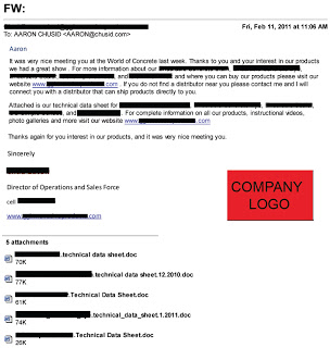
The text has been heavily redacted to protect the guilty, but the basic structure and every part I want to discuss are still viewable.


  1. First and foremost, look at the subject line. Yes, the subject to this email, the one that is supposed to convince me to renew my contact and do business with them, is actually "FW:    ".

    This is so bad for so many reasons. Many email systems tag forwards as SPAM, especially if it's coming from someone not in your contact book, has no subject line, or seems to be a commercial message. This hits all three counts. Honestly, I'm a little amazed it even made it to my inbox; I should probably tighten my SPAM filter.

    Worse, though, is the missed opportunity. The subject line is your chance, your only chance, to get the reader's attention. To convince them to open your email, instead of hitting delete. Like the advice given to novelists, you should spend as much time on your subject line as on the rest of your email, if for no other reason than it may be the only piece they read. Even a stock phrase, such as "Thank you for visiting our booth!", would have been better.
  2. The show ended Jan. 21. I received this email Feb. 11. That's three whole weeks! Do you think I still even remember who these people are? The window of opportunity for sending out your post-show email is very small; that's why I recommend prepping the email before you head to the show. If the email is coming this late, it's essentially a digital cold call. Which means it's getting deleted.
  3. It may not show well on this screen shot, but the font in the salutation is a different color than the body text. Ignoring the questionable grammar and business-letter formatting, that tells me instantly this is a form letter, and makes it feel impersonal. 
  4. The writing is bad. Flat out bad. The product names (hidden behind the thick black lines in the body of the text) are dropped in with no description or context, making it awkward and hard to read. And repeated, but again with no context! There is no call-to-action, no incentive, no reason for me to do anything after reading but delete.

    And despite what I said before, grammar counts. Your customers and prospects are very intelligent people; many of them are professional writers of some form. They may not reward you for good grammar, but they will definitely punish you for bad.
  5. The attachments. There are five of them! Six, if you count the company logo graphic! This is a major no-no. Do not send people attachments without their request and their permission. Period. Even if you understood your in-booth conversation with them to be a request for your guide specs, they probably did not.

    If, for some reason, you must send an unsolicited attachment, no more than one, not counting graphics, and nothing over 1 MB. Heavy graphics lowers the permissible file size; remember, they have to be able to get this on their phone. 
  6. There are not enough links. The only link in the whole email is to their homepage. In the second paragraph they mention their photo gallery and instructional videos; why not link directly to those? Why make me hunt for them? I understand not wanting to include product pictures, but at least make them easy to get to.

    Consider carefully where you want your email to take them. I recommend using a dedicated landing page with show-specific information, rather than your standard home page. Our typical follow-up email includes links to subscribe to our newsletter, and visit our Facebook and Twitter pages. Also, be sure to have "Click to view online" and "Click to unsubscribe" links.
They did include their contact information; I removed it, rather than black it all out. I don't know why they thought I needed their mailing address in an email, but they sent it. Also, their logo is much nicer than the big red block makes it look.


I do not have a problem with the minimalist style of the email; simple is good, and this email is almost guaranteed to open easily and display correctly on every system and device. I also like that it is short. No one will read your multi-page follow-up email. If they really want more information they will go to your webpage; make it easy and inviting for them to do so.

In summary, think of these emails like thank-you letters after your birthday. Do them, do them early, and make them nice enough that the recipient wants to send you another present next year.

Chusid Client wins Innovative Product Award

Hanley Wood has announced that the new SPD Protector by Lythic Solutions, has received the Editors Choice award in their Most Innovative Product competition held during World of Concrete. Chusid Associates helped Lythic Solutions with their entry into this contest.

Contests such as this give building product manufacturers great PR exposure. The award provides an important testimonial, it gets announced by the sponsoring magazine, and the manufacturer can use the award on its website, product labels, and press releases.

Remember: You can't win unless you enter.

Use high-touch opportunities at trade shows.

This is an encore of an article Michael Chusid wrote more than 20 years ago. While the internet has become more robust than could be seen then, trade shows still remain an important part of the marketing mix.

Does it make sense to cut our exhibiting budget to finance Internet development? If we decide to go to shows, what should we do to get the most from our exhibit?- N. W., marketing manager

High-tech marketing, such as the Internet and other multimedia tools, will only increase the importance of trade shows in building product marketing. As online sales and customer support increase, personal contact between salespeople and customers will decrease. Trade shows let you maintain that personal contact.
This is the dichotomy of high-tech/high-touch marketing predicted 15 [now 35] years ago by John Naisbitt in his book Megatrends: Ten New Directions Transforming Our Lives.

"The more technology we introduce into society, the more people will aggregate, will want to be with other people," Naisbitt wrote, "We will eventually do some shopping by computer, but only for staple items of which we have a very clear sense and experience. It will be no substitute for the serendipity and high touch of shopping for what we want to be surprised about."

Several building product marketing executives have recently told me that more of their customers are bypassing sales reps and dealing direct with the factory, entering orders online, exchanging CAD drawings by e-mail, and teleconferencing. These marketers are spending money to build Web sites, but they continue to allocate funds for trade show booths to maintain a face-to-face presence with customers.

Industry shows enable an exhibitor to build brand awareness, identify prospects, and shape consumer attitudes. The opportunity for customers to see and handle your products and shake hands with your salespeople makes trade shows a powerful marketing vehicle.

If marketers aren't convinced of the continuing value of face-time, customers are. An architectural specifier I know keeps a list all year of' the products he wants to investigate and the contacts he wants to make when he gets to the Construction Specifications Institute show. His sense of purpose is not unique. Even those who attend just to walk around and see what's new go anticipating serendipity.

To increase your odds of benefiting from that serendipity, you must attract attention. At a recent show, I watched a leggy female model invite attendees to take turns on a putting green in a booth. Although she attracted a crowd by bending over to retrieve golf balls, few attendees inspected the power tools in the booth.

Other efforts to involve customers are more successful. Consider, for example, how Davis Colors used a trade show to launch its Mix-Ready packaging for concrete additives a few years ago. The new package could be tossed into a concrete mixer without opening, weighing, or pouring the dusty powders, a significant advantage for ready-mix producers.

To get the point across, Davis decorated its booth like a basketball court, but with a graphic of the back of a concrete truck instead of a basket. The salespeople wore striped referee shirts and had whistles hanging from lanyards around their necks. They held up basketball-sized Mix-Ready bags and offered attendees chances to "score with Mix-Ready" by tossing bags into the truck.

Show goers greeted the invitation with humor and relief that it wasn't another booth crammed full of product information. It didn't need to be; just tossing the bags into the mixer was enough to create an indelible impression and communicate the benefits of the new admixture system.

The booth also facilitated personal interaction between buyers and sellers. From the free-throw line, the "ref" would hand off the customer to a salesperson who could discuss product benefits one on one.

Tactile tease

Cresset Chemical Co. also uses a high-touch approach at trade shows. Cresset places placards urging visitors to "Feel me" on concrete samples so attendees can understand firsthand the impact of the company's form release compounds on concrete surfaces. Cresset's hooked-up spray equipment lets customers develop a visceral feel for operating the products. While other trade show booths are as passive as a department store window, Cresset's is more like a science museum's hands-on exhibits.

Cresset also does an especially good job of interacting with prospects in the booth. In addition to collecting names and addresses, Cresset's booth staff conduct quick interviews. They use a customized questionnaire to record prospects' current brands, product interests, buying authority, and purchase plans, and decide on the spot what follow-up actions are best. By collecting this information, the staff can make best use of their time with each prospect at the show, and can build a prospect database for later use. The interview takes a few minutes, but I suspect it makes attendees feel they have been properly attended to.

Bring the computer to the show 
The high-touch marketing environment of a trade show is also a good place to showcase your high-tech marketing. Though products still deserve center stage, a computer in the booth lets you demonstrate your Web site and explain its cyber benefits. This is especially important if you hope to make the Internet a central component of your customer service program. The more you spend on your Web site, the more you might want to spend on showcasing it at trade shows.

Have a question you'd like us to answer?
Send an email to michaelchusid@chusid.com


By Michael Chusid, Originally published in Construction Marketing Today, ©1997

16 Fun Things To Do At Trade Shows

To get you in the mood for World of Concrete, here's a fun list from Skyline:

  1. Look up on the show city’s Visitors and Convention Bureau website all the fun activities you can do outside of show hours (try indoor skydiving in Las Vegas, it’s a blast).
  2. Go to dinner with the funniest sales person who is staffing the booth. Repeat nightly.
  3. Count how many trade show booths you can walk by before a booth staffer tries to engage you.
  4. Visit your competitors at the show and ask them what they don’t do well. Watch ’em squirm.
  5. When you meet attendees in your booth, stop treating them like numbers on the sales chart, and treat them instead as if they are going to be your new best friend.
  6. Drinking game: Walk down the trade show aisle carrying a bottle of water (unless you are at a European show). Whenever a booth staffer says, “Hi! How are you?” you reply, “Fine,” take a swig, and keep walking.
  7. Pick up giveaways from your fellow exhibitors, and then give them back … to different exhibitors.
  8. Go to lunch with the second-funniest sales person who is staffing the booth. Repeat daily.
  9. Look up old friends you haven’t seen in ages that live in the show city, via Facebook, LinkedIn or other social media, and relive the glory days.
  10. Create a fun activity in your booth that helps get your message across to visitors.
  11. Walk into an island trade show exhibit and play with their products. Count how many seconds (minutes?) it takes for a booth staffer to engage you.
  12. Smile at your booth visitors, even if they aren’t. Pretty soon you’ll both be smiling.
  13. Have a contest with fellow staffers to see who can work specific obscure words into conversation when talking with booth visitors, such as “corollary,” “obtuse,” and “Sandra Day O’Connor.”
  14. Walk the show with a colleague. Have a bet on who can count the most: booth staffers sitting down or booth staffers on the phone. A third friend can count booth staffers eating or drinking. (This is like counting states on license plates when on a long drive.) Loser buys lunch.
  15. Have another bet: Before you hit the show floor, bet which trendy new color will be on the trade show displays. Then count the exhibits with that color. Loser buys drinks … that are the color they picked.
  16. Thank everyone who has helped you with the show – your booth staffers, your exhibit house, your manager, the show owner, the show labor, and especially your booth visitors. You’d be surprised how much fun that can be.