Graphic Design

The Power of Graphics

Human communication is increasingly visually driven.  Digital cameras, shooting still and video, are everywhere, and everyone knows how to use them, so visual instructions and explanations are becoming ubiquitous.

Shooting a video to explain an idea or process is tempting, because everyone seems to want visual communication.  However, a video of someone reading an explanation isn't really "visual."  It's just Text in Video clothing.  Truly visual communication is a a very different animal.

Sometimes, a good old-fashioned graphic, or a clever, new-fangled interactive graphic, can do the job very nicely, where a video might be quite a challenge to execute effectively.  Here are two examples that each tackle the concept of giving scale to large numbers and sizes.

Goldman Sachs' office building, next to towers of palletized
$100 bills representing Goldman's derivative exposure.
Each tower is $1 Trillion ($1,000,000,000,000).  
This page uses static graphics to great advantage, depicting the 9 big banks' derivative exposure in $1 Trillion towers of palletized $100 bills.  (You might want to read the entire page, too, for some interesting info on world economics.)
http://demonocracy.info/infographics/usa/derivatives/bank_exposure.html


This page uses flash to let you "scroll dimensionally" in and out of size, from the size of quantum strings up to the estimated diameter of the universe (as distinct from the smaller diameter of the "known universe").
http://htwins.net/scale2/scale2.swf?bordercolor=white

Both illustrate the concept of scale very effectively.  They also offer the viewer the ability to dwell over them as needed to comprehend what they are saying, a measure of control that videos distinctly lack (as in, "Yeah, I already know that, move on to the next thing.").

They also illustrate the value that a good graphics designer can have to enhance your marketing efforts.

Digital Asset Management


Chusid Associates has recently entered the field of Digital Assets Management (DAM). We have invested in a new piece of DAM software to help us do our DAM job. This is a DAM-useful piece of software that simplifies many DAM projects. Its Graphics On Demand (GOD) capabilities allow us to quickly and easily produce a ### DAM slideshow, webpage, or presentation. If you would like us to help organize your DAM assets, let me know. Chusid Associates – We give a DAM!

How NOT to label images

As connection speeds and hard drives have improved, the type of media people look for online has changed. The early 'net was all about text (hypertext), but now people can access, and want, more images. It is neither coincidence or accident that every successful social medium incorporates some form of image sharing. Images are especially important in construction, whether project photos or technical drawings. They illustrate, showcase, and explain products in ways difficult to achieve using just pages full of text and data. This means it is now as important for search engines to find your pictures as your website.

So why do I keep seeing pages that use images like this:


This came from an email newsletter; my email client only downloads images with manual approval, so when I opened the message this is what I saw. The problem is all the images had generic alt text - "Placeholder image" - instead of useful names. 

Usually alt text only comes up when you hover the mouse cursor over an image, but it will also display if, for some reason, the image does not load. This means that if there is no alt text, or bad alt text, and the image is broken or missing, viewers have no way to know what was there. This email would work better if the alt text said, "Rotary hammer in action" or "Vacuum excavator close-up". That text is interesting, and makes me want to click through.

This example comes from an email, not a website, but the basic principal remains the same: Alt text is another way to get readers, and search engines, interested in your images. Adding alt text is fairly easy; most content management systems should provide a space for alt text when you upload an image. If not, it requires a small addition to the HTML that defines the image. Either way, if your webmaster doesn't know how to do this, get a new webmaster.

France's QR-enabled building

Teletech International has chosen MVRDV to remodel a building in the French city of Dijon. The proposed redesign includes QR codes on the fascade.

I was able to scan the codes, both of which resolve to MVRDV's homepage. The checkerboard-esque QR design also extends to at least one interior room, which, sadly, does not seem scannable.

I like this. Aesthetically, it speaks to the adoption of QR codes into popular culture, and how significant their impact has and will be. From a marketing perspective, I love the idea of branding a building like this, forming a direct connection to the institution's website.

QR codes point to an HTML address; make this a forwarding address and it is easy to change where the code points. This means the exterior code can become a sponsored ad, featuring a different company every month. This could also be a way to embed useful information, such as building maps, a school's course catalog, a calendar of events, or even, as MVRDV has done, a link to the building's designer.

It sounds like this is going to be painted onto the building; I wonder how long before a masonry or precast manufacturer develops a more permanent solution.

Infographics of New Zealand Earthquakes

One of the challenges in technical marketing is to communicate complex information effectively, efficiently, and engagingly. This website has a map of recent New Zealand seismic activity that meets all these criteria.
The quake is yet another reminder of the importance of adhering to best industry practices. If New Zealand had not had rigorous building code enforcement, the death and destruction there would have been even greater.

Ad produced in 72 hours

Sometimes there just is no time.

On Friday morning, I got a call from a client stating that she had just signed a contract to place a full page ad in a major architectural magazine. Then the call from the ad sales rep came, informing me that the press ready ad had to be delivered to the printer no later than Monday morning.
Ad in a hurry. Produced in just 72 hours.
72 hours later, the ad has been designed, approved by the client, and delivered to the publisher.

Many thanks to Stephen Klippenstein, our award winning art director and graphic designer, for giving up his weekend, and to the rest of the Chusid Associates team for pitching in.

Unbinding the power of binders: Know how a product binder functions for an architect, and design yours accordingly

This is an encore of a column Michael Chusid wrote nearly 20 years ago. While the use of three-ring binders has decreased as more information goes online, binders still have their place. Further, some of the concepts used to organize hard copy sales literature are transferable to your internet-based presentation.
 
When I send a catalog to an architect, I put it in a three-ring binder, accompanied by product data sheets and other technical information. As a cost-cutting measure, can I send the literature without a binder? And if I do use a binder, how should it be organized and presented to have maximum sales impact?—G.B., president

A sign in my dentist’s office says, “You don’t have to brush all your teeth, just the ones you want to keep.” Similarly, you don’t have to put all your literature in a three-ring binder, just the pieces you want an architect to keep.

If your primary purpose is to generate brand awareness or stimulate the recipient to make an inquiry, you can send your literature in a plain envelope or simple folder. But if you want the designer to keep the literature and refer to it in the future, then you should consider binding your materials.

Though there seems to be increasing use of paperback binding systems for building product sales literature, vinyl-clad (Update: Consider a more environmentally sustainable material instead of vinyl) three-ring notebooks are by far the most frequently used system. They can be assembled at moderate cost in small quantities, and offer flexibility to add to or modify a presentation. They also allow designers to remove pages as required for copying, tracing (this was important in the era of pencil-aided design), or distributing to design team members.
More importantly, notebooks address architects’ storage needs. Few architectural offices have an organized system for storing and retrieving individual brochures or product data sheets. Most loose literature pieces quickly become lost in the flood of information that flows through design offices. At best, a loose brochure may be stuck in a project file for use on a current project. But once there, it is unavailable for future reference. Binders, on the other hand, are too big to misplace in desktop clutter.

Bookshelves filled with product binders are important to the image of a design office. When prospective clients visit, the binder libraries help reassure them that the firm has the requisite technical expertise. Binders enhance your image, too; sending a binder instead of loose sheets shows you understand how architects work. It also communicates that your products have technical backup and your firm has the resources to support your relationship with designers.

Your binder gives you presence in a designer’s library. Think of it as your billboard on an architect’s shelf. While it may not have strong impact, it does have a high frequency of exposure. Every time an architect researches something in his library, or even just walks past the bookshelves, this billboard-on-a-binder exposes your brand name. Furthermore, your binder gives you visibility when the architect goes to the library to pick a product.

Building a better binder
The spine of your binder is the part most exposed to the traffic through an architect’s library, so pay special attention to its design. Most architects organize their libraries according to the MasterFormat 16-division (there are more divisions now) indexing system, so label the spine with the appropriate MasterFormat division or five-digit (six now) section numbers. Select an attention-getting color scheme that sets your book apart from other manufacturers in the division or section.

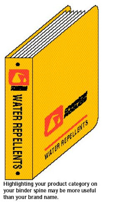
While your company or brand name should be on the spine, this may not be the most important text. For example, a water-repellent manufacturer with low name recognition realized that putting its company name in big letters on the spine would not motivate architects to pull the binder off the shelf. Instead, the company printed its product category prominently on the spine to appeal to specifiers trying to solve moisture problems.

Your next consideration is the binder’s front cover art. Most covers just repeat the company and brand names and product category. This may be acceptable in some instances, such as when you have to use the same binder in several market segments. But in general, you won’t get a second chance to make a first impression, so use the cover art to reinforce your product positioning or provide an overview of the product line.

For just a few cents more per piece, a binder can be fabricated with a pocket inside the front cover. The pocket is a useful place for shipping and storing samples, computer disks, catalog update sheets, and other items that don’t readily fit onto the binder rings. The pocket also encourages designers to store notes and sketches they make while studying your materials. This personalizes the binder and makes it more likely the binder will be used again.

Also, the inside front cover should have sleeves for business cards. Get two business card sleeves so you can insert a card from a local dealer or rep and a card from someone in the corporate office.

One further comment on the construction of your binder concerns recycling. To make room for new binders in their libraries, architects remove obsolete binders. Environmentally conscientious designers will attempt to reuse old binders. You can contribute to their environmental efforts by using binders with clear plastic covers and printed inserts instead of opaque vinyl with silk screened art. When the printed insert is removed (and recycled), the remaining binder is as good as new. In addition, the printed inserts allow you to use four-color art and to produce different cover art for each market segment you service.

The cover letters sent with most catalogs say little more than, “here is the catalog you asked for.” You can keep the letter brief and still recap key product benefits, explain your company’s strengths, list where your material has been used in the recipient’s community, identify your local distributors, or offer a promotional incentive. The letter is your chance to put a personal face on your company and further your relationship with the recipient.

Include a registration card or reply device, such as a postage-paid card or a fax-back survey. Use the reply device to build and update your mail list, to ask about current projects, or to get customer satisfaction feedback. If you depend on sales people or dealers to distribute your binder in their territories, code the reply devices so you can track whether your rep is actually getting the binders into circulation.

After the spine, the next most visible spot in your binder is what the recipient sees when he opens the front cover. Too often, this space is wasted on a drab table of contents or company history. Instead, bring some color and life to this page. Possibilities include your firm’s overview brochure, an ad reprint, or another piece of literature designed to build the reader’s interest, support your positioning, or explain your product line.

Finally, the key to an effective binder is a well-organized product presentation that allows a designer to find information quickly. Tabbed dividers are helpful. Some successful binders have a tab for each product line or model number (for example, residential windows, commercial windows, architectural windows). Others are organized by the type of information presented (for example, design guidelines, technical references, case studies, installation instructions, costs). Before determining how to organize your binder, review your marketing strategy and analyze the process a typical designer uses to select and specify your product.

Have a question you'd like us to answer?
Send an email to michaelchusid@chusid.com 

By Michael Chusid, Originally published in Construction Marketing Today, © 1995

Landscape Orientation for Online Newsletters

Most paper-based documents use a "portrait" orientation, with the long dimension of the page vertical. However, most computer monitors are in a "landscape" orientation with the longer dimension in a horizontal direction. Most internet-based documents still use the portrait orientation. This can make it awkward to see an entire page at a size that is still legible.

As an alternative, check out how this e-newsletter uses a landscape format to create pages that fit naturally on a monitor.


The newsletter, published by Los Angeles Chapter of CSI, allows a variety of page layouts. It is based on an 8.5 x 11 inch format, so it can still be printed on conventional paper if required.

I expect we will see more of this format for all sorts of documents, including technical data sheets, brochures, and sales sheets as well as for newsletters.

Utilitas, firmatas, et venustas: A Latin lesson for product literature designers

Written about 20 years ago, this essay has stood the test of time and continues to provide insight into building product sales and marketing.
 
I work for an ad agency that has just been hired to design product literature for a building product manufacturer. I have experience creating sales collateral pieces in other industries, but this is the first time I have done work for an architectural product maker. What do I need to know to meet the needs of my client's target audience: designers? - A.C., account executive

Like all sales collateral, building product literature must stimulate awareness of and interest to your firm's products. But unlike product literature used in other fields, building product literature must also provide designers with the information they need to engineer, detail, and specify products. While these objectives appear simple, designing an effective piece of product literature can be as challenging as designing a building.

Vitruvius, a classical Roman architecture critic, wrote that good architecture is characterized by "utilitas, firmatas, et venustas," which means, "utility, firmness, and delight." Like architecture, sales literature has to be useful; it must help someone evaluate and select appropriate materials for a project. It must have firmness; the information provided must be accurate, reliable, complete, and clear. Finally, the literature must also delight the senses by being visually attractive.Aesthetics are especially important if the piece is geared toward architects and designers. As visual thinkers, they are strongly motivated by pictures and the graphic appeal of catalogs. Whenever possible, the most important features and benefits. of a product should be expressed through illustrations or photos. Effective literature uses an architect's visual language for communicating information, such as isometric drawings that show several surfaces at once, poche patterns to differentiate materials, and other drawing techniques.

Text is important, especially in technical data sheets and engineering manuals, but not as effective as visual information. If architects wanted to spend their time reading, they would have gone to law school.

Media jockeys vs. technocrats
Although aesthetics are important, they can receive too much emphasis. "Media jockeys" - graphic designers and other ad agency staff - know how to get readers emotionally attracted to a product, but too often they don't understand the technical data. They may create a beautiful page full of exciting images but product selection data can get lost in advertising hyperbole.

On the other hand, many manufacturers are staffed with technocrats who are so intent on talking about roofing or windows that they forget that the product will be part of an entire building. Other technocrats have great product knowledge but can't write catalog copy that communicates information to someone considering their product for the first time. The best sales literature balances aesthetics and technology.

Literature sells
Most architectural and engineering firms have large libraries of product literature. There are so many products available that no individual can have a comprehensive knowledge of them all If building products are the palette with which designers create, then the more catalogs available, the larger the palette of design options. [Update: Today, every designer has an internet full of product literature, creating a different set of challenges.]

The brochure or catalog is often the manufacturer's only contact with a specifier. If an architect can't find information quickly and easily, the literature has failed to serve its purpose.

Different pieces serve different goals. The type of information that is helpful to a specifier early in the design process is different from the information needed during preparation of construction documents. In the preliminary design phase, general information is needed so product selection decisions can be made quickly. Later, designers need complete technical information and supporting documentation to detail and specify a product. Although general and specific information can be included in the same brochure, it is usually better to create separate pieces of literature for each.

Depending on the type of product, sales literature can contain details, engineering criteria, installation and operation instructions, warranty information, code approvals, and much more. An architect writing specifications for product material usually works from master specifications. But many products are not written up in commercially available master specifications, so manufacturers must provide guide specifications to help the architect.

The word "specifications" has two meanings when marketing building products. Design professionals use it to mean project requirements, and manufacturers use it to refer to product capabilities. Product literature must be written and organized so that specifiers can readily determine where the projects requirements and the product's capabilities overlap.

All the architectural product literature for a product line should be assembled into a three-ring binder. It's easier for architects to find a conspicuous notebook in their crowded offices; individual brochures are easily misplaced in project files. The binder on the architect's shelf also serves as an advertisement for the building product manufacturer.

Keeping up with concerns
The construction industry never stands still. New technologies are developed, building codes change, and manufacturers merge and downsize. Construction marketers should avoid using product literature that is more than five years old.

With changing social concerns, product literature now gives more emphasis to building materials' environmental features. Metric units are becoming more common, to accommodate federal construction policies and international construction. And for many manufacturers, it is also important to translate product literature, especially installation instructions, into Spanish and other languages to accommodate international markets and a changing labor pool.

Electronic media have already made a huge difference in how architects select products. A large number of building product manufacturers are currently evaluating the development of CD-ROM's or Web sites. [Update: Obviously out of date. If I wrote this today, it would talk about BIM and mobile apps.]

During the next decades, the nature of construction information will change even more dramatically. Architects and engineers will shift from creating paper drawings of their buildings to creating computerized building models. Manufacturers will provide computer models of their products to be incorporated into the virtual models. The challenge, however, will not be to put existing product information onto computers, but to use computers to create new relationships between suppliers and specifiers, and to add value by offering better access to information. [Update: This is still the challenge.]

Send us your questions about building product marketing and we will answer them. Send to: michaelchusid@chusid.com.

Previously published in Construction Marketing Today

Your web site's first impression

Your web site's first impression just got more important than ever. Google's Instant Preview allows users to see a small screen preview of your web site before they click through. Take a look at copyblogger's post on the subject:
With Instant Preview, potential visitors are going to make a judgment about whether or not to visit your site without even reading the content. It’s too small to see in the pop up window. They’re going to decide based purely on — (drumroll, please) — design.

In building product marketing, the visual impact of your site was always important. But now that architects can leaf through a pile of online "brochures" and only open the most attractive ones, the pressure is on. In the preview, designers can see the shapes and colors of your site, the headlines, and the visual style of your text, but none of the small words. Even on my 24" monitor, the preview is smaller than the screen of my iPhone. And sure enough, the site I previewed had a Flash-based image, front and center, that shows up in the preview as a gray box. Give Google Instant Preview a try, and see for yourself how your site appears.


The good news? Changes you make to create a better Instant Preview are also smart changes that improve the full-size impact of your site and the mobile view of your site. And the other good news? Chusid Associates can help you choose which elements to emphasize, to give your site the visual impact to survive the preview.

Google's New Image Format: WebP

Last night, Google released a new image format: WebP. Designed to compete with JPEG, they are claiming approximately 40% reduction in file size without, according to the post, "perceptibly compromising visual quality". Since images still make up almost two-thirds of web traffic, this is potentially a major step towards speeding up the web.

Here's a side-by-side from their comparison image gallery:

JPEG: 1,175,642 bytes
WEBP: 864,134 bytes (26.50% reduction)


I can see differences between the two when they're next to each other, but nothing I think I would notice seeing them independently. And I don't think I would be able to identify which was the WEBP in a blind taste test, so to speak.

The biggest obstacle right now is simply that none of the major browsers are ready to support the new file format. Microsoft is making a similar play, backing the JPEG XR format, and if history is a good indicator Apple will be a long-term holdout, so it's not guaranteed the format will be widely adopted. On the other hand, Google is one of the net's juggernauts, so throwing their weight into this might be enough to make it happen (although see Buzz and Wave). If one other major player, such as Facebook or Twitter, picks up on the new format, it will probably be a lock.

A few thoughts on how this will impact our industry in the short term:

PRO:
  1. Architecturally-focused pages can be very image intensive; as we've all seen, it's common on such pages for the text to load quickly and images to take much longer. If site navigation or important parts of the message are in those images, that can negatively impact a user's experience with your site. Smaller image sizes mean quicker downloads, mean better experiences with image-heavy sites.
  2. Sitting in my office with the DSL running straight into my laptop, it's easy to forget that not everyone has a reliable high-speed connection. About a third of Americans still do not have access to high-speed connections, especially outside of urban areas. Better image compression will make it easier for these net users to access your page.
  3. This will be a huge boon for mobile! While I'm in the office my phone connects via wifi and downloads images about as fast as my computer, but when I'm on the road and downloading over 3G, or using the airport's free - but slow and crowded - wifi on phone or laptop, download rates crawl. Better image compression will improve your reach with mobile users, which is becoming a key marketing issue. Plus, smaller images means you can store more on your mobile device, making it easier to bring your entire photo library with you on the road. 
  4. When I send photos to editors, usually I start by sending a collection of thumbnails; they pick their favorites, and I send full-sized images using ftp or a file transfer site like yousendit.com. To fit the thumbnails comfortably through email, image size usually gets reduced along with image quality, meaning the editor is looking at a bunch of 2" square images. For the same file size, WebP could potentially let me send larger images via email, making it easier for editors (or prospects!) to see details in the compressed photos. 
  5. There is a potential SEO benefit; if Google image search becomes optimized for WebP, images in that format will return higher in search results.

CON:
  1. We don't usually think about it, but most file formats start out proprietary; it blew my mind when I met the man who created MP3. After a while the format becomes so ubiquitous that it doesn't matter as much where it came from. Short term, however, this will be a proprietary technology which means many web users may not be able to view them properly. If you are concerned about universal accessibility, I would recommend you move slowly in adopting WebP.
  2. Google has managed to maintain a great deal of trust as they have grown, something most large corporations have trouble managing, and they have done a good job of acting in a manner worthy of that trust. Still, between search, Gmail, YouTube, Maps, and Docs alone, they have their hands in a huge percentage of my data; handing over all of my images might be too much.
  3. Given how many image formats are already available, adding another increases the chaos. Sorting our photo library is already tricky, and it is not uncommon to find the same image in JPEG, TIFF, DNEG and PSD formats on our hard drive. We just added a new 1.5 TB drive, so I'm not too worried about storage space (it should last us through the end of the year, I hope) but keeping track of which version is color corrected, which is cropped, which is the original, which has up-to-date metadata, etc. can be a headache. It's unlikely we will go to the trouble of converting our entire existent library, so there is a compelling reason to stay with our current formats.
My initial gut reaction to this news was that Google is overreaching again, and this will become another failed program (which, to their credit, never stops them from attempting the next innovation). As I think more about it, though, if it is successfully adopted it could have a beneficial impact on the way the net works. For now I'm holding out until there is confirmation of support from browsers besides Chrome, but this is definitely a story to watch.

[H/T to ReadWriteWeb for the tip]

Product Shots: Faking It For Real

Looking too good to be true is what a product shot is all about.  And frequently, that’s how product shots are made, too.
We recently needed to shoot a magazine cover shot for an article we’d placed, a sort of stealth product shot with a good deal of production value.  The scene is supposed to be a steaming shower, a location that is not so easy to photograph for several reasons: they're small, they're often short, they're wet.  To make the assignment more challenging, it had to be a wheel-chair accessible shower.  And to make our lives more interesting, we had a very short deadline.

Our first solution was to find a nice-looking wheelchair-accessible shower in a hotel room.  After seeing several places where there was no room for lights and a camera, we abandoned that idea and decided to buy a pre-fab showerstall and set it up in a sheltered exterior place, where we could light it and shoot it.  A trip to the warehouse store failed to turn up any units that were suitable, however. 

The ultimate solution was to use our own ingenuity, building a wall out of plywood and tile set up in a well-shaded carport, where the light could be controlled and the water flow wouldn’t damage anything.  Use of slightly non-standard materials accelerated the time for tile and grout to set, and construction was accomplished in a bit over a day.  Materials and labor were roughly comparable to the original budget for identifying and renting a hotel room. 

The shower-valve was mounted in the wall, but was unconnected to the water supply.  The shower-head was piped to a garden hose.  Steam was portrayed by dry ice on the set, later augmented in post-processing in Photoshop.  

The set looked like a mess. 
But what the camera saw looks like a steamy shower (see top of post).

By creating this image,  we were able to make our client's article into the cover story, considerably enhancing its visibility and publicity value. The client will get further value by using the same photo in their marketing materials. 
Photos copyright 2010 by Chusid Associates.
_______________________________________________________
Addendum:

Final Product (Posted 11/1/10)

Tiny Type

Can you read the following? I can't.
This was printed in a catalog I received in the mail. There are eleven lines of type per vertical inch, making the type size about 7 point. It is the same font size the catalog uses to keep its copyright notice small and inconspicuous. While a font this small might be acceptable for a short footnote or caption, a full page of it is just too difficult to read.

If it is being printed for the convenience of a customer, then it is worth printing at a size the customer can read.

However, there is little reason to print a guide spec in a catalog. Few specifiers will take the time to type your spec into their word processor when your competitor's website has a digital copy of its spec ready to cut and paste.
-----------
Chusid Associates will be sharing more tips on guide specs in a webinar on September 21. The webinar is sponsored by CSI. Click here for more information.

More Grammar and Spelling Errors on Sales Literature

We've caught more grammar and spelling errors on a building product manufacturer's sales literature:

At least this company didn't create a grammar error that could find itself as a point of ridicule on The Tonight Show with Jay Leno.  However, it's still important to ensure that your sales literature presents your company as being professional and having high quality control.  If a simple grammar or spelling mistake makes its way through numerous edits of an 11-word advertisement, a consumer might think twice about your company's manufacturing control methods.  Ultimately, this could be detrimental to your sales.

See our other recent post about proper grammar and spelling in sales literature here.

Kerning and Graphic Design

Kerning refers to the adjustment of spacing between letters during typesetting. When skillfully done, it can improve the appearance and legibility of text or a headline.

But watch out, careless kerning can have unintended results. For example:
Do you see "click here" or something else?

These examples, created by MSLK, were included in a recent show called "Uncomfortable Conversations" in New York City.

Good Looks Don't Always Sell

A recent issue of Architect Magazine had an interesting report on architectural compensation and other practice-related issues. Instead of using conventional bar, line, and pie graphs, the article explored new ways of constructing charts. One of the resulting graphics was even featured on the cover:


While visually interesting, the graphic is almost impossible to understand. A simple bar graph would have been much easier to read and understand, allowing trends to be identified at a glance. This chart contains data, but it obscures information.

Perhaps one can forgive an art director that wanted to create a cover that would catch the eye. But the charts in the body of the article were equally confusing. This reflects a tension in architectural practice: the drive to create new forms versus the need to create structures that perform well.

Building product manufacturers and their ad agencies can also experience the same tension. Sometimes, in the drive to create visual excitement, they end up with an ad, website, or brochures that no longer communicates usable information.

For useful guidance on how to create useful charts, I recommend How to Lie with Charts by Gerald Jones, an interesting read and a handy reference in our office.


Customizing QR Codes

One of the top questions at my presentation last week on QR codes was how to make customized codes that incorporate company colors, logos, etc. The extremely artistic codes may require decoding software (to determine which parts of the image are essential), lots of trial and error, and someone who can, well, draw.

I cannot draw, and only have basic graphic editing software at the office, but I do have a good supply of trial and error, so I spent some time this morning seeing what I could produce with a simple QR code and Photoshop. Fortunately our logo is simple, geometric, and square-based, so we got some good  results.

For the first attempt I simply layered the logo over the QR code and made it slightly transparent:


Anything over 66% transparency was too opaque for the code to scan, so the colors were a bit more washed out than I was comfortable with. Also, I had to make a lot of the lines thicker and heavier, losing some of the grace of our actual logo design. Interesting attempt, but not satisfactory.

Next I tried one of the most common approaches: creating a white space in the middle of the code, and inserting the logo:

I'm always impressed how much information can be removed from the center of the code without breaking it. It does count towards the 30% data loss limit, though, so this one is more vulnerable to damage.


Next came a fun attempt:


The corner targeting symbols are one of the essential parts of a QR code, so in general you should leave them alone. I could read the code with this level of modification, but removing the black box to just show the logo broke the code.

Finally, I pushed my Photoshop knowledge to the max (and asked for copious amounts of help) and built the color layers into the code itself:


This is where having a square logo really came in helpful. I really like this one; for the next revision I'll make the colors a more intense shade, so they show up better against the black, but this did basically what I was hoping to do.

Final analysis: the experiment was a success. With an outdated version of Photoshop, minimal artistic skill, and a little creativity (and a lot of trial and error), you can do a lot to put your company branding into a QR code.

Worst Marketing Communication of the Week

Messaging - the noun - is a popular term in marketing. It is, indeed, important to "get your messaging right," but this includes more than just the words you choose. It's not just what you say, it's the way that you say it. Everything you offer in a marketing communication becomes part of your messaging, like it or not.

Case in Point:


This sign - freehanded in magic marker on a piece of corrugated plastic - was stuck among the weeds alongside a freeway entrance ramp that serves two of the most upscale neighborhoods in Los Angeles. During my first, brief impression of it, I was not filled with confidence that the advertiser knew anything about making big money. Even if I had been able to stop laughing before the car behind me started honking, I would not have written down the phone number.

The advertiser chose the right audience: plenty of people using that entrance ramp have money to invest.

However, a crucial piece of his messaging goes counter to his message.

Getting all the pieces right requires both insight and wide vision. It's easy to get wrapped up in crafting the message and get seduced into any of a number of pitfalls: publicity articles that strike the wrong tone because they're selling too hard; ads that try to be clever for a product that really needs to convey honesty and transparency; and websites so carefully designed to control User experience that they make access to information difficult or irritating.

Professional marketing people have to develop the ability to stand outside the work occasionally and see how it looks to the target. Unless they know how to make Big Money In Real Estate.

Hate that Gray? Wash it Away!

Grey text can be difficult to read, as this excerpt from a window website demonstrates.
The use of gray type fonts is in vogue among many graphic designers. This, despite extensive research that demonstrates that contrast between characters and background is a key to readability. The challenges of using gray on paper is compounded when using gray text on a computer monitor, where background contrast is already diminished. To make matters worse, many designers use a medium gray font on a light gray background, further reducing contrast. Here is a simple demonstration:

The use of gray type fonts is in vogue among many graphic designers. This, despite extensive research that demonstrates that contrast between characters and background is a key to readability. The challenges of using gray on paper is compounded when using gray text on a computer monitor, where background contrast is already diminished. To make matters worse, many designers use a medium gray font on a light gray background, further reducing contrast. Here is a simple demonstration:

The use of gray type fonts is in vogue among many graphic designers. This, despite extensive research that demonstrates that contrast between characters and background is a key to readability. The challenges of using gray on paper is compounded when using gray text on a computer monitor, where background contrast is already diminished. To make matters worse, many designers use a medium gray font on a light gray background, further reducing contrast. Here is a simple demonstration:  

The use of gray type fonts is in vogue among many graphic designers. This, despite extensive research that demonstrates that contrast between characters and background is a key to readability. The challenges of using gray on paper is compounded when using gray text on a computer monitor, where background contrast is already diminished. To make matters worse, many designers use a medium gray font on a light gray background, further reducing contrast. Here is a simple demonstration:

The use of gray type fonts is in vogue among many graphic designers. This, despite extensive research that demonstrates that contrast between characters and background is a key to readability. The challenges of using gray on paper is compounded when using gray text on a computer monitor, where background contrast is already diminished. To make matters worse, many designers use a medium gray font on a light gray background, further reducing contrast. Here is a simple demonstration:


Least you think I am overstating the trend, take a look at the excerpt above from a stylish but hard to read website.

Remember, please, that many senior designers, myself included, no longer have such keen eyesight.

For more on this topic, see http://contrastrebellion.com/.

---------------
UPDATE:  White text against a light background is also difficult to read.  For example, the following from www.MasterFormat.org:

---------------
FURTHER UPDATE: I just had cataract surgery and can now see most of the gray fonts used on websites. But still, I argue for use of higher contrast typography. In contemporary architecture, we are compelled to create buildings that are accessible by those with disabilities. The same standard should apply to access to information.

-----------------
A RELATED RANT

Gray with an "a" or Grey with an "e"?

We don't spell Awey, Brey, Cley, Dey, Essey, or Frey, so why Grey?

Okey, I want it my wey.