Landing Page

Use landing pages on your Facebook page

Landing pages are useful tools on websites because they take visitors to the informative, useful, targeted entry page you choose, rather some random, potentially out of date, non-applicable page. The DreamGrow blog makes an excellent case for doing the same on your Facebook page.
Number one annoyance was the fact that when you land on the wall you don’t understand immediately where you are. Is it a page created by fans, employees or some random guy who just created a placeholder. The brands with a landing page stood out. Make people understand that this is the right pace, the official page...

Even if you don’t have anything else create a landing tab for your Facebook page!
Facebook landing tab should answer two [sic] questions:

  • Where am I?
  • What can I do here?
  • Why should I click “like”?
The post also includes brief tips on how to set up the landing tab, which is a fairly simple process if you already understand how to set up and customize your page.

How NOT to send a World of Concrete follow-up email

Oh, where to begin...

Alright, I'll start by saying something nice. I am glad to see this company, unlike many of the ones I spoke to at World of Concrete, bothered to send any follow-up email at all. Even at a small trade show you will make dozens of new contacts; at one the size of WoC that number can easily get into the hundreds. And each of those people you met also made hundreds of new contacts. Meaning the odds of them remembering you are slim unless you do something to make yourself memorable.

Which is why a follow-up email is a good idea. It reaches everyone quickly, sends them to your webpage (or other important destination), and maintains that contact until you have time to reach them personally. I usually tell clients that, in general, any follow-up email is better than none at all.

Then I got this.

Click for large version
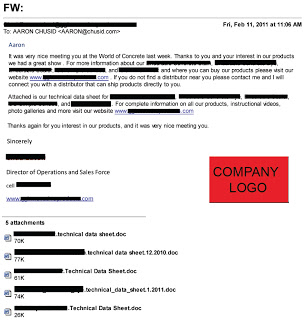
The text has been heavily redacted to protect the guilty, but the basic structure and every part I want to discuss are still viewable.


  1. First and foremost, look at the subject line. Yes, the subject to this email, the one that is supposed to convince me to renew my contact and do business with them, is actually "FW:    ".

    This is so bad for so many reasons. Many email systems tag forwards as SPAM, especially if it's coming from someone not in your contact book, has no subject line, or seems to be a commercial message. This hits all three counts. Honestly, I'm a little amazed it even made it to my inbox; I should probably tighten my SPAM filter.

    Worse, though, is the missed opportunity. The subject line is your chance, your only chance, to get the reader's attention. To convince them to open your email, instead of hitting delete. Like the advice given to novelists, you should spend as much time on your subject line as on the rest of your email, if for no other reason than it may be the only piece they read. Even a stock phrase, such as "Thank you for visiting our booth!", would have been better.
  2. The show ended Jan. 21. I received this email Feb. 11. That's three whole weeks! Do you think I still even remember who these people are? The window of opportunity for sending out your post-show email is very small; that's why I recommend prepping the email before you head to the show. If the email is coming this late, it's essentially a digital cold call. Which means it's getting deleted.
  3. It may not show well on this screen shot, but the font in the salutation is a different color than the body text. Ignoring the questionable grammar and business-letter formatting, that tells me instantly this is a form letter, and makes it feel impersonal. 
  4. The writing is bad. Flat out bad. The product names (hidden behind the thick black lines in the body of the text) are dropped in with no description or context, making it awkward and hard to read. And repeated, but again with no context! There is no call-to-action, no incentive, no reason for me to do anything after reading but delete.

    And despite what I said before, grammar counts. Your customers and prospects are very intelligent people; many of them are professional writers of some form. They may not reward you for good grammar, but they will definitely punish you for bad.
  5. The attachments. There are five of them! Six, if you count the company logo graphic! This is a major no-no. Do not send people attachments without their request and their permission. Period. Even if you understood your in-booth conversation with them to be a request for your guide specs, they probably did not.

    If, for some reason, you must send an unsolicited attachment, no more than one, not counting graphics, and nothing over 1 MB. Heavy graphics lowers the permissible file size; remember, they have to be able to get this on their phone. 
  6. There are not enough links. The only link in the whole email is to their homepage. In the second paragraph they mention their photo gallery and instructional videos; why not link directly to those? Why make me hunt for them? I understand not wanting to include product pictures, but at least make them easy to get to.

    Consider carefully where you want your email to take them. I recommend using a dedicated landing page with show-specific information, rather than your standard home page. Our typical follow-up email includes links to subscribe to our newsletter, and visit our Facebook and Twitter pages. Also, be sure to have "Click to view online" and "Click to unsubscribe" links.
They did include their contact information; I removed it, rather than black it all out. I don't know why they thought I needed their mailing address in an email, but they sent it. Also, their logo is much nicer than the big red block makes it look.


I do not have a problem with the minimalist style of the email; simple is good, and this email is almost guaranteed to open easily and display correctly on every system and device. I also like that it is short. No one will read your multi-page follow-up email. If they really want more information they will go to your webpage; make it easy and inviting for them to do so.

In summary, think of these emails like thank-you letters after your birthday. Do them, do them early, and make them nice enough that the recipient wants to send you another present next year.

Should you buy your friends?

In the lead-up to World of Concrete 2011, Wacker Neuson ran a fairly aggressive (and judging by their Twitter traffic, successful) campaign to increase their pool of Facebook friends. In short: they bribed them. This tactic can be very successful, but for most small to medium-sized manufacturers I recommend against it.

The plan was simple: take your picture at their booth, upload it to their Facebook page, and win (potentially) an iPad! There was also a related campaign encoura- ging Twitter users to retweet announce- ments about the contest, again by offering an iPad.

This is an impressively well designed cross-platform campaign; it was set to drive traffic to their Facebook page, Twitter stream, and World of Concrete booth; not bad for marketing synergy! The landing page is well designed; it is clear, clean, uncluttered, easy to read, and has prominent subscription and retweet buttons. I would go so far as to say that, in the B2B construction market, this is about the best you could do a campaign of this nature. (Also, check out their YouTube channel; this company really understands social media!)

Here's the problem: unless your company is the size of Wacker Neuson, you probably cannot afford to do this.

Start with the basics: can your company currently afford to buy several iPads just to give away? This tactic is the equivalent of making friends in school by throwing great parties; everyone will come for a free trip to Disneyland, but few will come for microwaved pizza and DVDs. Likewise, as the cost of the giveaway decreases, you see sharply diminishing returns on the campaign. iPads are cool enough and expensive enough that tons of people will jump through hoops to get one; substantially fewer people would take the effort for a $25 gift certificate. This makes finding an effective value-priced incentive extremely difficult.

More importantly, the friends this will make you are not friends you will keep. Like the school party, again, everyone will be your friend until the party is over. If that is the only reason they like you, though, you only keep them as long as you keep throwing parties. I guarantee Wacker Neuson will have a huge boost in Facebook followers during and immediately after the show, and I guarantee that, barring some amazing follow-up campaign, most of them will un-follow or go dormant within a month.

For a company like Wacker Neuson that is probably ok; their social media strategy seems based on TV marketing, meaning they want eyeballs and brand recognition, not an enduring, engaged community. And that brand recognition is probably all they need.

For most manufacturers, though, that is not enough. The construction industry is big enough and varied enough that almost every product is a niche product (granted, some have very large niches). Short-term engagement will not produce the long-term brand recognition that you need, because there are not enough people using your product often enough. For you, social media campaigns need to be about engagement and long-term relationship building, so when the day comes that they need your product, they remember your name.

As in real life, buying online friends is a great strategy if you can afford it. Most of us, though, make friends by being interesting, polite, helpful, and social. And that strategy will help just as much online.

How NOT to comment

Commenting on blogs, forums, and networking sites is an important part of your online presence. Search engines are likely to find and index your comment, especially if it is on a well-known site, and links you post (when allowed) can send new traffic to your page. More importantly, it shows you and your company are participating in the conversation. But it is important to do it right.

Michael's recent post about white boards received a comment that looks like this:


Anonymous,  December 31, 2010 8:11 AM  


For a whiteboard that stays pure white, check out this glass marker board. Great for the corporate or classroom environment.


I went ahead and published the comment - we post almost every comment we receive, except for the most obvious Spam, but review them first - because it does fit both with the topic of the post (white boards) and the theme of our blog (building products), but this comment fails on several levels to achieve its goals.

1. This was posted by "Anonymous", which does several bad things. Most importantly, it makes me not trust it. Anything I get, via any medium, without a real and recognizable name looks immediately like spam. If it has a real human name I will at least open it, instead of automatically deleting it, but the sender only has 1-2 sentences to get my attention. But this also represents a missed opportunity. Digital marketing is as much about developing your brand as an individual as the company brand; social media is about people, so your personal reputation is what brings people to your company. Posting anonymously is like sending someone a birthday card without signing your name; they want to like you, but do not know who you are.

2. The company or product name does not appear anywhere in the post. There is an art to doing this right, because overusing either makes a comment look like an ad. I recommend following the same guidelines as for a magazine article; focus on the technology and include the name as part of your credentials ("In my work for Chusid Associates, I've found that....").

3. Clicking on the link brings you to a very busy, hard-to-read homepage. Most surfers will get there, look around for 10 seconds, and leave because they cannot find what they want. Instead this should point towards a dedicated landing page, with "Whiteboards that stay pure white!" in big, clear letters. Look for more on landing pages in an upcoming post.

4. This is not a well-written comment. Spelling and grammar are fine, but there is no sense of excitement, no sense of who this is for, no real motivation unless I was already looking for a white board that addresses this topic. That describes a very small part of the architectural market at any given time. If it had said, "See the lated improvement..." or "Learn how we made..." then you draw the much larger audience that does not currently need a white board but is curious about new products. Or better, actually respond to the post; but have an actual response, not a formulaic salutation ("I like what you said about....", not "Great post! Visit....") Also, consider an exclamation point.

I am certain this comment was placed by a automated script; probably no one at the company has ever heard of our blog (too bad for them!). There is nothing wrong with using these scripts, if you use them well. I would recommend setting the script to notify you so you can write a custom response, rather than using a canned message. Anything canned looks like spam, and eventually that will get you in trouble.

Commenting is a very controversial issue right now; there are as many views on the best way to do it as there are digital marketers, and many high-profile blogs forbid including links or have even disabled comments altogether. The general rule everyone agrees on, though, is be polite. You are a guest in someone else's home; if you cannot improve the conversation then stay quiet.

Signs of Change: Smartphones More Personal Than the PC?

For years my daily end-of-work-day routine was power off the laptop, pack it up, go home, unpack it and turn it back on. Now I do this so rarely that I can leave the laptop at the office (wouldn't that be a great marketing slogan?) most nights and never even miss it. And the 7-year-old desktop in our home library gets booted up so rarely I keep forgetting the password.

How is this possible? What changed so much that these once indispensable tools are becoming so peripheral to my life? 

According to Lifehacker editor Adam Pash, Your Smartphone Is a Better PC than Your PC Ever Was or Will Be. His premise is controversial and debatable, but has an undeniable nugget of truth to it. And it has huge ramifications for our industry.

Pash is not the first to make this argument. The core of his argument is that regardless of how good it is as a computer, the smartphone is far better at the "personal" part of "Personal Computer":
And from a computing perspective, what's more personal than a gadget that:
  • ...comes with you wherever you go
  • ...knows where you are
  • ...is always connected to the internet
  • ...handles every form of electronic communication short of Morse code (oh wait)
  • ...recognizes your voice and reacts accordingly
  • ...doesn't just spellcheck, but corrects your typos

And he's right; that is a highly personal relationship to have with a computer. It beats out my laptop by being easier to bring with and access on the go, and being more specialized for the "personal" tasks. Much of the debate missed this point, though, saying things like:
If my iPhone is so much better, why does it need my PC in order to do something as simple as delete a song?
This commenter is confusing function with message, in a McLuhan sense, however. He wants something that can be achieved with a simple software tweak. What's more important is that of the over 15GB music library on my computer, less than 2%  makes it onto the "personal" playlist that goes in my pocket.

Another commenter makes the case for the laptop as a "BC" - business computer - instead of PC; I like that distinction, with the BC being the high-powered, high-performance machine I use for specific tasks, and the PC being the maybe not-as-powerful but more personal smartphone that is always within reach. Of course, as the same commenter pointed out, "...the line between business and personal is becoming blurred for a lot of people these days - my business is my business, and that is personal to me."  (My favorite part of this comment is that we often "forget that most people use their PCs for exactly the things that smartphones do well. Most people don't photoshop -- they just shop.")

The Problem - and Opportunity - For Marketers

The opportunity this presents us is what this commenter hinted at; there is not a clear distinction between "personal" and "business". Social media is blending them even further, because most people use a single Facebook account both for catching up with friends and making professional connections, but the key to selling to architects has always involved developing a personal connection; become their Go-To Guy and you're much more likely to get specced.

If both these points are true - that it takes personal connections to get specified, and the smartphone is more personal - then it stands to reason that reaching specifiers through their smartphones will help you get specified.

There are many ways to make these mobile connections, but how do you take advantage of this smartphone/PC issue?
  1. Optimize your website. There's a reason this goes first: it's the most basic and obvious way to start reaching mobile clients and prospects. If you have a smartphone-friendly website, or at least a useful landing page, they will go to your site. If not, they will go to whichever one of your competitors does.
  2. Live in the cloud. Lack of processing power is one of the biggest obstacles to smartphone use. Typing a short email is fine, but large-scale graphic design or data manipulation will overtax the smartphone's capabilities (or the user's patience). Cloud computing presents a way around this limit by moving the heavy lifting to a more robust server. What cloud-based utility can you offer your clients that they can access from their smartphone? There is a lot of fertile ground not just in developing new services, but making existing services more mobile.
  3. Know what belongs on the PC. One thing many of the commenters - and the author - agreed on is there are certain tasks that are still better on the full-sized keyboard-mouse-and-monitor machines (KMMM?). If the task involves heavy data entry, large graphics, frequent searches, or intense reading, it should still be on the KMMM. The mobile site should make it easy to transfer the experience to a PC, along with essential data. Don't make them fill out the same form twice.
  4. Be reachable via mobile. One advantage of smartphones is the ease with which they switch between communication media. A single interaction could start on Twitter before moving to a phone call, sent photos, streaming live video, file transfer, and back to Twitter. Know what communication tools your clients use, download the mobile versions, and become familiar with their capabilities. 
The desktop and laptop computer will be with us for a long time, even as our definition of "desktop" (or "computer") changes. But just as email once dethroned the telephone as the primary business communication tool, the smartphone is a disruptive technology that is changing the way we do business and form relationships. Taking advantage of the enhanced personal touch it provides can help your products get in - and stay in - your clients' specs. 

Social Media and the Paradox of Choice

On the way to work this morning I was listening to a 2008 episode of Radio Lab about choice. The lead story had Barry Schwartz, author of The Paradox of Choice, discussing that for most people decision-making capability drops sharply when they are confronted by more than seven options. Listening to him as I walked, I realized this could also explain one of the major obstacles to social media adoption: there are too many channels for businesses to make effective decisions about which to use. And if there are too many options for businesses, what is that doing to our customers?

The answer is not to limit choice, but to sharpen focus.
A new client recently asked me what I considered "essential social media" for a B2B company. Off the top of my head, I listed (in no particular order):
  • Blog
  • Twitter stream
  • Facebook fan page
  • LinkedIn profile for key executives and company
  • Email newsletter
  • YouTube channel
  • Online photo gallery
  • Website optimization
  • Wikipedia editing
  • Mobile landing page
...and then I paused to take a breath. Is it any wonder my client felt overwhelmed? Seeing the panic on his face, I considered the list and refocused. The first thing we did was narrow the list down by combining similar items:
  1. Website overhaul (which includes blog, mobile page, and SEO review)
  2. Online media gallery
  3. Social networking
  4. Email marketing
  5. Online brand monitoring
Suddenly we had a manageable list.  Sure, creating an "online media gallery strategy" takes more work than starting a YouTube channel, but it made it easier to see the full picture and start our next step: prioritizing.

We began with goal setting; what was the purpose of this online campaign? The client's experience showed that their existing sales network was very effective; the major needs were brand awareness, education, and maintaining customer loyalty. That suggested a single technology to me: email newsletters.

E-newsletters can be very effective at keeping your brand top-of-mind for both new prospects, who need education and awareness, and existing customers, who are reminded of past positive experiences. With the right set-up it is even easy to send multiple versions of your newsletter at once, each customized for a particular audience. Better yet, all of the other online options we discussed suddenly became part of a single project by contributing content to the newsletter, building awareness of it, and building a subscriber base.

It is also important to remember that no company can be successful in every social media venue, so it is always acceptable - encouraged even - to pick the few you want to focus on and ignore the rest. Redesigning the social media mix is fairly simple, so there is little opportunity cost involved. Still, this experience with my client was a good example of how asking the right questions and focusing on goals can change a seemingly impossible list of options into a single manageable project.

"Be The One" uses QR codes to promote Gulf clean-up

As both an important environmental story and a creative use of social media technology, the "Be The One" effort deserves your attention. From their website:
In light of the Gulf of Mexico oil spill disaster, Women of the Storm is rallying to restore America’s Gulf coast now and for future generations. The “Be the One” effort intends to galvanize the nation around the cause of coastal restoration in order to demand that government leaders address this critical issue.
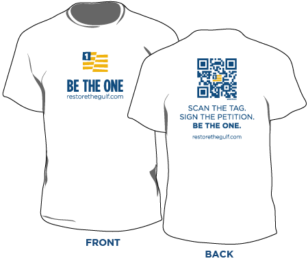
Considering one of their sponsors is YouTube I'm not surprised they're using social media well, but I was impressed by their use of QR codes to encourage people to sign their petition. Note the simple, but effective, customization.

In addition to QR codes on signs and billboards, they are offering a scannable t-shirt, taking the usual benefit of branded clothing a step farther. Now instead of just a passive, but mobile, poster, the shirt becomes a portable hyperlink to the site. Presumably, people who wear this shirt will wear it around similarly-minded groups, who would be highly likely to also sign the petition. In other words, imagine a couple of people show up wearing this at the next USGBC meeting. Talk about highly targeted marketing!

This is a great example of what's possible with QR codes: create a highly targeted landing page, put the code where it will have the most impact, and use some outside-the-box creativity. This could have a huge impact at trade shows, with your whole staff wearing scannable shirts as they're out networking. I want to see these in the product demo area at World of Concrete and the Concrete Decor Show; put one on the concrete artist your company is sponsoring, with the message, "Want to know more about the products I'm using? Scan my shirt!"

Please take a minute to check out the "Be The One" page and sign their petition. The Gulf oil spill is one of the environmental disasters of our age, and to be true to our ideals of sustainable design we must also clean the world outside our buildings.

Tag Used (Almost) Correctly

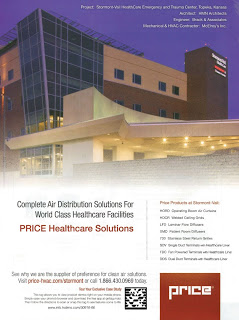
In last month's ASHRAE Journal, Price Industries ran a full-page ad including a Microsoft Tag - their proprietary version of QR codes - and used the Tag almost exactly correctly. Unfortunately, the one rule they broke is the big one.


Here's the ad:


At the bottom is the tag, with instructions on how to use it. Including instructions is a smart move, and I like that they used the black & white version so it would still work if someone made a non-color copy of the ad.

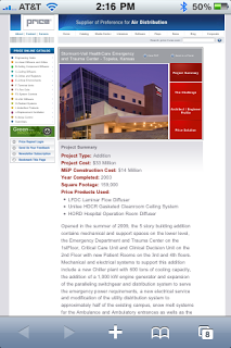
Scanning the tag brings you here:


Very cool; the site's good looking, and it's information about the project I was looking at in the ad. That gives it relevance, which is essential to a successful QR Code campaign. [Note: I use QR Code as the "Kleenex" of the industry, because it's a more resonant term than "Two-dimensional Bar Code"] Users want information about their current task at hand, not a webpage they might be interested in later.

Where this fails, though, is the landing page itself. Look at the screenshot above again. Here's a link to the same page on a full-size browser. You need that second link, because most of the screen from my iPhone is too small to read! It is essential to have all your QR Codes point to mobile friendly sites!

When I started researching QR codes, a simple search of the app store brought me over 20 readers in a few seconds. Looking for a reader that works reliably from my desktop took days. Most people will use QR Codes with a phone, so the content needs to be optimized for mobile screen sizes.

In summary, Price did a great job of using Tag in their ad; it was clearly displayed, looked good, and had relevant information. But they failed to use a mobile-friendly landing page; that's a big enough sin to almost erase everything they did right.