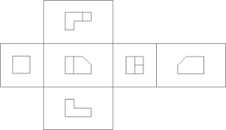
If you use plan, elevation, and section drawings to illustrate your products, I recommend you organize them using "third angle projection".
Most architects are not familiar with the term "third angle projection". But most have internalized the method (at least those who began their careers drafting with T-square and triangle).
This advice is particularly important to manufacturers based outside of the US since "first angle projection" prevails some parts of the world. As you make plans to enter the US, revising your drawings is an appropriate part of your technology transfer.
Drawing: CC BY-SA 3.0
 |
| Each surface on the shaded 3D object is projected onto the surface of an imaginary box. |
 |
| Visualize the box unfolding to display each of the 2D projections. |
Most architects are not familiar with the term "third angle projection". But most have internalized the method (at least those who began their careers drafting with T-square and triangle).
This advice is particularly important to manufacturers based outside of the US since "first angle projection" prevails some parts of the world. As you make plans to enter the US, revising your drawings is an appropriate part of your technology transfer.
Drawing: CC BY-SA 3.0

