Bathroom fixture manufacturer Bradley recently released the Bradley ColorSpec iPhone app, and it is impressively well done. Be sure to check it out as an example of what can - and should - be done with building product apps.
Guided Tour
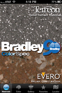
The home page is very pretty and eye-catching. I was expecting a standard digital catalog, so this was a pleasant surprise. You can select a product line, get more information about Bradley, or choose from the bottom menu: Materials, Color, Gallery, Favorites, and Locator.
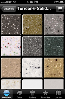
Selecting one of the product lines brings you to a page with tiles of the various options within that line.
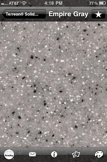
You can then view a color in closer detail
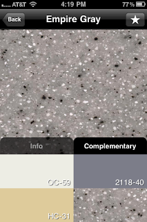
Get information on complimentary colors and the relevant partitions.
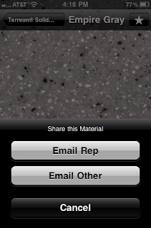
And - best of all - email the color to a contact, or request more information from a rep.
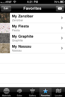
You can also create a list of your favorites for later reference.
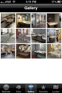
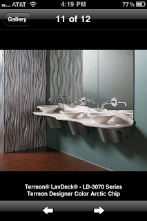
Or visit a project photo gallery.
These are not linked to the color samples, making it harder to find photos of your favorites, and there are very few images. I suspect they will expand this section in future revisions.
Other features help you select patterns using a color chart, and locate reps using Google maps.
Bugs or features?
The front page is very attractive, but it was unclear until I played with it a bit which parts were clickable buttons, and what they would do. More importantly, when I tried to email a rep, nothing happened visibly. I can't tell if it sent an invisible message to a rep to contact me later, or if the button is broken.
Other than that, the app works very well and was intuitive to learn. My only other comment - not a criticism, just an observation - is that it provides almost no functionality. In other words, it will be very useful to existing customers trying to select the right material, but does little to draw in new ones. Why should someone download an app that's little more than your - very nicely done - digital product literature? What's in it for them, and what would convince them, if they do, to make a purchase?
My observation is about how the program is used, though; not about its quality. It is important to start app design by deciding clearly what you are trying to accomplish, because it is impossible to make one app that does everything. Better to focus on doing one thing well than everything badly.
The Bradley ColorSpec app does its one thing very well. It will be a useful tool for designers and installers in the field, or possibly even at their desks, that looks good and works reliably.
Kudos!

